Cube House by Carr Design Group
Minimalist two-storey single family house designed in 2015 by Carr Design Group.
It’s situated in Melbourne, Australia.

Description by Carr Design Group
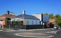
From the front, this house presents as a typical Edwardian terrace. But turn the corner, and the setting instantly transforms from heritage ornamentation to contemporary simplicity.
Positioned on Edgevale Road in Kew, the property belongs to a young couple and their two children. The couple purchased the site in 2010, with the intention of creating something extraordinary. Living in the house for two years gave them a better understanding of the type of spaces they wanted to inhabit; spaces with an emphasis on raw materials, natural light and a sense of openness.
After seeing the work of Carr Design Group, the couple contacted the firm. Although not governed by a particular aesthetic, Carr’s simplicity and understated material palette instantly struck a chord.
After viewing the property, Director of Carr Architecture, Chris McCue, aspired to create a robust extension that was completely different from the original architecture. The corner site meant the new building had its own distinctive frontage, providing a great contrast to the neighbouring period houses.
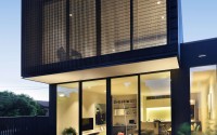
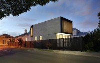
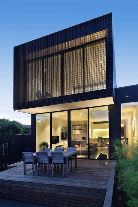
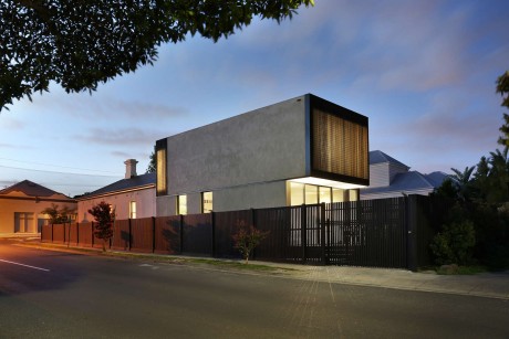
From the street, the new extension appears as a big concrete box. Step beyond the fence, however, and you will notice a simple arrangement of two rectangular forms stacked behind the retained section of the original terrace. The top form slightly cantilevers over the ground form, creating eaves for privacy and shade.
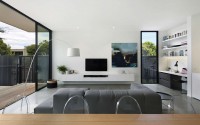
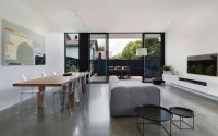
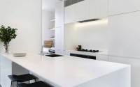
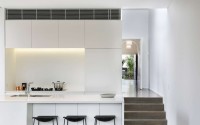
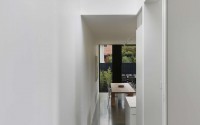
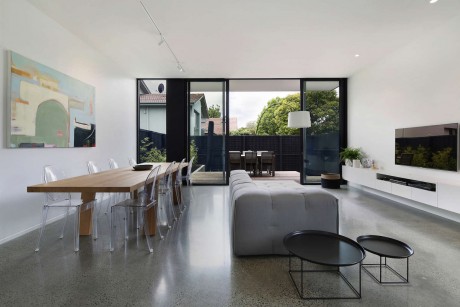
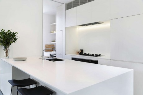
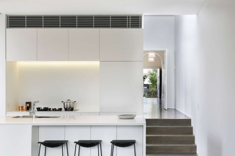
Inside, open plan living spaces occupy the ground floor. Referencing the external facade, the kitchen is monolithic in form with plenty of storage. Floor-to-ceiling glass doors frame the back garden, blurring the threshold between inside and out.
The material palette is pared back and honest. Timber floors in the front of the house provide texture and warmth. Steel framed black windows and white walls play off the concrete floors enthusing the space with an industrial aesthetic. Externally, there is an uncomplicated rawness. Enveloped in a natural grey render, the striking form will age and develop beautifully over time.
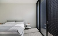
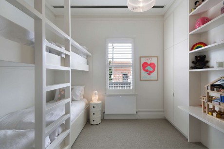
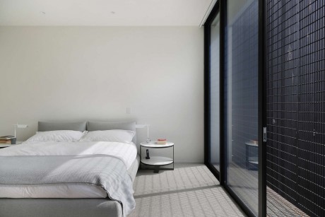
In contrast to the open spaces downstairs, the new master bedroom wing is a play of contrasts – it is big yet intimate, enclosed but open, luxurious and minimal.
“One of the major concerns right from the beginning was this issue of privacy,” explains McCue. “To overcome this issue, while creating a novel residential solution, we wrapped the second glazing level in a fine layer of mesh. This interlay not only provides an impermeable cloak of privacy, but it also allows for sunlight and views.”
To avoid confusion between the spaces, McCue has skilfully taken the new work and pulled it slightly away from the retained part of the original terrace. This design not only signals an obvious departure between the old and new, but it also creates a light-filled vertical space, giving the house a feeling of generosity. It has become a space with no obvious purpose. With views of the surrounding garden, it is an area for repose and reflection, study and work, peace and quietness.
It is through these subtle gestures, that McCue and his team are able to meet the brief. Designed for a family of four, the work is undeniably bold, with an interior that is considered and refined.
For the leafy and sometimes conservative suburb of Kew, this project is a great example of the way brave architecture can be integrated into a period context.
Photography courtesy of Carr Design Group
- by Matt Watts