Apartment in Panama by dos G Arquitectos
Completely redesigned in 2016 by dos G Arquitectos, this modern apartment is situated in Panama.



Description by dos G Arquitectos
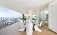
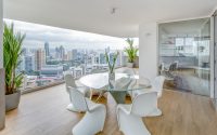
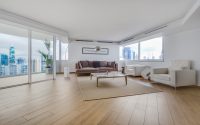
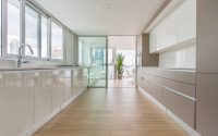
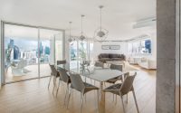
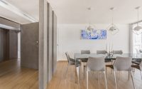
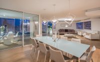
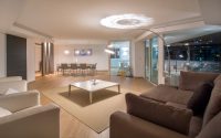
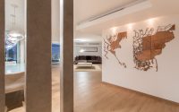
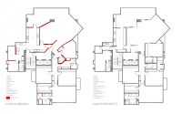
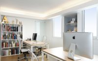
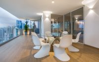
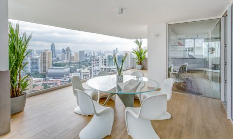
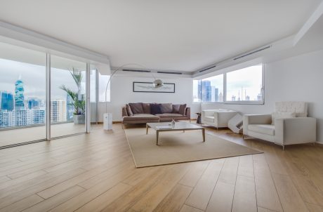
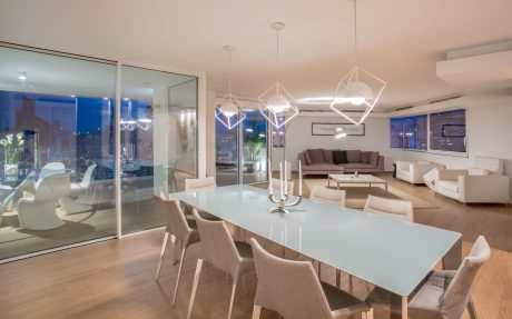
The concept for the renovation of spaces was to update the floor plan of a 30 years old apartment in Punta Paitilla (Panama City) with an old distribuition in order to adapt it to the demands of contemporary life, for the current owner that enjoys cooking, wants his privacy, has no need of using air conditioning because prefers cross ventilation, enjoys the “dolce far niente” of sitting and watching a sunset. The most important element was to include the views/sky and the exterior as a part of interior design. We made punctual demolitions in order to achieve this modern layout of open spaces that intercommunicate and relate with the environment and landscape. The apartment is the entire 26th floor of the building, so we were able to re-design the entire lobby, creating a new and more central entry. From this lobby the owner has another service entry to the apartment’s kitchen and to an independent space of laundry, service room and small home office, with this layout we achieved the privacy the owner aspired. The dining room was modified to achieve more defined and single environments, since the original layout had repeated and void spaces that didn’t contribute and took value to the contemporary language we desired to provide. The terrace didn’t exist since the previous owners had close the original balcony and use it as a redundant addition to the living room and dining room. Due to the new distribution we were able to create a terrace rather than a balcony which provides a roofed space for outdoor dining which is used daily thanks to the tropical weather of Panama. This space is completely surrounded by the stunning views of the city getting a complete view from the Baha’i temple in the mountains to the old quarter in the Pacific Ocean. The demolitions mainly improved the kitchen, which was closed without direct access to the original balcony. We extended the kitchen counter creating a linear continuity between the interior and exterior space that can be read even through the window and allows that when opened it feels like a single space that perfectly complements. The counter is used as a serving space, bar and bbq. The design of the new layout also covered the bedrooms. We redesigned the bathrooms in order that from the 1.5 original bathrooms (visitors and a shared bathroom between 2 bedrooms) we achieved three full bathrooms, one for each room.
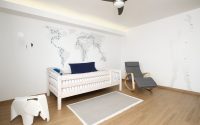
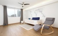
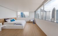
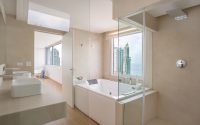
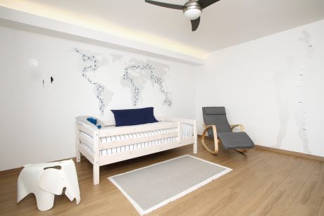
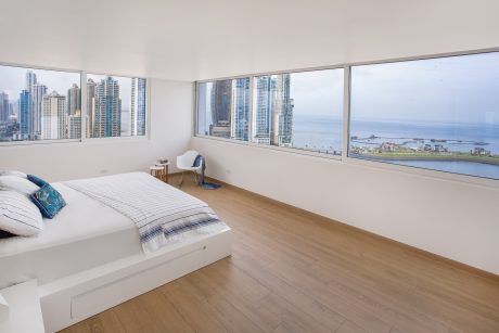
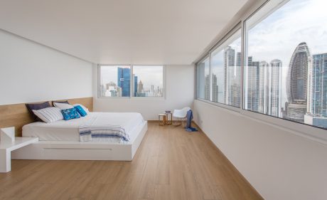
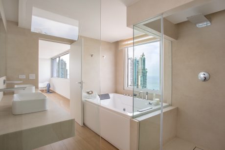
We also managed to create a guest room / tv room that used to be too small with a strange non perpendicular walls distribuition which made it impossible to furnish the space. The master bedroom was completely turned, since the original distribution had the room giving it’s back to the ocean, the main focal point of the room was a blind Wall to watch the television, for this reason we decided to make a wide linear window which allows the sky, the sea and the skyline of Punta Pacifica to take over the space and it was not neccesary to add any striking elements in the room that might distract the focal point from the panorama. The main bathroom had a small high window that did not allowed to enjoy the sea view from the jacuzzi. The sober and neutral tones of the furniture and accesories contribute to highlight the sky and to make it a design element like a painting. The original distributions had very large spaces that couldn’t be furnished in a functional way, this spaces were not interconnected and were redundant therefore the weakness of the apartment was that a lot of space was lost and wasn’t completely used, it didn’t offered special spaces that could direct the focal point in order to enjoy the sky in every room.
Photography by Tirone Garcia
- by Matt Watts