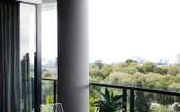
M Residence by Studio Tate
Situated in Melbourne, Australia, this inspiring apartment was completely redesigned in 2016 by Studio Tate.


Description by Studio Tate
Studio Tate completed this comprehensive apartment renovation for a penthouse in the Melburnian complex, overlooking the Shrine of Remembrance and the botanical gardens. Our clients were an emptynester couple who had lived here for several years. Looking for a refreshed, opulent look and a space that could cater for entertaining kids and grandkids, we introduced the idea of ‘LA glamour’ – a sophisticated and bold concept that uses feature materials to evoke understated luxury with a vintage Hollywood vibe. As part of this project we also selected loose furniture and artworks for each room, accentuating the colour palettes, materials and textures of each space.
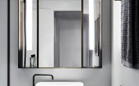
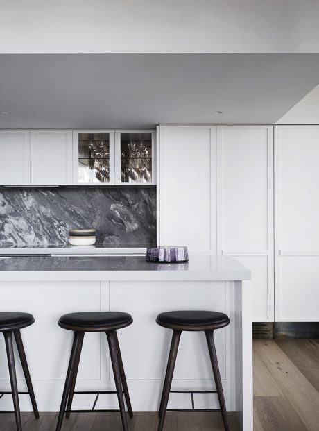
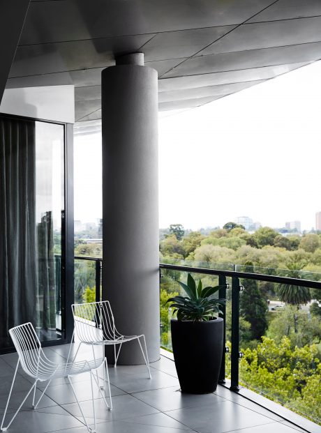
Major spatial reconfigurations included transforming the second bedroom into a study/den area, as well as alterations to the kitchen and giving extra amenity and storage in the master ensuite, walk-in robes and integrated outdoor dining on the terrace. We considered how both of our clients used the space whether together or on their own, and made changes to ensure they could really get the most out of their living space. Naturally, we looked to maximize the exceptional views at each opportunity.
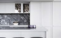
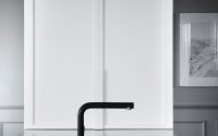
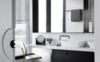
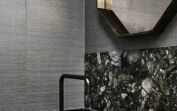
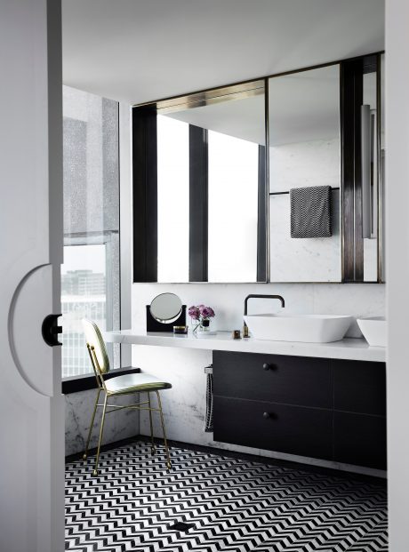
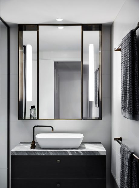
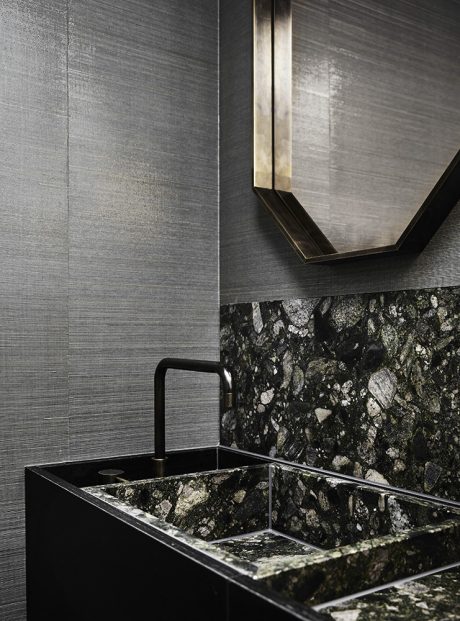
Each element of this project was an exercise in detail. We think of it like the clasp on a luxury handbag – subtle notes of luxury that speak volumes. Picking up on our client’s love of black and white, we made this is a central theme throughout the apartment, such as the chevron tile with black stone border in the master ensuite. Other special touches include the powder room with sumptuous pink-veined green marble, pink pendant lamp and bronze mirror trim. Custom features are found in panelling on the kitchen and living areas, detail on the ceiling strapping and distinctive lighting choices.
Furniture & Artwork
Furniture selection for this apartment played off the LA glamour theme – working in and around the feature materials and colours that are woven throughout the interiors: green stone, brass and a considered selection of soft and bold colours – pink, deep green and bright blue – set against a black and white backdrop (a favourite combination of the clients).
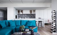
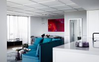
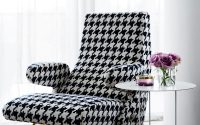
A peacock blue upholstered circular lounge in the living sets the theme. This central piece is contrasted with a black and white houndstooth armchair and matching ottoman from Arflex, the gold trim tying in with detailing in the bathrooms. A custom-designed blue and white rug complements the colour scheme, with a soft pink lamp completing the striking ensemble. Two black and white Peter Clarke works and two muted oil paintings hang in the entry space.
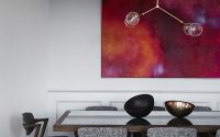
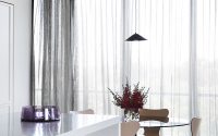
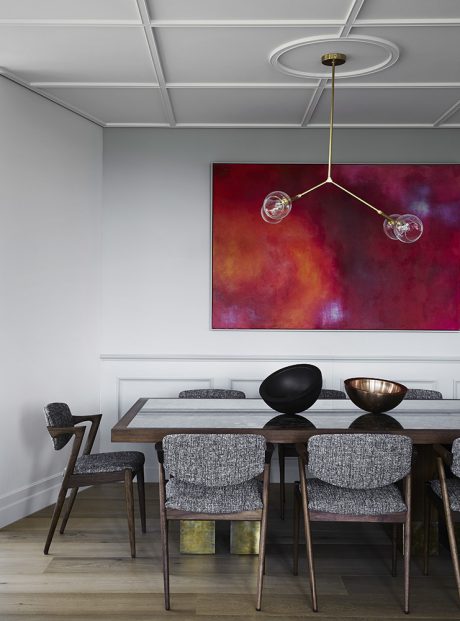
The dining area is centred on a bespoke American Oak table, accompanied by vintage chairs from Great Dane upholstered in blue and white fabric. The pink-veined, green marble used in the bathroom is inlaid into the table with a brass trim surrounding the stone and brass ‘socks’ on the table legs. An abstract artwork in bright pinks graces the wall behind this suite, the perfect counterpoint to a delicate pink and brass pendant light hanging above the table.
Another more casual dining area is decorated with a smoked glass table, which contrasts with a set of limited edition pink Series 7 chairs with brass legs.
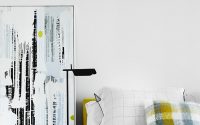
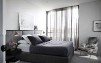
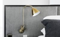
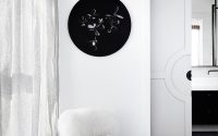
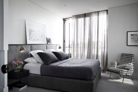
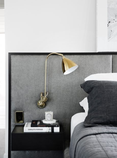
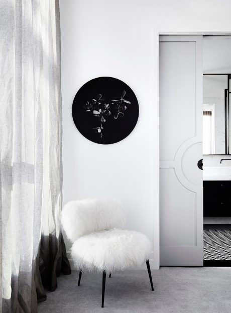
In the master bedroom, we created a bespoke bedhead and frame with integrated side tables, above which is a brass wall lamp. A fluffy white chair sits below a round artwork in dark tones to add depth and interest. We’ve even been shopping with our client to pick out bed linen to coordinate with the design!
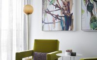
The guest bedroom features chartreuse yellow accents, matched with a piece by Leila Jeffries. In the study, green is the dominant shade with two botanical oil paintings chosen to complement the Utrecht armchairs covered in white-flecked forest green upholstery, and a green stone and copper side table.
Photography courtesy of Studio Tate
- by Matt Watts