Deep Gray by Azovskiy + Pahomova
The Deep Gray project designed in 2020 by Azovskiy + Pahomova is a minimalist apartment located in the Ukrainian city of Kryvyi Rih.

Description
The clients are a family with two children who know how to see the beauty in minimalism and appreciate it. Their wishes were succinct and understandable: to create comfortable housing for life in concise methods.
Initially, the apartment was a “clean” space without any partitions, but with several columns to which it was necessary to attach. The result is a functionally non-standard layout, including due to the task that the nursery should be very voluminous.
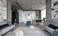
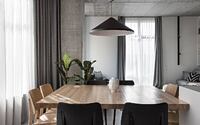
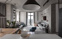
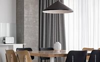
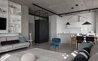
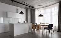
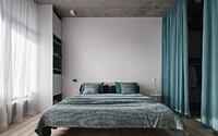
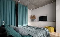
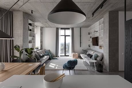
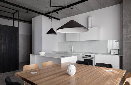
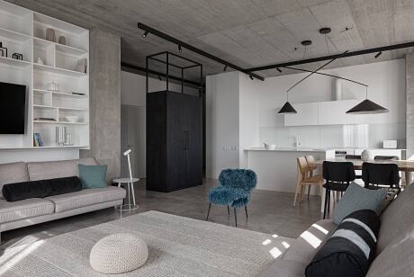
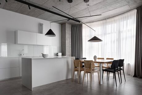
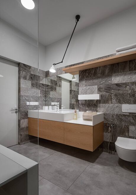
We worked with rich raw data such as concrete ceiling and columns. It was decided not to close them and not to decorate them in any way. Where the wiring could not be concealed, other materials were used: veneered wood panels and a plasterboard ceiling. Here all materials play the role of themselves. Thus, two-thirds of the apartment became open.
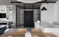
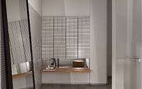
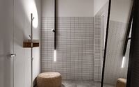
The hallway is incredibly charismatic. There is a separate dressing room, which allows you to take all interactions with it from your eyes. The structural design of the transit zone gives rhythm, keeping in line with the doors.
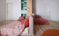
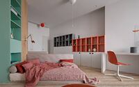
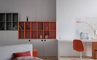
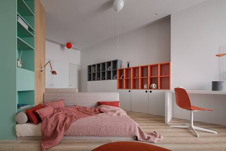
The closest to the hallway is a children’s bedroom and at the same time a play area for two girls, each of whom we tried to organize the maximum space. The arrangement of two beds in the children’s room is an original and key functional solution. Reliable and pleasant to the touch bed linen with textiles added zest to the interior of the room. By the way, the beds are completely made according to our design. Non-trivial and fresh colours in the children’s bedroom set the mood. Parquet, replacing porcelain stoneware in the rest of the apartment, adds extra comfort to the room.
Almost the entire body part of this apartment was made according to our sketches. This gave the interior a unified mood and freedom of expression.
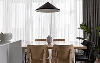
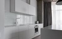
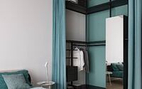
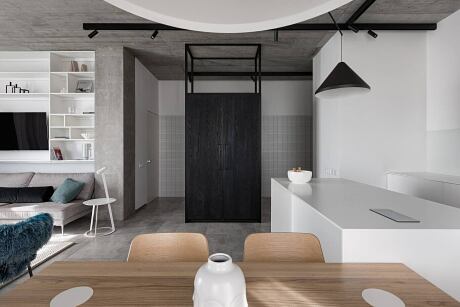
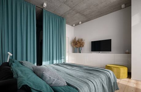
We zoned the common area of the living room kitchen with a refrigerator and a storage system, which was not only a connecting and attractive link of the entire space but also a functional solution. Balancing on the combination of delicate and hard, we used burnt wood on the refrigerator, which is practical to use and serves as a colour spot in the interior. Behind the partition is the master bedroom with its dressing room and access to the terrace.
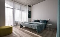
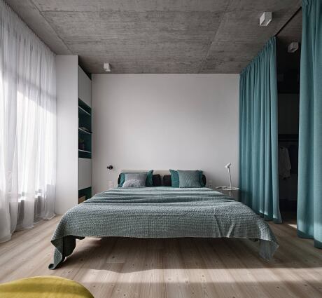
Mint bed linen is an accent in the interior of the master bedroom. The textile solution in mint shades also “sounds” in the colours on the walls and in the furniture, which can be seen in the design of the inner side of the vertical furniture composition at the head of the bed.
The kitchen is also made according to our sketches. Here we note a rare solution with an open hood connection and bottom illumination, which is no less convenient than the top one.
Photography by Andrey Avdeenko
- by Matt Watts