AA Apartment by Maya Sheinberger
Located in Tel Aviv, Israel, the AA Apartment is an elegant home redesigned in 2020 by Maya Sheinberger.

Description
A young couple approached interior designer Maya Sheinberger as they were expecting their first baby girl, in hopes of renovating a 110 m2 apartment, located in a quiet neighborhood in Tel Aviv, Israel. They wished for a calm, elegant and unique atmosphere and decided to keep the existing layout as it was and focus on replacing all finish materials in addition to purchasing new furniture, lighting fixtures, artwork, and accessories.
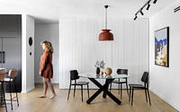
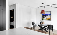
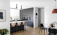
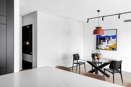
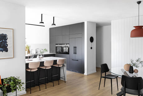
A custom made cabinet welcomes the visitors and serves multiple esthetical and functional purposes. It revolves around and hides a constructive column to face the entrance to the apartment, in addition to creating a background to the dining table. It incorporates a lot of storage space as well as a washing machine. A light warm grey color was chosen and vertical lines were carved in the wood to elongate the space, hide the cabinet doors, and create a clean look. In front of the door, a built-in black colored niche was planned with a golden lighting fixture, which acts as a piece of jewelry, adding a bit of sparkle to the design.
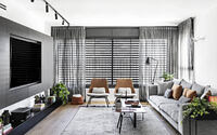
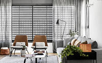
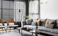
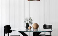
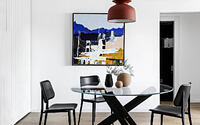
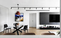
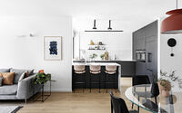
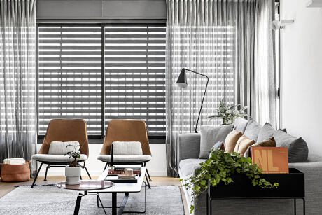
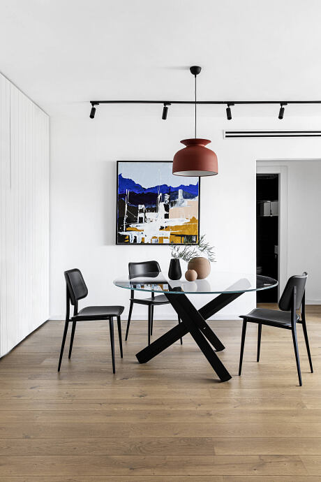
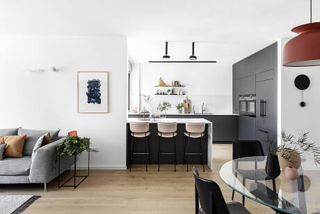
The designer chose several items with circular lines, such as a round clock and round lighting fixtures, which create a nice flow to the space. The dining table is round as well, it is made out of a glass surface and black wooden legs. Around it are leather chairs with a steel frame and above it is a terracotta-colored lighting fixture by Gubi. One long lighting strip connects the dining area with the living area, which incorporates a light gray sofa, two camel-colored lounge chairs, and a combination of two coffee tables – a black rectangular larger table and a smaller circular table in a terracotta finish. The main feature in the living room is the custom made media wall, which includes a wooden frame around the television and an elongated low shelf that doubles as a bench. Light gray textiles, such as carpet and curtains, add softness and texture to the space.
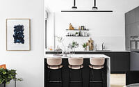
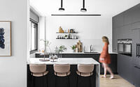
The kitchen is designed in contrasting white and dark gray colors. Along with the wooden oak flooring and warm terracotta touches, these create the main color and material palette of the entire apartment. The tall cabinets were placed on the right side, incorporating integral appliances. Two parallel workspaces were designed next to it, featuring a white surface with a light gray marble texture that lights up the space. Two minimalistic open shelves on the back wall allow for the display and storage of objects that are used daily. Two geometric lighting fixtures hang above the kitchen island and in front of it are three light pink leather chairs, thus allowing for the family members to eat light meals on the counter.
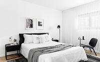
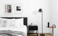
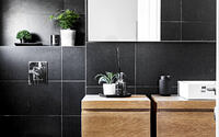
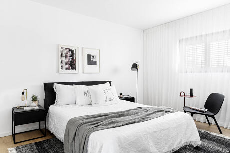
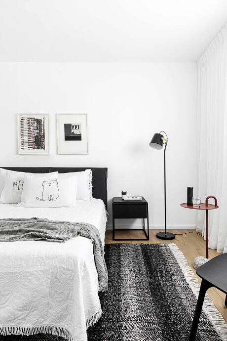
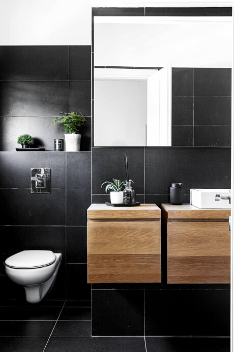
The private area of the apartment continues seamlessly with the design style, atmosphere, and color palette from the public area. The master bedroom includes furniture in dark gray and black colors, such as a handmade carved wooden lounge chair. Next to it is a reddish side table that adds a pop of color. White curtains, a wool monochromatic carpet, asymmetrical lamps, and abstract artwork complete the decor. The master bath is covered almost completely in black tiling and the wooden cabinet, made out of oak, enriches the room with texture and warmth.
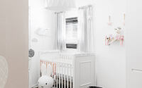
During the renovation, the couple was expecting their first baby girl. For her, the designer created a dreamy nursery with a custom made light pink wallpaper with a cloud print, white furniture, and light gray textiles.
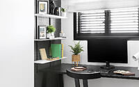
In the home office, the existing niche was covered in textured graphite gray wallpaper and shelves were added for convenient storage. A black desk and chair were chosen and a carpet featuring warm colors connects the space to the terracotta touches that were carefully placed around the apartment.
Photography by Itay Benit
- by Matt Watts