The Great Unit Apartment by K.O.T Architects
The Great Unit Apartment is a modernist home located in Tel Aviv, Israel, designed by K.O.T Architects.


Description
On the third floor of an old modernistic structure on the outskirts of the Florentin neighborhood in Southern Tel Aviv is s gem of an apartment, a true surprise – definitely not what you would expect in the 1938 building and clearly revealing international style.
To reach the apartment, you climb a modernistic staircase to the third floor, alongside a vertical thermometer window all the way up. It is a small apartment (55m²) that originally had two rooms that were reverted to an office. The apartment was purchased by a 40-year old single man who did not have special design demands beyond comfort and practicality.
Architect Kfir Galatia-Azulay of K.O.T. Architects, who was responsible for planning and designing the project related strongly to the client’s demands. “I appreciate comfort. In general, I believe in clear statements: clear and defined spaces in context, without whimsical and presumptuous elements that do not serve the client’s interest”, he explains.
The main concept for the project and its guiding context was to create a “living machine”, derived from the construction techniques applied when the building was built while properly integrating with the client’s demands. These factors, alongside the apartment’s challenging area and shape, motivated the architect to “create a space that optimally meets the client’s needs and lifestyle”.
The initial step toward adapting the apartment to his needs was the removal of all of the interior walls. This was possible because the walls framing the apartment are bearing walls, so there were no constructive elements – like columns – within the interior space.
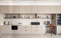
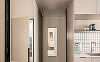
The apartment plan and design were developed and created with a scheme simulating a “day in the life” scenario suited to the client’s profession as a director. The scheme is based on 2 dedicated carpentry elements – connected and extending the other: a small unit at the front door – a service unit with “wet” and storage functions and another unit, the larger and central one, that extends through the apartment and echoes the thermometer window at the building’s façade.
The larger unit provides necessary domestic functions and it is “seamlessly” embedded in the space as it defines the flow within the apartment and its various areas. “The absence of partition walls and the use of functional elements renders the space flexible, able to transform according to operational needs and provide separation for private areas, such as the bedroom”, explains Galatia-Azulay.
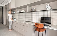
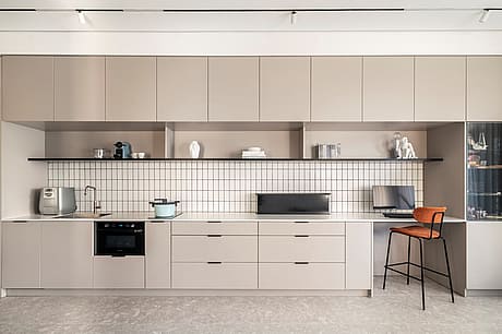
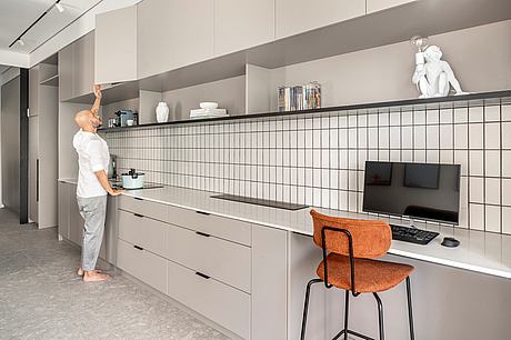
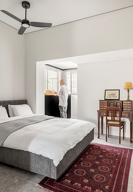
The large unit consists of an accessorized kitchenette, a hidden refrigerator, computer and work station, home cinema and television system, storage cabinet, wardrobe, overhead storage, a hidden partition that is removed as needed to enclose the bedroom, and a vitrine to display the owner’s ornaments and collections.
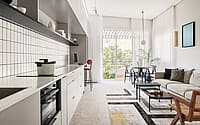
The scheme was calculated meticulously, to ensure that each element optimally meets its intended function. For example, the kitchen comes with a television that is pulled out of the marble top and watched from the living room across from it, thus eliminating the need for another element, like a “dresser/buffet”. Every part of the unit corresponds with the functionality required across from it: the wardrobe is across from the den and bedroom; the kitchen wet area is across from the bathing area; the cooking and hosting area is across from the kitchen and living room.
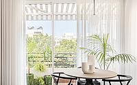
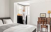
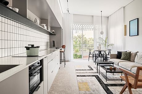
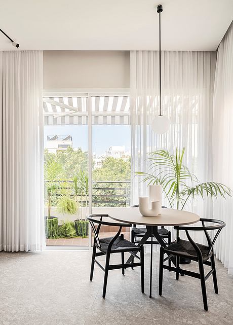
On the western side of the apartment, at the edge of the living room, the façade was opened and the exit to the balcony was widened. A 3-wing floor-to-ceiling vitrine window was installed to replace the wall enabling, when open, the consolidation of the dining and living room area with the balcony. Another balcony, originally covered by a tin roof at the eastern end of the apartment, was annexed to the living room, enlarging it and serving as a comfortable dressing area.
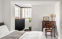
The color palette and materials selected for the apartment support the planning concept with minimal materials and a light monochromatic pattern-based mainly on gray shades, black and white. The light terrazzo tiles with coarse aggregates correspond with the international style that prevailed when the building was built. The balcony was tiled with reddish terra cotta tiles corresponding with the decorated tiles seen on old buildings of the late 1930s and, the entire façade, including the plants in the striped Parisian marquee, brings back the European balconies of yore.
Hidden lighting in the ceiling emphasizes the apartment’s longitudinal axis. A decorative opaque glass accessory serves as a lighting fixture hanging over the dining room and the two linestras on the living room wall create an atmosphere of a Parisian Brasserie.
The detached ceiling creates a floating dimension and soft white curtains hang from the gap between it and the walls. Most walls were clad with white and smoothed mineral plaster and those by the curtains were painted in light mocha. Wall cladding in the kitchen consists of white rectangular tiles (metro tiles) reflecting a contemporary interpretation to the generic white tiles that were used in old apartments. An upper shelf with select ornaments complements the meticulous and simplistic design, blurring the border between the kitchen and library.
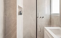
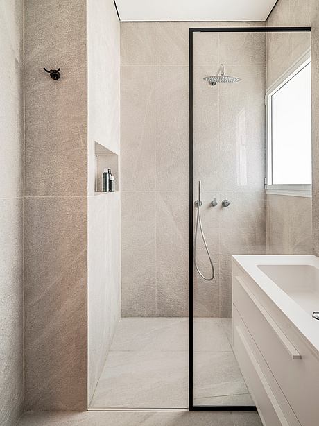
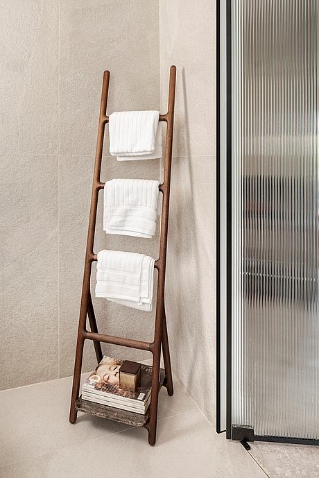
The bathroom is the only room with a door in the apartment and being part of the open space, its door is made of a wavy glass partition: transparent enough to retain the sense of openness, while ensuring the necessary privacy.
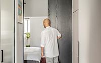
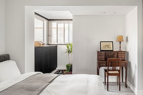
A black veneer carpentry detail was planned for the bedroom, such as a shelf unit and drawers in the dressing area, nostalgically accompanied by an antique secretaire with a matching chair, which the client inherited from his grandmother.
“This is the true story”, concludes Architect Kfir Galatia-Azulay, “the design language can indeed be called contemporary, but it was devised and developed in reference to the international style. This connection between the past and the here and now, bears with it a richness of content that corresponds with the times and, as it fully meets the design program, precisely reflects my vision for the apartment”.
Photography courtesy of K.O.T Architects
Visit K.O.T Architects
- by Matt Watts
