Casa Rubens: A Colorful Retreat by EstudioReciente
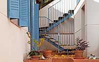
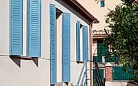
Nestled at the foot of Monte Abantos, in San Lorenzo del Escorial, lies Casa Rubens – weekend retreat designed by Estudio Reciente. This single-storey house, envisioned as a warm Mediterranean getaway for a young Madrid family, draws inspiration from the 1950s summer homes of Cadaqués. Color takes center stage in this inviting abode, which doubles as a venue for gatherings and artistic showcases.
With a special nod to the region’s rich history and proximity to the Monastery of El Escorial, this comprehensive renovation seamlessly blends modernist flair with vibrant hues. Get ready to explore a colorful, modernist masterpiece in the heart of Spain.

About Casa Rubens
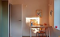
Nestled at the foot of Monte Abantos in San Lorenzo del Escorial, this single-story house has undergone a comprehensive rehabilitation. Originally designed as a weekend getaway for a young couple from Madrid and their two children, it draws inspiration from the charming summer homes of Cadaqués from the 1950s. The primary goal? To create a warm and welcoming haven, invoking the Mediterranean spirit with a vibrant burst of color.
Respecting the Heritage
The renovation project pays homage to the region’s heritage in two crucial ways. Firstly, it respects the historical significance of the location, which falls under special protection due to its proximity to the Monastery of El Escorial. Secondly, it preserves the integrity of the original 80cm-thick stone walls and the sturdy roof structure. This thoughtful approach maintains the essence of the past while infusing it with modern vibrancy.
Creative Redesign and Spatial Transformation
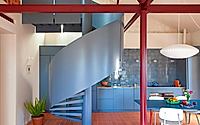
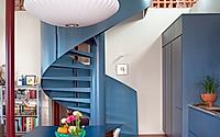
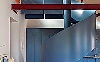
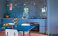
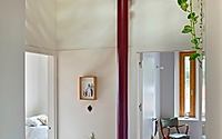
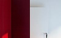
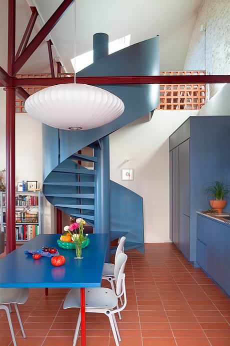
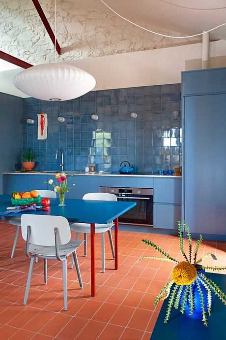
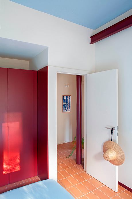
The interior of the house underwent a remarkable transformation. The original floors were in poor condition, and the pillars and wooden structure were dilapidated. To address these issues, the interior was completely emptied, allowing for a complete reconfiguration of the floor plan. The result is a dynamic new layout that divides the volume into two distinct spaces. A double-height unitary area now houses the living room, dining room, and kitchen, while a mezzanine with a sculptural spiral staircase serves as a cozy study. The original wooden structure, with its intricate joints, has been faithfully recreated in steel, which is lacquered in an intense garnet color.
This not only showcases exceptional craftsmanship but also serves as a striking visual focal point. The three pillars and their capitals not only add to the aesthetics but also play a functional role in defining and organizing the space. The other half of the volume accommodates three bedrooms, two bathrooms, and a small double-height distributor, providing seamless interaction with the mezzanine and welcoming natural light.
Color as a Design Element
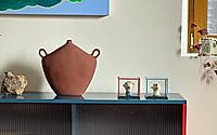
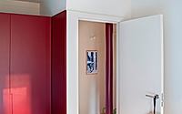
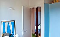
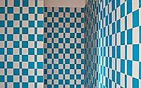
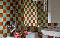
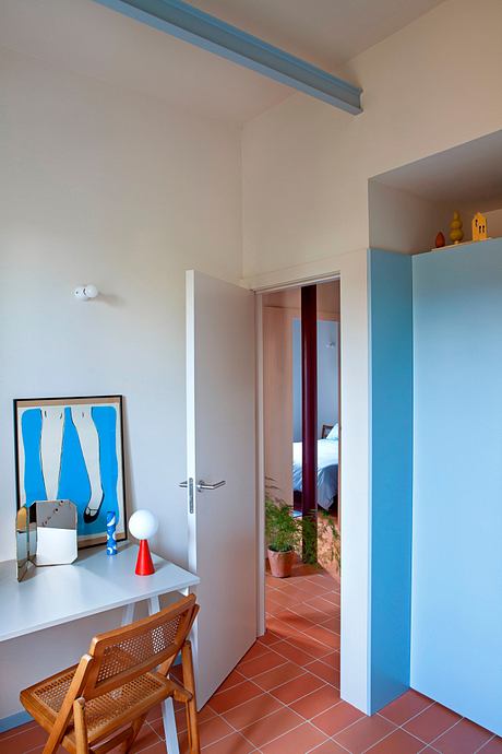
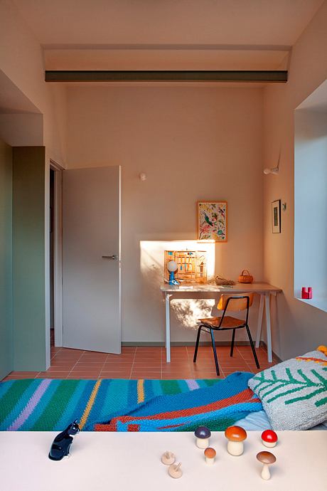
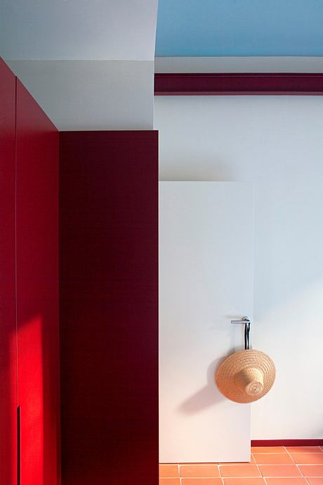
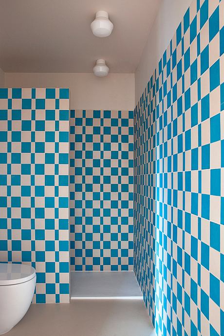
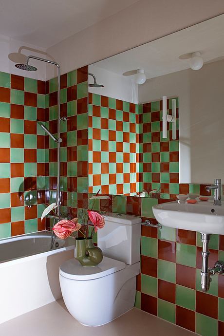
Color played a pivotal role in this project, serving as a means of individualization for each family member. Even in the seemingly simple bathrooms, the designers took bold steps by combining tiles to create a unique visual impact. This careful attention to detail and use of color adds depth and personality to the overall composition of the house, making it a vibrant and inviting retreat for the family and their guests.
Photography by Asier Rua
Visit EstudioReciente
- by Matt Watts