Alberto Alcocer Apartment by De la Villa Studio
The Alberto Alcocer apartment in Madrid, designed by De la Villa Studio, features a minimalist and timeless character. Crafted in 2024, this interior design seamlessly blends natural oak wood and travertine stone into a cohesive aesthetic. The layout abandons corridors for fluid transitions, with elements like sliding doors hidden in architectural recesses.

The original layout resembled that of an office, with excessive compartmentalization resulting in loss of light and space. A dark and broken corridor stretched along the central axis of the house. The main objective of the integral reform was to unify spaces in a large social area, using visual dividing elements such as recesses or cut-outs in the floors to maximize the entry of light. The challenge was to design a layout with almost no corridors.
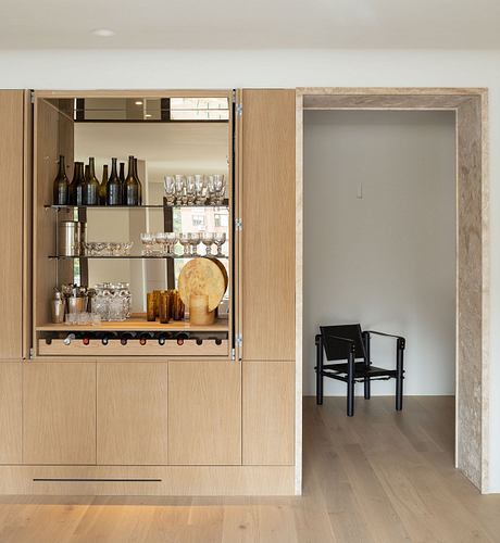
A nucleus of wet areas was established in the centre of the house and a succession of rooms using natural stone embrasures, which bring elegance and solidity to the construction.
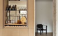
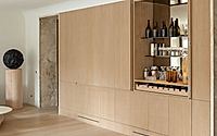
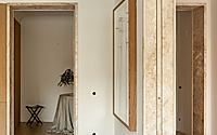
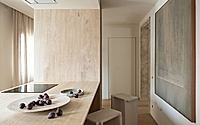
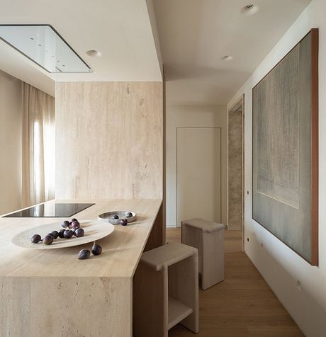
After crossing the entrance door, a global vision of the materials that will unify the essence of the project can be seen throughout the house: natural oak wood and Olivillo travertine stone. The wood, treated with water-based varnish, is used in the made-to-measure joinery and in the floor in a lighter tone, laid with a loose joint. The Olivillo travertine stone is used in the mouths.
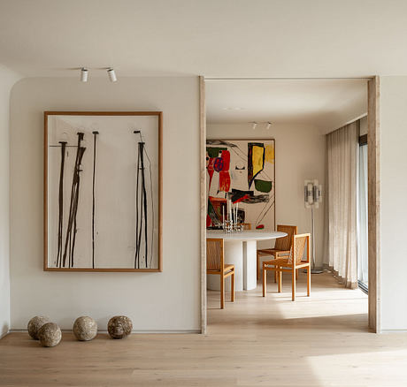
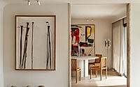
In the first distributor, the elegance of the geometric shapes takes precedence, highlighting the height of the ceiling with a curved hatch as a union between walls which, apart from softening this encounter, guides the indirect lighting towards the ceiling through recessed wall washers. An initial dialogue is established between the recesses and the importance of the hierarchy of heights.
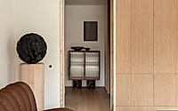
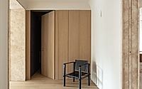
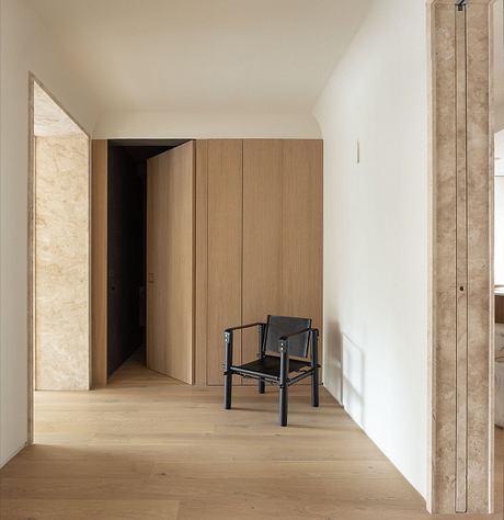
The recesses are treated with the intention of being able to separate rooms or keep them unified. Some of these architectural resources house large sliding doors which, when open, are concealed in them and, when slid open, act as enclosing panels, so that various routes through the house can be established.
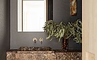
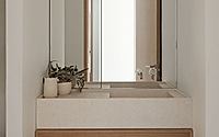
A panelled wall, with a set of doors, creates the entrance to the toilet, which is concealed and, when uncovered, contrasts with the rest of the home. With an elegant and marked ash tone, the vertical walls are wallpapered, emphasized by the use of Dark Emperor stone, in a sculptural piece as a washbasin.
A floor-to-ceiling storage space is built into the wall. This element acts as a partition between the kitchen and the passageway to the laundry area and installations room. The house has underfloor heating, using aerothermal energy as a source of energy, renewable and much more energy efficient.
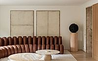
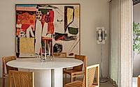
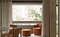
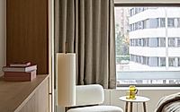
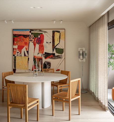
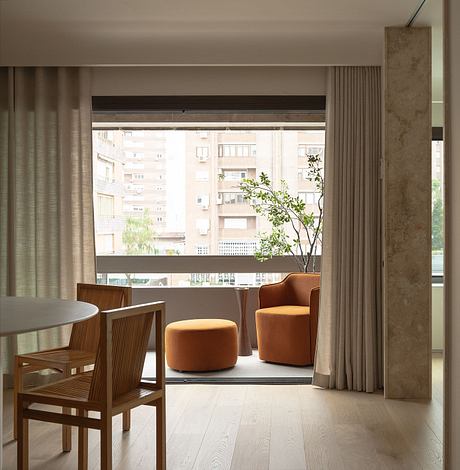
The main rooms of the house, such as the living room and dining room, are located on the south facade, with views of the street through a continuous window that provides them with natural light and spaciousness. Our intention has always been to unify these social areas by accompanying them with a charming terrace.
From the living room, we continue to the hallway of the most reserved area of the property. Here we find floor-to-ceiling oak woodwork that leads to each of the three bedrooms.
Both bathrooms have Alba limestone washbasins and microcement cladding with clay. In the main bathroom, a volcanic rock tone was used for the cladding of the shower cubicle with integrated bathtub. In the other bathroom, a more neutral sand tone was chosen.
In both of them, large mirrors have been fitted to reflect the light, so characteristic of this home, and to give a feeling of greater spaciousness.
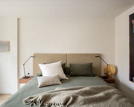
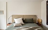
To this neutral canvas, with a clear and simple architectural language, is added a selection of furniture that provides a modern and avant-garde character, with pieces of great value in the history of design and others by emerging artists, more contemporary, which have been carefully chosen to enhance the uniqueness of each room.
These pieces, with a harmonious chromatic connection, ranging from shades of brown to green, including pink or orange flecks.
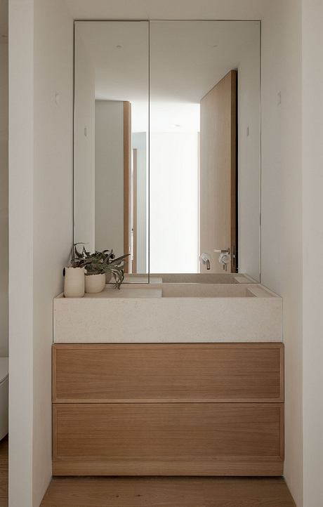
Each room has the right pieces to meet the needs of each space, while also fulfilling its decorative mission. The aim is always to achieve this balance between utility and design, which will guide the visual journey through the home. All the pieces are special, and each one has its own role to play, without competing with the others.
Collaborators Espacio Betty, Rue Vintage 74 and Alzueta Gallery.
Photography by Erlantz Biderbost
Visit De la Villa Studio
