Gardener’s House by Splinter Society Fuses Old and New Design
The Gardener’s House by Splinter Society in Brunswick East, Australia, is designed to harmonize with an ornamental garden. This house features a red-toned period structure blending old and new elements. The modern addition faces a neighboring home, allowing light to filter through.

Old Meets New in Red
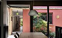
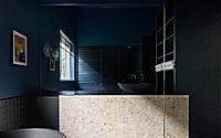
The front portion of the home is a period structure painted in a contemporary tonal red. This choice rationalizes its historical elements, from the masonry construction to the Italianate features and a pink terrazzo bathroom. The red hue is both sustainable and cost-effective, preserving the original building’s narrative while fostering a dialogue between old and new.
Celebrating Past Elements
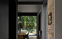
The intersection where demolition once occurred is now an artifact of the past. A previous concrete veranda is visibly peeled away, opening into a new modern living space. Unique aspects of the old architecture, such as the terrazzo bathroom, are integrated into external plantings, now forming a courtyard complete with existing plumbing features. Garden spaces, including a collection of exotic orchids, occupy the physical separation between old and new, allowing light to permeate the extension throughout the day.
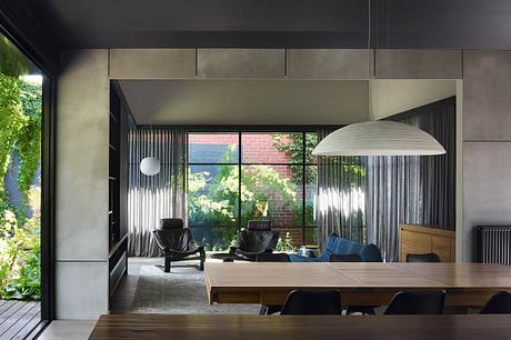
Light-Flooded Modern Addition
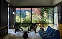
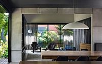
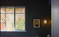
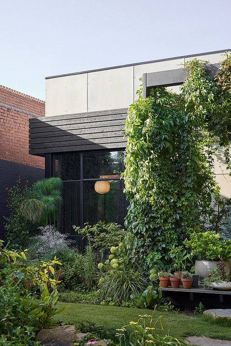
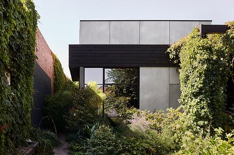
The modern volume is strategically positioned to face the neighboring home, allowing light to slice through the space despite limited orientation. Surrounded by gardens on all sides, the interior benefits from natural light and expansive glazed outlooks. The use of red integrates the home with the neighboring heritage brick wall and roofline, offering vibrant glimpses through all viewpoints.
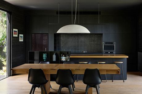
Subtle and Engulfing Design
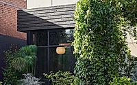
The architectural design of the modern addition adopts a restrained approach, aiming to become engulfed within the garden. Clad in raw cement sheet, it harmonizes with the masonry construction of the original building. Detailing and proportions relate to the substantial aspects of historic brick and concrete. Timber components are incorporated to allow plants to climb and provide shade, gradually obscuring the architecture as the flora matures.
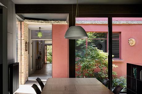
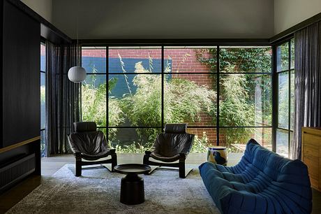
A significant pergola is positioned to support rapid vertical growth, offering shade and dappled light to the floating deck below. Within the new volume, a refined dark palette creates the sensation of being beneath the garden’s canopy, with the garden itself becoming a dominant interior characteristic.
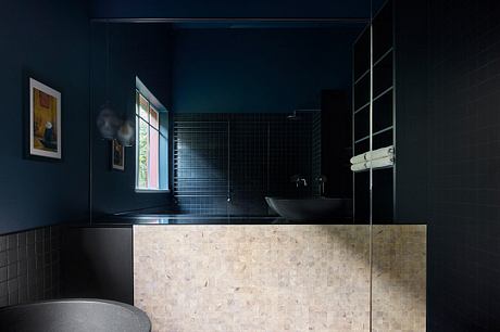
This modern living space contrasts sharply with the period portion of the home through its detailing and materiality, offering an elevated sense of amenity. An eclectic collection of lighting and furnishings, including salvaged items from the old home and treasures from the client’s extensive travels, enriches the narrative.
A Layered Experience
Focusing initially on the landscape, the Gardener’s House offers a layered experience where architecture and interiors take a supporting role. This approach ultimately creates a richer exchange between the home and the client’s passion for plants, encapsulating a harmonious blend of design and nature.
Photography courtesy of Splinter Society
Visit Splinter Society
