Vorst: Triangular Top-Floor Apartment
Vorst crowns a modernist 1955 building in Brussels, Belgium, where architect Arnout De Sutter reimagines a once-awkward top-floor apartment for a stylist and art lover. What began as a triangular pied-à-terre now unfolds as an urban retreat, shaped around light, views, and a generous rhythm of hosting friends. The result is a calm, layered interior that folds hospitality, privacy, and art display into one clear, flowing plan.


Late daylight washes across the top floor of a 1955 modernist building, drawing the eye along angled walls toward the horizon over Brussels. Shadows track across the pale surfaces as the city shifts below, while the interior stays quiet and measured, composed as a place to arrive, unpack, and linger between journeys.
This apartment in Vorst is conceived as an urban retreat for a well-travelled stylist and art enthusiast, reworked by architect Arnout De Sutter. The project starts from an awkward triangular plan and turns it into a clear, almost choreographed sequence of rooms. Every move responds to how the resident lives: welcoming friends to the kitchen, wandering between artworks, ending evenings sunk into a deep conversation pit.
Reworking The Triangle
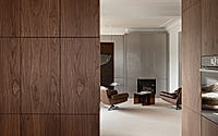
The original triangular floor plan left slivers of unusable corners and a choppy feel between rooms. De Sutter removes all non-load-bearing walls, stripping the layout back to its structural bones and letting circulation run cleanly from end to end. What had been leftover corners now fold into a more logical flow, where the eye and the body move along long, open diagonals rather than dead ends.
With interior walls gone, the geometry no longer dictates small, closed rooms but a sequence of volumes that catch light at different angles. This simple but radical act also prepares the apartment to receive larger works of art, since walls can now be read as broad surfaces rather than narrow partitions. The triangle remains, but it works rather than fights the daily routine.
Shifting Rooms, Clear Uses
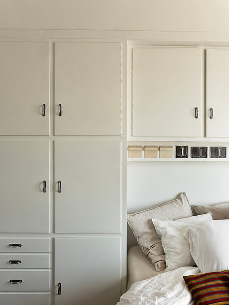
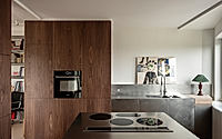
Key functions trade places to support how the apartment is actually used. The former kitchen becomes a compact guest room, where original Cubex cabinets stay on as an improvised headboard and subtle trace of the building’s past. The main bedroom moves into the old kitchen area instead, gaining a calmer position within the layout and better alignment with the new circulation.
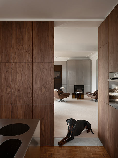
By contrast, the new open kitchen now stands at the heart of daily life, directly tied to dining and living areas. Guests drift from aperitifs around the island to dinner at the table, then onward to more relaxed corners without sharp thresholds. Each room has a clear role in the evening’s progression, yet remains visually linked to the next.
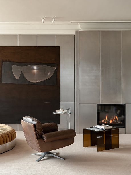
Living Around The Conversation Pit
In the living room, a conversation pit anchors the plan as a built element rather than a loose piece of furniture. Designed by Jonas Van Put together with the client for her brand Fortlaan, it sinks occupants slightly below the main floor level and gathers them inwards. This stepped recess acts as a natural destination at the end of the social arc that begins in the kitchen.
Because the pit holds the center, circulation drifts around it, leaving edges free for artworks and views. Even when empty, it reads as a sculptural volume embedded in the room, giving the apartment a quiet focal point that balances the sweep of glazing and long diagonals.
Light, Views And Art
Removing interior walls unlocks an impressive 270° view over Brussels and lets daylight slide through the apartment from morning to evening. Large windows now read as part of one continuous perimeter, so the resident can track the city’s movement almost in the round. Natural light becomes the guiding thread, brushing across art and furniture as the day turns.
The plan is tuned to that light: walls for artworks are placed where they catch a soft wash rather than harsh glare, and the main social rooms sit where the city view feels most expansive. Modernist charm from the 1950s structure remains legible, yet it is enriched with materials and references drawn from the 1960s and ’70s, echoing the resident’s taste for tactile, layered interiors.
As evening arrives, the apartment settles back into its triangular footprint, now calm and legible rather than cramped. The resident moves from the glowing city edge to the sunken pit, with each room marking a step in that quiet journey. Light, art, and plan work together, turning a once-awkward top floor into a pied-à-terre that feels both generous and precise.
Photography by Piet Albert Goethals
Visit Arnout De Sutter

