Living by the Market by Egue y Seta
Architects Daniel Pérez and Felipe Araujo of Egue y Seta redesigned in 2012 this spacious apartment located in Barcelona, Spain. The end result is perfect. Get inpsired!


Description by Egue y Seta
Throughout history the configuration of the dwelling unit has undergone changes logical evolution of production and social habits of its inhabitants have required. However, this evolution stylistic level, far from being linear, has been punctuated by flashes of great stress or deep nostalgia innovative revisionist. That is why today, once left behind the raging trend futuristic hyper-technological aesthetic and austere silence minimalist turn of the century, to achieve a truly contemporary, has to resort to force to a combination of vernacular elements and traditional, deeply related to the original building, combined with the newest forms of living and inhabiting the space.
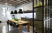
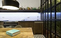
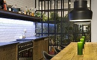
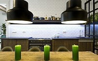
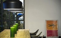
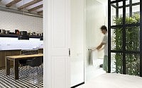
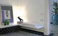
In the home of Santa Caterina is reflected unequivocally contemporary trend is blurring, among others, the border between the public and private spheres of the house. Such is the case of that hide getting opaque border areas and private service, hopelessly separated from the social rooms. Thus, this re-interpretation of the typical floor Eixample, rather than articulated through a broker, elects instead to turn around a large kitchen, which built on the traditional cement floor tiles, is offered as an area with deep social and entertainment vocation beyond its simple functionality and service unit. Crossing the floor longitudinally, the kitchen includes a third of the floor area of the house and it is thanks to their balconies, their shelves-sofa converted into banks, their wide table made of wood and solid nature; their seats and fixtures Contemporary design your old apothecary dresser wrought iron and marble, and its art appliances hidden behind a facade of wood recovery stay becomes the stylistic summary of home and leading large space, deeply extroverted and hedonistic housing makes this representation space of a new lifestyle.
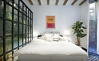
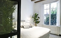
Around the large kitchen and dining room are arranged, in the direction of clockwise and without proposing just transition spaces, a toilet attendant courtesy, an outside room with bathroom and balcony, a living room with possibility of being transformed into guest room, the master bedroom with its respective bathroom, and access to the inner courtyard of the farm whose walls covered in ivy achieve visually link it with other internal gardens recreated in the building.
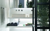
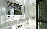
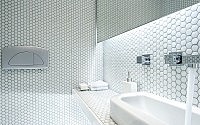
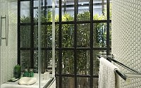
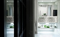
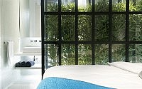
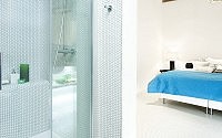
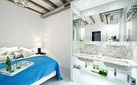
Avoiding the transition spaces: hallways, “halls” and aisles separated by partitions, you get a general sense of openness promotes uniform propagation of natural light and ventilation, while to some extent resignation strict privacy zones “intimate” I used to be in opacity, shadows, and specialized spaces constrained dimensions. That is why the rooms of this house, but can be closed after towering double doors adorned with classic moldings and metal handles, can only open up to the bathrooms by transparencies and reflections given by two major domestic gardens bordered by large windows made extent lacquered woodwork. Consequently, the bathrooms are treated here as relaxation areas that should enjoy the breadth and the preferred lighting that usually stays only enjoy more social. However, discretion is not sacrificed at all: The curtain generated by the bamboo plant inhabiting successive internal gardens achieves ensure transparency of glass, offering the user the necessary privacy without sacrificing light or amplitude. Marble recovery; white glass mosaic with half round rounded corners, fittings and stainless steel fittings, large transparent glass partitions and new walls a vibrant green plant eventually set three instances traditional hygienic offering very little in return great comfort and originality.
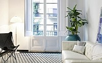
In the lounge, white leather sofa and pure lines in a plane is cut dyed a deep turquoise by wallpaper linking, on the right flank, the visual texture mosaic Escher hydraulic striped with restored wooden beams in the Catalan vault ceiling. From here are illuminated by directional light, furnishings and decor that the owners have been finding gradually over travel around the world and walks in the neighborhood of Borne, progressively customizing the space and making it increasingly unique and welcoming. In this room without TV you can watch movies projected onto a white wall as a screen is devoid of decoration, while central opening doors side cabinet, the room becomes a third room for guests to display the double folding that is hidden inside your head together, bedside tables and reading recessed lighting. On the sides, and after porvençal style doors painted white, hides the control console of audiovisual equipment, while offering space for storage of records, films, and lingerie.
- by Matt Watts