Camper Store in Granada by A-Cero
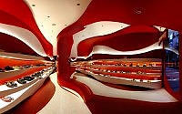
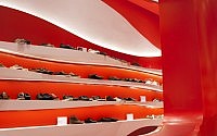
One of my favorite shoe brands, Camper, opened a new futuristic store in Granada, Spain. The project was assigned to A-Cero, and as you can see below … they did an amazing job. Love the color combination and smooth shapes. Enjoy the gallery.


Description by A-Cero
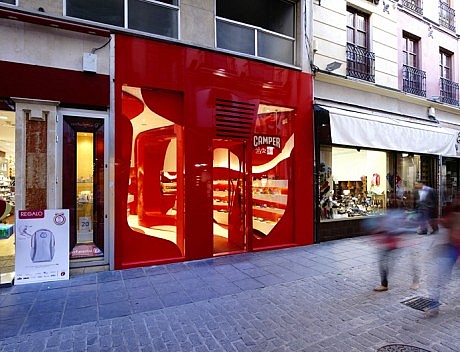
On Mesones street, one of the best known, commercial and important streets of Granada, Spain, there’s a little store of 50 m2 whose reform has been developed by A-cero. The customer is the spanish brand Camper, dedicated to the exposition and sale of shoes. It will be its first store in Granada.
The first important point is the use of the space, because a wide and useful place is needed. A-cero was selected for this work because of its actual, fresh and dynamic design, typical in Joaquín Torres and Rafael Llamazares’ projects. Each store that Camper opens is an event, depending, among other things, on the designer chosen for the project, because each one has his own style.
Camper always looks for a new style and concepts for their stores, making different and special places.
The location of the store is really good being placed in the most famous and commercial street of Granada. The store, with 48 m2, was a clothing shop partially abandoned.
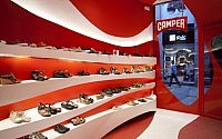
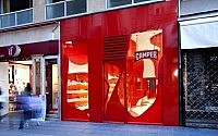
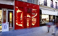
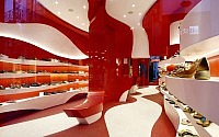
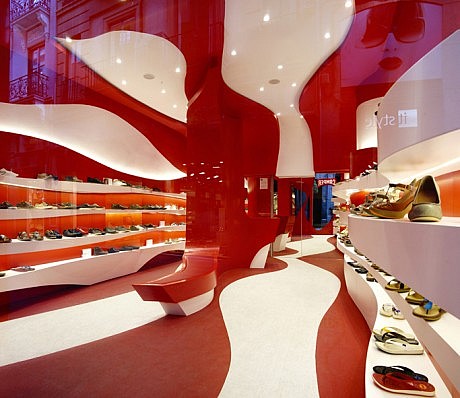
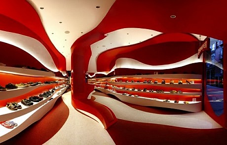
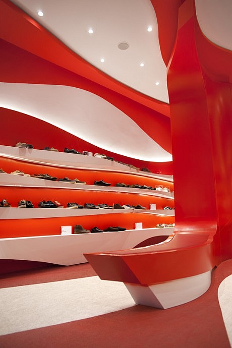
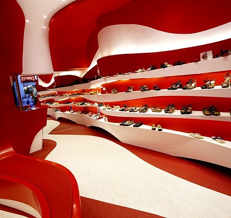
Two colors: white and red, typical of the A-cero interior design projects and Camper. The space is open and projected with organic elements like the expositors, made of lacquered wood with white shelves and red face, having an indirect lighting by leds. Also, following the floor shapes, there’s a red and white bolon. Adding more sculptural values to the complex, in the middle part there’s another curve module used as a brech-change. To achieve more depth the rear wall is a mirror. There is still space for a warehouse at the back. The front is made of composite panel with red aluminium and the showcase of glass and red vynil following the style of the store.
The final result is an interesting fusion between the corporative resources and designs of Camper and A-cero. A special place that improves the market of the area and also, the possibility of feeling the universes of Camper and A-cero.
- by Matt Watts