12 Feet Wide Family House by Ferrolan LAB
Narrow contemporary family house designed in 2010 in Barcelona by Ferrolan LAB. It’s just 12 feet wide! Let’s take a look …

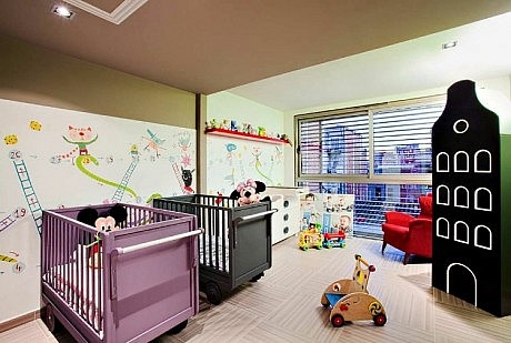
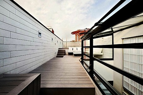
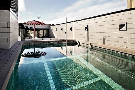
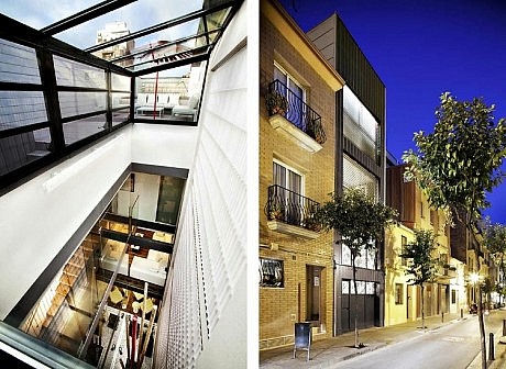
Description by Ferrolan LAB
The house is situated in the heart of an old town district in Barcelona. The urban grid of the area is characterized by small, narrow and long plots.
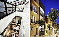
This house is probably situated in one of the narrowest spaces around the neighborhood, as it measures only 3,7m wide. The plot is very long and connects two streets.
The dimensions of the plot (3.7 m wide x 25m long), its location (between neighbouring walls) and its orientation (N-S) dictated the development of this housing.
Our proposed architecture attempts to take these shortcomings and try to turn them into positives. Because of the limited front and the depth of the house, the treatment of light became the most important aspect of the project.
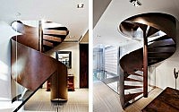
In addition, because of the pre-existing features, we decided to explore developing the house vertically, putting in different floors to meet the different needs of our project.
Therefore, the layout is distributed as follows:
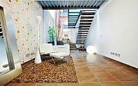
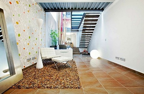
At ground floor, a garage and a cinema. Then, in the mezzanine, there are two rooms connected by a living-study which opens to a patio garden.
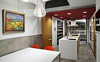
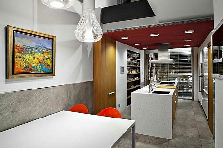
The first floor. Here you are greeted with a courtyard. On one side of the courtyard you will find the dining-room and on the other, a kitchen that’s connected with a gallery which can be converted as a terrace during the summer.
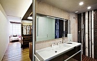
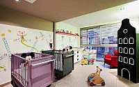
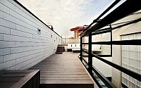
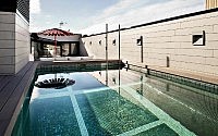
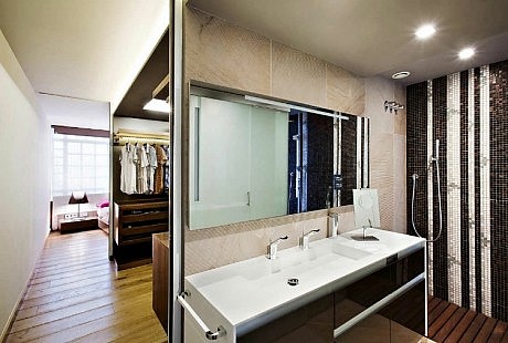
On the second floor are the bedrooms, and finally we’ll find a pool terrace on the roof.
The distribution of the different rooms are built with large open spaces and communicate amongst themselves in an almost transparent way. By including the double spaces generated by the courtyard, the house becomes very flexible and reconfigurable, with the capacity to be changed at any moment.We wanted to create a dwelling space that was able to take advantage of the outdoors while avoiding the stress of the city. The house had the need to open fully to the outside, while ensuring the maximum inner privacy.The two facades have large openings, but are resolved differently.
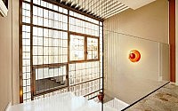
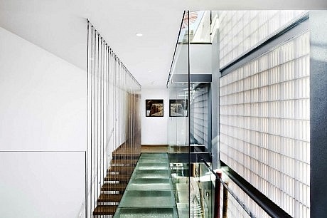
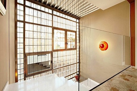
In the south facade, the openings are resolved through adjustable horizontal slats to allow on one hand control over the entrance of sunlight, and on the other, the degree of privacy. The north-facing facade is solved with a wall of glass blocks of large dimensions that lets in light while maintaining an aura of privacy. The house opens to the outside in facades with only the intention of collecting light, hiding the rest of the residence inside to try to escape the direct contact with urban space and noise. As a result, the courtyard becomes the protagonist of the house. The link with the outside world becomes more direct and more immediate.
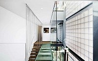
The patio allows us the contact with the outside world, far from the noise and pollution of living in an urban environment. The patio also allows us to see the sky from any point of the house, whether it be in the garden or even the pool terrace. If we understand the facade as an element that links us inside to the outside, the courtyard becomes the project’s main facade.
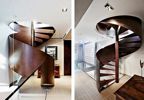
The ideas of the house are very well explained in section and are also reflected in the treatment of materials, which play a very important role. Materials such as wood, stone, warm paint colors, wallpaper and low ceilings convert the rooms to become comfortable warm living spaces. As we approach the patio, the house is stripped to the basic materials. Here you can view the structure where we have worked with lighter materials such as glass, steel, iron, white paint,… to achieve maximum clarity, lightness and brightness.
The study of materials is by no means an afterthought, and in fact has been taken into consideration from the very first sketch of the house. We understand that during the design process it is essential to understand how different materials and parts interact together to form the whole and complete subject.
- by Matt Watts
