Oak Tube Apartment by Peter Kostelov
Moscow-based architect and interior designer Peter Kostelov turned an old 110m2 apartment into unique oak masterpiece. Pretty cool!

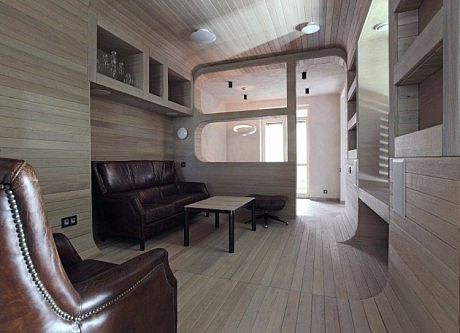
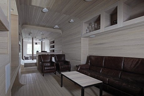
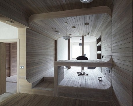
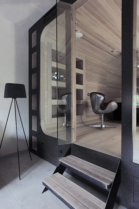
Description by Peter Kostelov
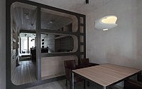
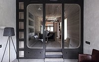
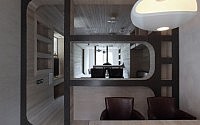
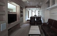
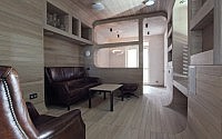
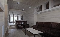
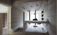
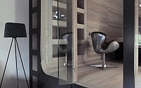
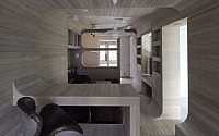
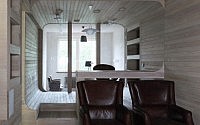
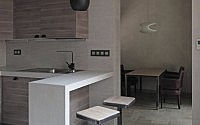
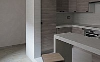
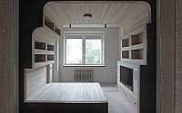
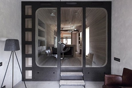
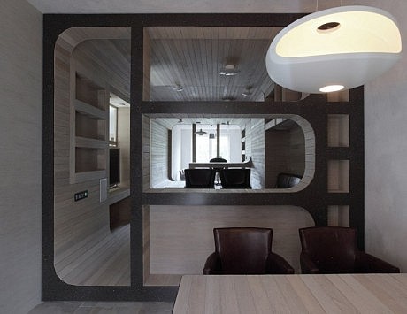
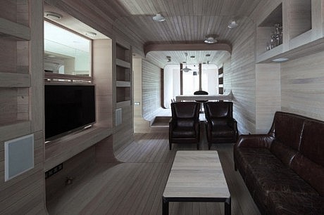
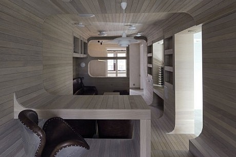
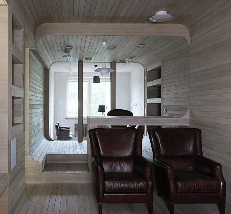
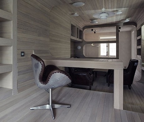
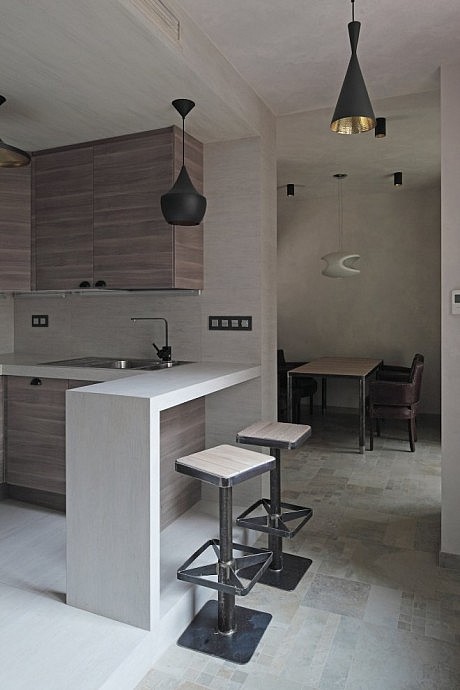
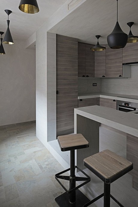
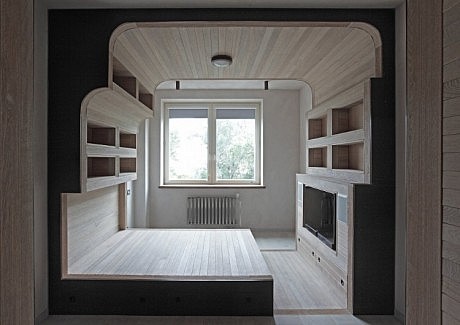
The apartment is on the 5th floor of a tall multistory building with inner yard. Large balcony next to the dining room, low location of the apartment and a part of the house, which strongly shadowed the inner yard – all these didn’t let the sun get into this very part of the house. The greater part of apartment has vividly oblong proportions. Space between windows used to be large notably 14 meters. Walls and balcony made it 2,5 meters larger now its 16,5 meters! The width between structural solid-cast walls was only 3,3 meters while the places, where ventilating shafts were embedded, made it even less just 2,8 meters. Having these proportions and spaces it came out that the middle of the apartment practically was not lightened. The solution came like this: there shouldn’t be dead walls in this part, instead they are to replace with glass wall which if necessary can be blinded with curtains. In the end, the part of the apartment with dining room, guest space, living space and working place got enlightened from both sides. Thus, apartment proportions and poor lighting caused its space-planning design. As for the middle part it was lifted on the podium, so that “to catch” the light coming through the window. Smooth and rounded passages between walls, ceiling and floor visually joined and expanded the small spacing between the walls in the living room. This part of the living room is finished with light oak tree, which gradually goes from ceiling to floor and walls with its built-in closets, shelves and desk. In fact styling design concept was determined by so called “oak tube” which runs just in the middle of the apartment with its working and leisure place to which the dining room adjoins it from one side and the guest room from another. External parts of “the tube” are fined with composite stone. The butts of the “tube” imitate the cuts of its form, while loose airy joining to the walls underlines its ease, giving the illusion of something brought from outside. Similar idea was implemented for the bedroom too. The room is divided into sections which also have smooth, closed passages between ceiling, floor and walls making up shelves closets and a bed. The butts of the “tube» is also fined with stone, imitating the cut shape. As for the part less enlightened it is given to secondary premises: guest loo, gowning room and a bathroom adjoining bedroom. Kitchen is sited as separated block contra-lateral to a window The floor in the common places like hallway, kitchen, dining room and corridor is fined with ceramogranite while all private zones like leisure space, study, and bedroom are fined with oak planks.
- by Matt Watts