Back to Head Road 1816 by SAOTA
Amazing two storey luxuriuos house designed by SAOTA located in the Fresnaye neighborhood of Cape Town, South Africa.


Description by SAOTA
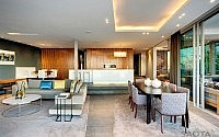
The clients required a four bedroom home for their young family, the design of which had to encapsulate all the qualities of luxury open-plan living while still providing a homely environment.
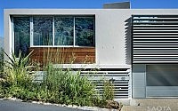
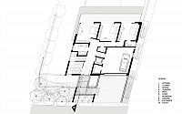
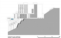
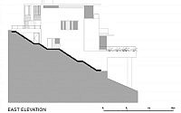
The practicalities of the site – steepness and town planning restrictions – were key initial drivers in determining the parameters available. The narrow proportion of the property also necessitated the careful consideration of privacy and bedroom accommodation, which is set back from the street or suitably screened.
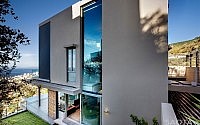
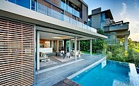
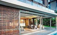
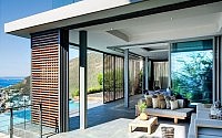
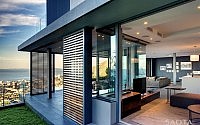
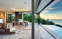
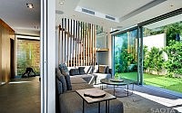
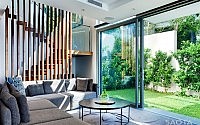
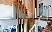
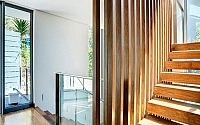
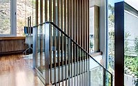
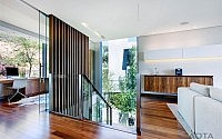
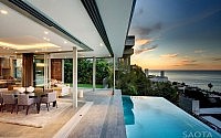
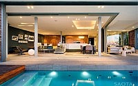
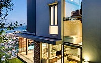
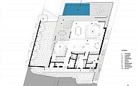
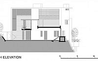
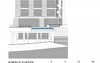
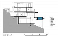
Effort was put into capitalising on views to the rear onto Lions Head as well as across Sea Point and the Atlantic Seaboard. There is a clear vertical distinction between the living and bedroom accommodation. With young children, the bedrooms needed to be in close proximity to each other and to the parents thus a securable ‘family only’ portion of the home was a result. The upper-most level accommodates the master bedroom; a generous open-plan space inclusive of a dressing area and en suite bathroom. From the entrance a timber staircase accesses the primary living and entertainment area. The living areas are arranged to allow seamless connection to the garden, covered terrace and pool. Level changes, the ceiling plane and sliding doors subtly define this versatile space.
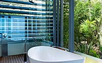
The language of the house reflects bold contemporary lines and extended planes, but the introduction of timber has softened and blurred this distinction. The tactile qualities of timber and the way it is used activate the senses – the sound and smell of the hardwood timber underfoot on the staircase sets a tone on entering the house. Screening elements ensuring privacy have become an integral component of the aesthetic. The juxtaposition of solid mass to large expanses of transparency is transitioned with semi-transparent slatted screens and shutters. The architectural language takes its cues from a Spanish approach to simple cubic volumes with punctured openings and planar walls that open up to create generous ocean views.
Such a narrow, steep site often compromises the final outcome but here, with the seamless connection of indoor and outdoor spaces, the heart of the house was successfully extended from boundary to boundary.
- by Matt Watts