Design for Living by Daniel Hopwood
Amazing 110m2 apartment designed by Daniel Hopwood located on the first floor of a building with a Georgian façade situated close to London’s Regents Park.


Description by Daniel Hopwood
Program
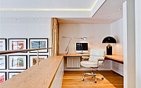
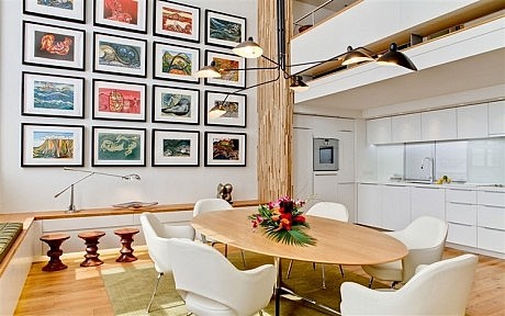
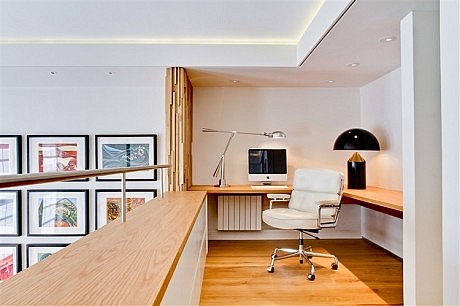
The 1200 square foot [110sqm] apartment is located on the first floor of a building with a Georgian façade situated close to London’s Regents Park. The apartment overlooks a street lined with late 19th century red brick mansion blocks that have terracotta, stone and render detailing. The space is divided into three rooms, one with an open-plan kitchen leading into a reception room that has 16-foot [5 metre] high ceilings. A mezzanine overlooking the double-volume space has been configured as an additional study area.
Design Concept
The clients, who enjoy entertaining at their 5400 square foot [500sqm] home in the countryside, had a clear design brief: the relatively small pied-à-terre needed to be configured in a way that would maximise its potential for hosting dinner parties. Design inspirations could be drawn from the late 1960s to complement the clients’ mid-century furniture collection.
The kitchen was relocated from a room at the rear of the apartment and repositioned into the apartment’s large reception room. This emancipated the smaller room from its functional use and allowed it to be transformed into a second, albeit smaller, reception room.
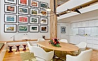
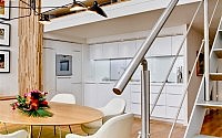
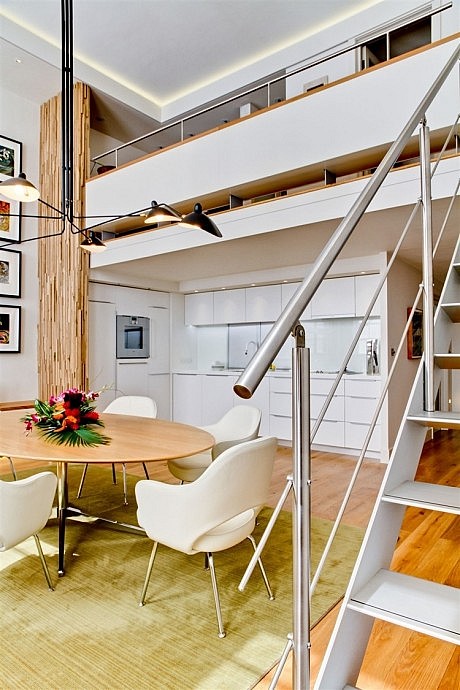
Bespoke kitchen fittings were designed in white melamine with work surfaces fabricated in Corian®. Aluminium shutters hide appliances in order to give the space a minimalist appearance. Tucked under the overhanging mezzanine, the kitchen merges unobtrusively into the double-volume reception space.
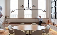
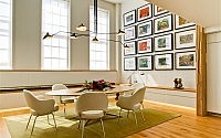
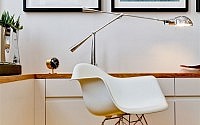
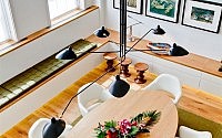
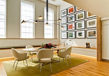
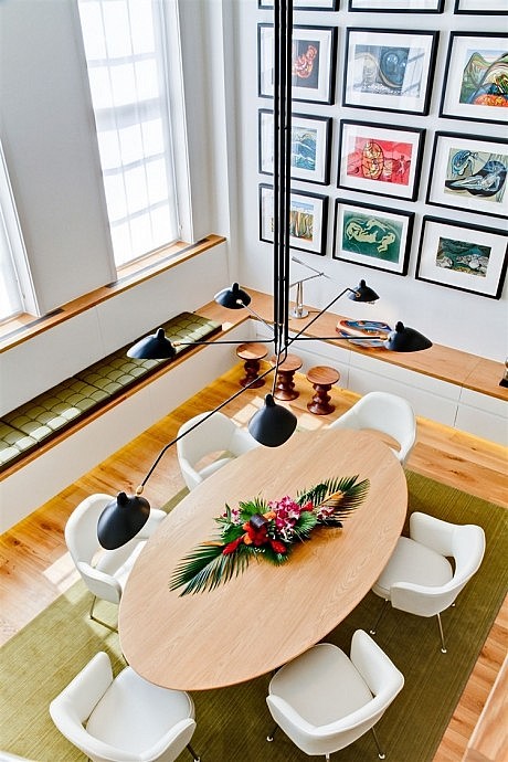
A similarly light palette was used in the main reception area, which was configured as a dining room with a custom-made, multiple-armed Serge Mouille pendant light as a centrepiece above a Florence Knoll elliptical dining-room table.
Lighting, which was integrated into the bottom of built-in seating on the outer edge of the room, demarcates the space. This is echoed in concealed lighting on the perimeter of the ceiling, which visually integrates the mezzanine study area into the double-volume reception area below.
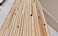
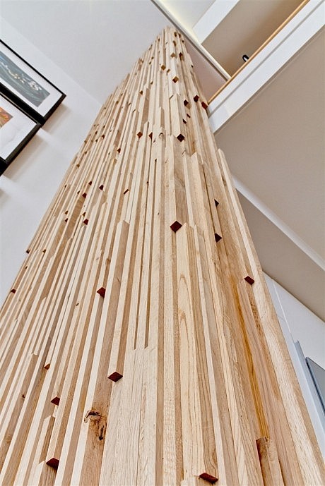
A spiral staircase was removed and replaced with aluminium straight-run stairs that have open risers and a simple stainless steel balustrade. Though this links the vertically separated spaces, a sculptural wall in rough-sawn oak was designed to further harmonize the arrangement and provide partial privacy for the kitchen and study areas. Together with the oak dining table and wide-plank oak floors, the reduction of colour and materials creates a pared down appearance.
Images of Halston’s apartment in Manhattan’s Olympic Towers in the 1970s, which were seen in the documentary “Ultra Suede: In Search of Halston”, inspired the design of a credenza that replaced a railing on the mezzanine. Suspended off the floor with five fin-like brackets in metal, the custom-made cabinet overhangs the reception room and impedes any potential visual discordance that might disrupt the minimalist aesthetic.
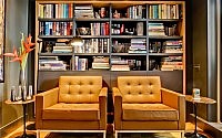
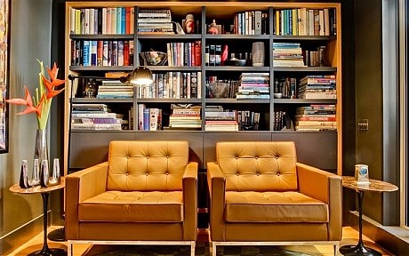
In contrast to the light-filled, double-volume reception area, the space where the kitchen had previously been located was given an altogether different aesthetic. Now used as a library and reading room, the room’s walls were painted charcoal grey, shelving covers an entire wall, and lighting was designed to be moody and subdued. A window was removed and replaced by sliding doors to a terrace, which was landscaped.
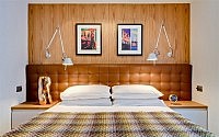
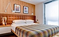
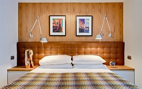
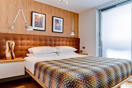
A custom-designed headboard was made for the bedroom and upholstered in brown leather and fitted across one wall. This was backed with book-matched oak panels fitted with Artemide Tolomeo lamps. An oak-framed bed and side tables were custom designed.
The en-suite bathroom was reconfigured and fitted with a high-power shower, Japanese “washlet” toilet and washbasin with stainless-steel mixer. Mirrored cupboards and glass-covered walls convey contemporary styling.
- by Matt Watts