Contrast House by Dubbeldam Architecture + Design
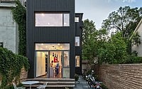
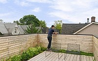
Canadian Dubbeldam Architecture + Design redesigned this narrow 125-year-old residence situated on a corner lot in a dense Toronto neighbourhood.

Description by Dubbeldam Architecture + Design
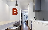
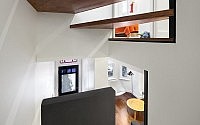
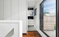
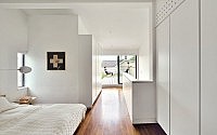
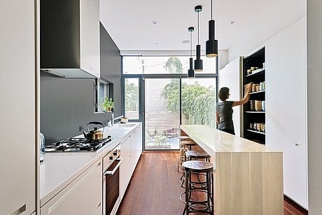
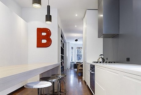
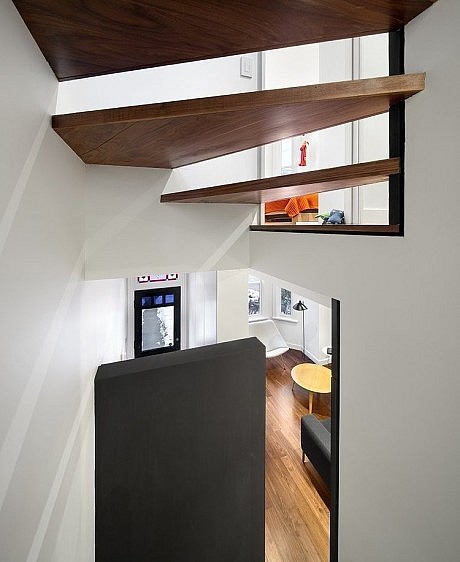
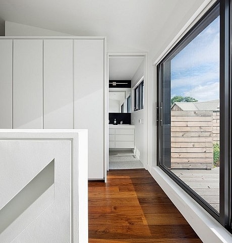
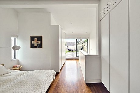
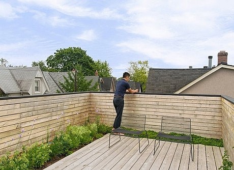
Contrast House explores the role of contrast in the modern renewal of a 120-year old home. Employing the use of contrast in a historic neighbourhood and as a means to amplify natural light, the design juxtaposes opposing elements to explore the relationship between light and dark, old and new. The owners, relocating to Canada from southern climes, hoped to brighten the dark, narrow house. Although the existing house possessed a south-facing façade, it was only 11 feet wide and due to a traditional Victorian layout, had no direct sight lines to allow outward views and access to light. As a result, the primary design challenge was to increase natural light in the space, accomplished through both physical and perceptual means. Physically, the long, narrow house was reorganized in plan and in section, introducing new sight lines to the expanded openings at the rear of the house and updating the layout for a growing family. Perceptually, contrast is used as a means to ‘brighten’ internal spaces without direct access to natural light. Contrasting elements are placed in proximity to visually intensify the natural light
spilling down from the large openings above.
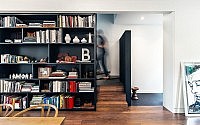
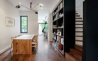
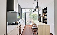
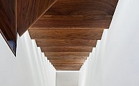
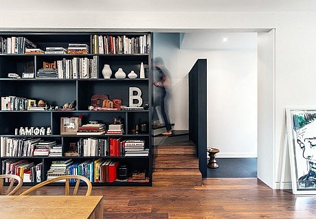
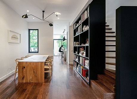
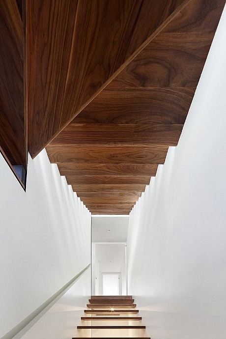
Stacked vertically along the party wall from the basement to the third fl oor, a repositioned, porous stair improves the fl ow of light and sight lines. The stair’s open risers and direct proximity to full height windows at the top, allows light to bathe the house’s interior spaces. At each level below, the stair is delineated by a defi ning black element. Be it tall black bookcases housing the owner’s colourful collectibles on the ground fl oor, or a chalk board wall for play on the second fl oor, these bold, dark pieces, in combination with rich walnut fl oors and crisp white walls and ceilings, create contrast to produce an intensifi ed effect. The monochromatic palette highlights the house’s architectural forms, and is animated by the family’s collection of colourful
objects, furniture, art, books, and toys, as well as the original stained glass window and views to the outdoors.
Visit Dubbeldam Architecture + Design
- by Matt Watts