Strelein Warehouse by Ian Moore Architects
Conversion of a late 19th century former grocery warehouse by Ian Moore Architects into a 2 level, one bedroom residence.

Description by Ian Moore Architects
This project is the conversion of a late 19th century former grocery warehouse into a 2 level, one bedroom residence. In the mid 20th century it had 35 years of use as an engineering workshop before being converted to an artist’s studio and residence in the 1970s.
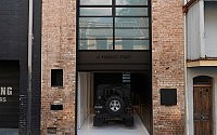
The property has 2 street frontages, allowing clear separation of pedestrian and vehicle entries. The new front door is located in the former loading dock at the end of a quiet cul-de-sac, adjacent to a heritage listed sandstone wall. The entry is defined by a full height steel plate portal, adding to the palimpsest of former window openings and recycled brickwork that make up this façade.
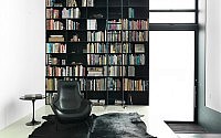
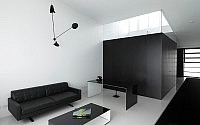
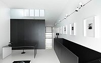
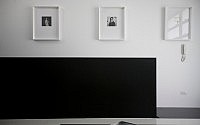
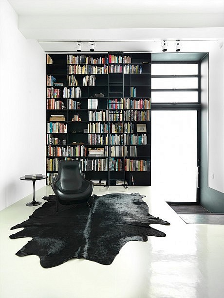
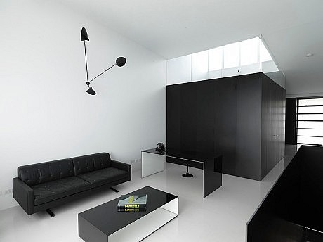
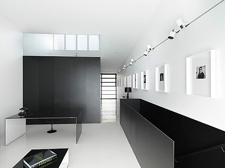
Internally a 1.7 metre height difference between the 2 streets is utilised to create the tall volume of the living space, with its’ floor to ceiling wall of books. The kitchen occupies the half level above, overlooking the living area and is screened by a black steel plate structure incorporating a built-in black leather bench seat. The garage opens off the kitchen, with its’ internal dimensions defining the major strategic move within the design. Once the guest bathroom/laundry/storage and the stair opposite were deducted from the internal width, together with the minimum width required for the garage, the remainder was 10 millimetres with which to construct the wall between the garage and stair. This led to the adoption of the 10 millimetre thick steel plate structure that flows through to the entry portals, the kitchen surround and bookcase.
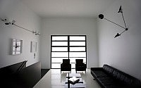
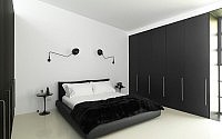
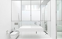
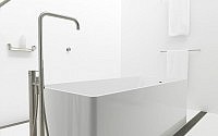
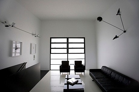
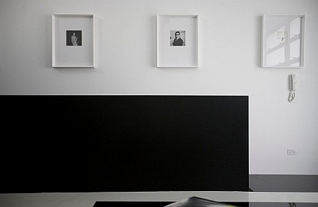
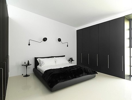
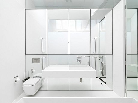
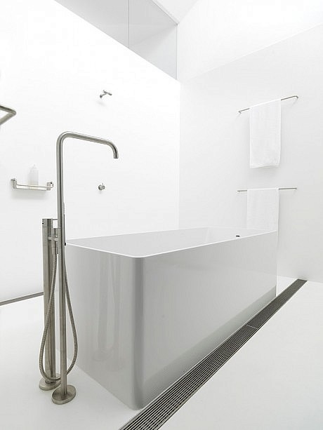
All existing structure has been retained, lined and painted white, while all new elements are painted black. This concept is carried through to the black and white rubber flooring. All joinery is finished in black anodised aluminium, including the bathroom on the upper level, which maintains the datum established by the height of the original window openings. The clear glazing above allows light from the new clerestory window to illuminate the formerly dark centre of the deep open planned space. Internally the bathroom is lined with Corian on both walls and floor.
The main street façade reinterprets the original but in steel rather than timber, with the address spelt out in water jet cut steel letters reflecting the original engineering workshop signage. The contrast between the precision of the steelwork and the patina of the original brickwork summarises the transformation from 19th to 21st centuries and from industrial to residential
- by Matt Watts