Narrow Bathrooms can be effective…..
Set in the prestigious Eastern Suburbs of Sydney – Dover Heights and perched on top of the hill, this home sets down a cliff face with 6 levels and boasts panoramic views from Bondi all the way to North Sydney. This new development was designed to be a shower stopper that took in all of the surroundings and stunning views. It was to be a cutting edge modern home with large expanses of glass, concrete, sand stone and basalt.
The family consisted of two adults with two young girls leading into their teenage years. The kids are aged 5 and 9, this bathroom with a mirror reverse on the other side of the level was the ensuite for each of the girls.

Description by Minosa
The Brief
This ensuite had to have good storage for the you girl as she matured, it have make good use of a small foot print, make use of the natural light and fall inline with the stunning architecture. The space had to cater for a young girl now but be able to cater for the needs of a teenager also. The bathroom was to be easy to clean with a good use of artificial light to compliment the large EAST-facing window.
CLIENT REQUIREMENTS:
- Good use of the small footprint
- Lots of storage space but MUST not be bulky
- Cater for a young girl maturing into a teenager.
- Inline with the sleek architecture
- Good use of artificial lighting
- A Touch of decoration to a very masculine home
- Quality fittings and fixtures
CONSTRAINTS:
- New space – Small foot print
- Only one wall to work with
- The masculine nature of the home
How the requirements of the client brief were achieved & problems solved
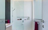
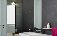
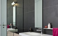
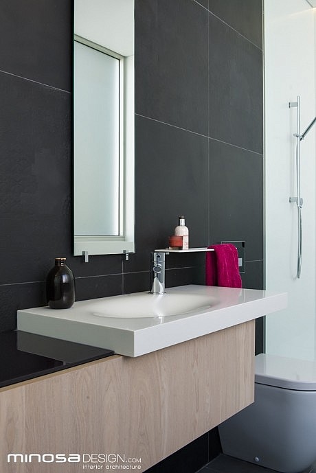
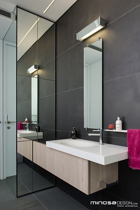
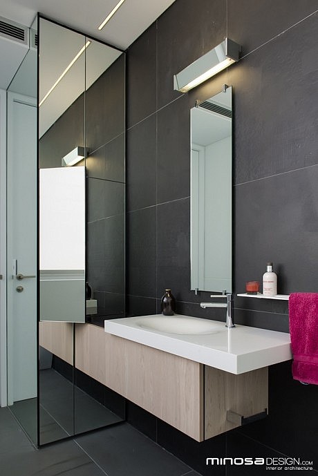
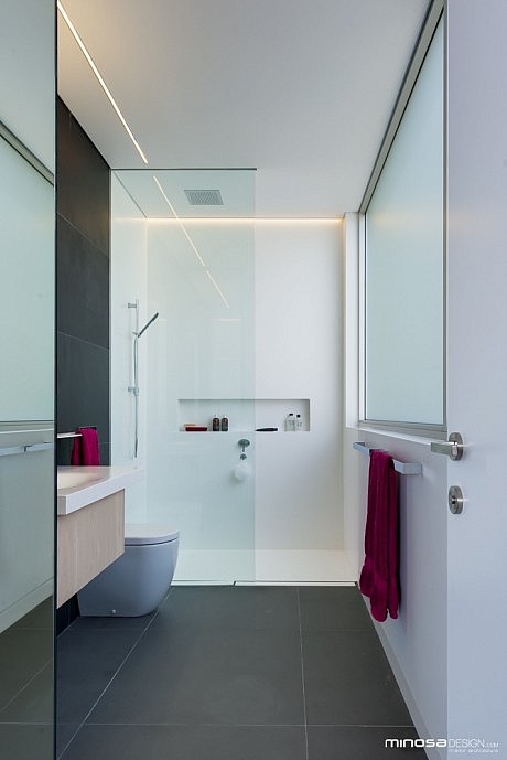
All of the thought in this space really went into one wall, there was no other option given the location of the door and the size & location of the window. The designer choose to create a floor to ceiling cabinet on the small southern wall to create the storage and future make up area’s, Mirror was applied to the side to allow for a full length mirror as was the front face of the joinery. The mirror helps to make the space feel larger but it also bounces the natural light around allowing the selected dark floor tiles to be successful within the space.
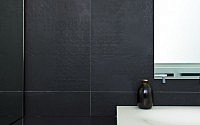
The complement the basalt floor tiles which run thru all living rooms and the other 5 bathrooms in this home, the designer chose a 6oo x 600 wall tile in flat and embossed (pattern) to create a custom textured tile layout to fit the decorative side of the brief. This brings a touch of softness to the hard space. Corian was chosen for the shower recess for its seamlessness and ease of cleaning, this also (being white) helped to lift the space. This alos offered a sense of balance with the vanity area as it is also made from Corian.
The Corian washbasin was chosen as it is Australian made and effortless to live with as the young girl matures. The base unit of the vanity is electronically operable and houses all of the cleaning & toiletry products. The basin is offset to add a little bench space to the left from a practical perspective and from aesthetic approach it plays on the cantilevers of the architecture.
The shower screen was made floor to ceiling to try and increase the height and scale of the space.
There are NO halogen lights in the ceiling!!! Two LED extrusions with diffuser are sufficient to illuminate the space; one used a wall wash down the shower wall & the other over the toilet and the vanity area. A task light is placed over the mirror to give even facial illumination.
The success of this space is integration of all amenities into the one wall and the way the light and scale of the space is utilised by the designer.
- by Matt Watts