Garden House by LGA
Minimalist three-storey single family residence designed by LGA situated in Toronto, Canada.

Description by LGA
After years of living in an Edwardian house in Toronto’s west end, Alexandra Palmer, a museum curator, decided it was time for change. She wanted to remain in her neighbourhood, but she was keen for a smaller home in order to declutter her life and she was excited to engage in the creative process of designing a house. Palmer found a small lot only a block away from her historic home and she approached LGA Architectural Partners to help her build a new home with a modest budget and a contemporary attitude.
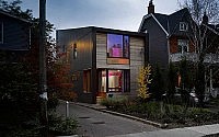
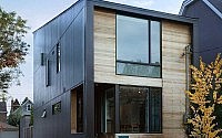
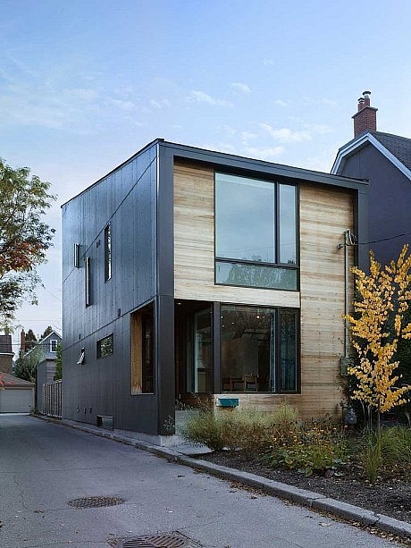
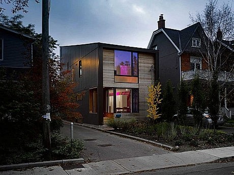
Simplicity and practicality were of prime importance. LGA designed a neatly stacked trapezoidal box that maximizes the space of the narrow lot and breathes within the generosity of the adjacent laneway. They clad the front and back façades in no-maintenance cedar to warmly greet the street, and the sides with a dark cement board to visually “remove” the private house from the shared laneway.
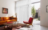
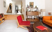
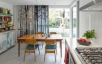
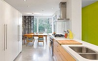
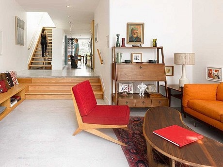
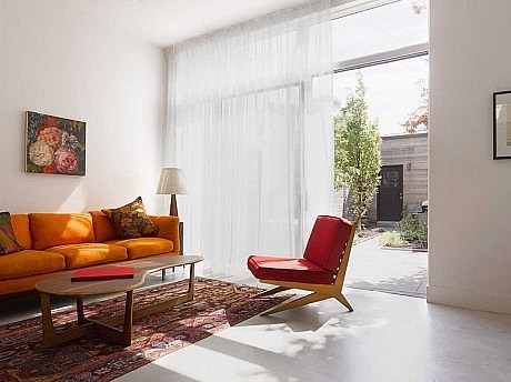
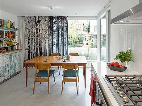
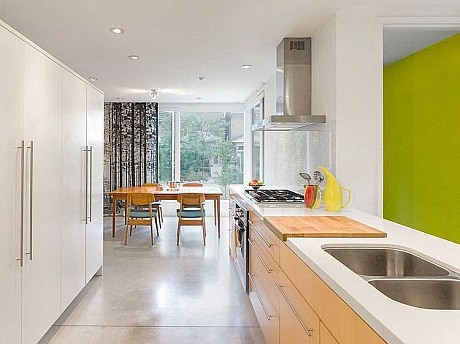
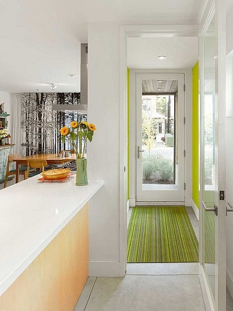
LGA employed a number of strategies to create a spacious interior that belies its small footprint and modest street elevation. They organized the open concept interiors by cleverly defining rooms without closing off most spaces. A low counter separates the kitchen and entry vestibule and three stairs serving as seating lead down to the generous sunken living room. By placing the breakfast room at the front of the house facing a large window overlooking the street, LGA created an area that doubles as an indoor porch where Palmer and her family can sit and watch the street life, or draw the curtain for privacy. In the living room, built-in storage provides additional seating and leaves the room open and uncluttered. Sliding glass doors open to the backyard extending the interior space outside.
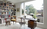
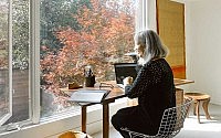
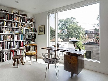
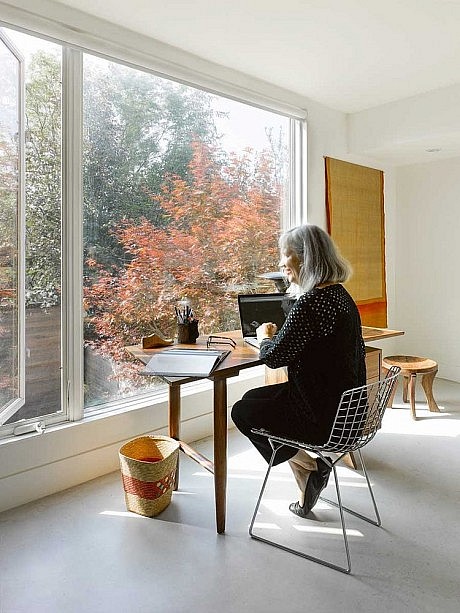
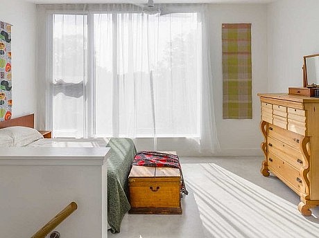
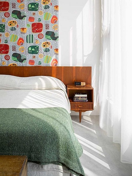
On the second floor and at the nexus of the house, Palmer’s library/office takes advantage of natural light and prime views with her desk placed in front of a floor-to-ceiling window overlooking mature backyard trees. Up a small stairway, the master bedroom and modest three-piece bathroom feel protected, but not cramped as big windows wash the interiors with natural light. A skylight above the open riser stairwell leading up to the second floor draws natural light down into the house, reducing the need for artificial light in the basement.
The interior artfully balances Palmer’s love of colour, texture and pattern with her need for neutral spaces to think with clarity and to display her books, art and artifacts. The cheerful green accent wall in the entry vestibule playfully contrasts the primarily bright white walls. Pops of turquoise on the inside of the kitchen cabinets delightfully surprise. Palmer’s partner, a lighting designer, programed the LED light bank along the expansive white wall by the staircase, transforming the house itself into a canvas for an ever-changing light show. Palmer brought the furniture from her previous house and her vintage pieces are refreshed in their new contemporary setting. The house is a play of contrasts – old and new, subtle and bold, playful and practical, small yet spacious.
Photography by Ben Rahn / A-Frame
- by Matt Watts