Tyche Apartment by CaSA
This colorful midcentury apartment is situated in the Eixample district of Barcelona, Spain.
It was designed by CaSA and Margherita Serboli for an Italian family.



Description by Casa and Serboli Architecture
The property occupies an art nouveau building of the Eixample district of Barcelona and was fully renovated by CaSA and Margherita Serboli to become the holiday apartment for an Italian family.
The original layout wasted considerable space and was poorly orientated. Its longitudinal distribution, forced by the transversal bearing walls, resulted in many densely separated small spaces, spared along a long corridor that isolated the two ends of the apartment.
The project is the result of a collaboration between CaSA and Architect Margherita Serboli.
The clientʼs brief was used a guideline: their wish was to have three double bedrooms and a home that would highlight and underline the early 1900 detailing of the building, through a design that using a contemporary language.
Spaces and light
The natural light – as usual a fundamental project theme – brought the architects to the complete renovation of the existing arrangement of spaces.
The three bearing walls that previously compressed the fractured layout have been transformed into transversal axes around which the space is organized into different areas.
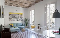
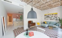
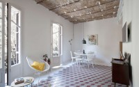
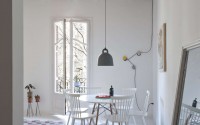
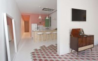
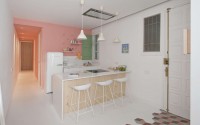
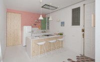
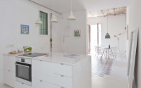
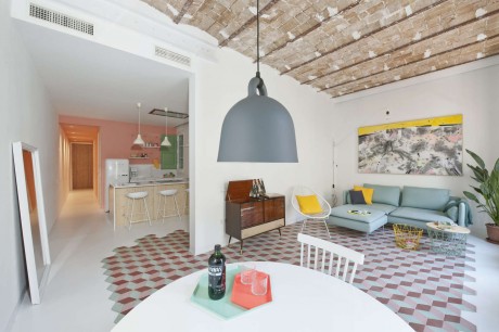
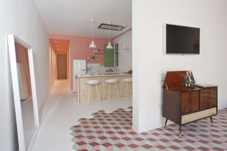
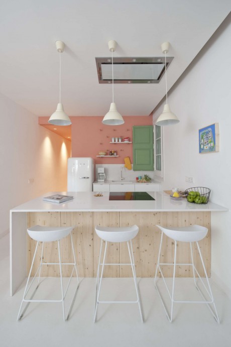
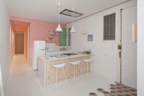
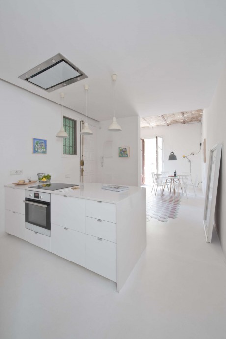
The first of these axes corresponds to the hall, and it organizes the continuous space between the wide living space and the open kitchen that now occupies the area that was previously a bedroom. A widest day area has been created by opening part of the old corridor to the kitchen-living area, and by doing so allowing the light to flood in, through the dense pattern of treetops.
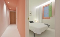
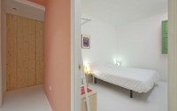
The block that embodies the two minor bedrooms grows around the second axe. This light pink coloured volume separates the day area from the area ad the inner end of the property, which became the suite.
This master bedroom, previously occupied by kitchen and a studio, forms an open space of almost 20sqm, which includes the bathroom that is separated by a change of floor level. This solution allows making the most of the light coming from the great original window frame that occupies almost all the wall facing the inner courtyard.
Colours and materials
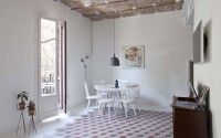
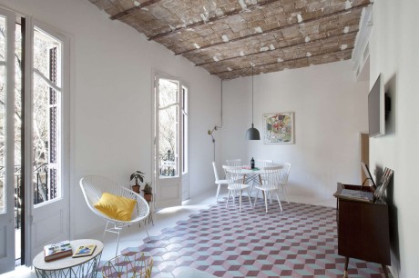
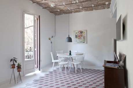
The clientʼs will to retrieve the art nouveau essence has led the project to the restoration of original features while adding new components that could sustain the same language without betraying his own contemporaneity. For this purpose some of the original features have been rescued, like the original windows woodwork, or the Catalan vaults, previously hidden behind a false ceiling that now expose their original terracotta finish, typical of the buildingʼs period.
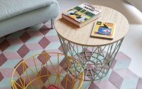
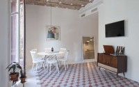
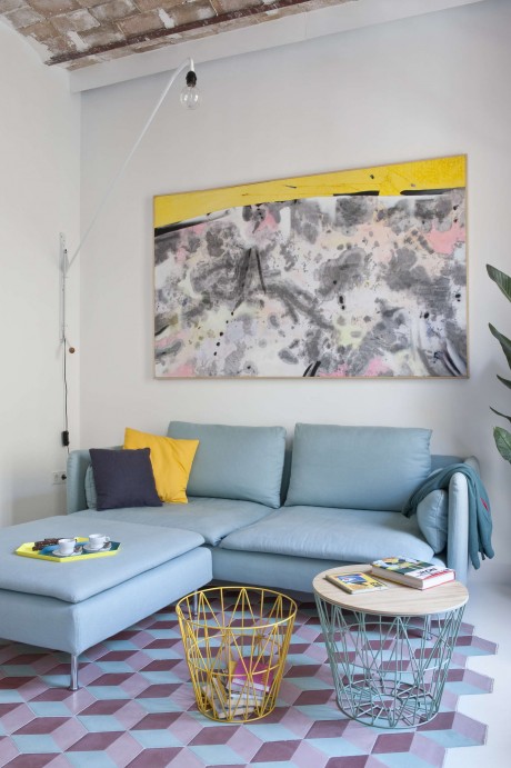
For the same reason it was decided to intervene reinterpreting one of the most characteristic elements of art nouveau apartments in Barcelona: the floors (which in this case had been previously replaced by a synthetic parquet). The hydraulic tile represents a typical element of this kind of early twentieth century dwelling; It was the customerʼs wish to reintroduce them in this project. The architects have expressly designed a hydraulic tile, using a current format as the hexagonal and contemporary colours.
The neutral coloured tiles traditionally used as a frame to hydraulic tiles have been replaced here by an off-white solid continuous floor, forming the edge to an irregular carpet of colourful geometrical shapes that lead from the entrance to the hall, unifying environments.
In the rest of the apartment, the seamless flooring changes from being a white frame to a continuous satin-finished surface that brings light into the centre of the floor plan. The choice of this floor responded to clientsʼ requests for a high resistance, low maintenance material.
The palette of materials and colours creates a dialogue thatʼs always different, punctuated by the two volumes that define the project, one in pink paint, the other clad in wood.
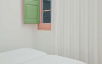
A Mediterranean-inspired atmosphere dominates the entire floor with a combination of colours partly suggested by original features – such as the amaranth wooden window frames of the facade – and dominated by white and pastel tones.
The desire to maintain an essential language through light colours, simple shapes and rough materials such as natural wood, responds to the need to highlight the floor and
original elements.
The secondary bedrooms block is shaped as a pink box whose volume is inserted with its tonal load between the white spaces of kitchen/ hallway and a second body, of natural wood.
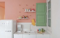
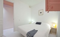
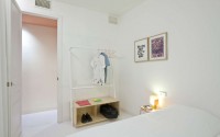
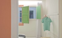
The colour white prevails inside the pink block and itʼs pink becomes the colour of the original window frames. The exterior green colour of the same windows enters the room through the window shades becoming a further element of colour.
At the end of the corridor, a pine-clad block disguises the general bathroom; this same timber volume becomes the suiteʼs walk in wardrobe – once passed the sliding door thatʼs the suite threshold – and protrudes into the bedroom turning into wooden nightstands, that double as steps to access the suite bathroom.
The wood clad volume is lined internally with a bright yellow and in parts shelled with mosaic-like white hexagonal tiles. White tubular elements which allow pivoting mirrors
being oriented.
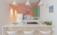
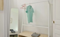
Natural wood also appears from the first elements of the kitchen – the structure of sticks on the wall that forms a small shelves, the front of the kitchen island and the large sliding door that separates the day area from the night one – and returns as storage boxes in the secondary bedrooms, supported by tubular elements in the white racks designed by architects.
In the kitchen an industrial extractor – flush with the ceiling – avoids the volume of the hood above the stove.
As for the furniture project, customers have asked for pieces that would be a consistent with the fresh colour palette, to reaffirm the holiday vocation of the property.
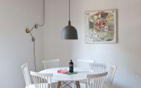
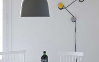
White metal elements and pastel colours were picked, along with a few grey objects, to emphasize even more colours and give life to the environment.
An antique bevelled mirror found in the apartment and an old radio record-player furniture add the human “lived-in” touch to the very contemporary furniture, dissolving it in a warmer atmosphere.
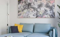
Large paintings by Piero Serboli dominate the living space and the suite, offering a Mediterranean and colourful imagery
Photography by Roberto Ruiz
- by Matt Watts