Tel Aviv Apartment by Maayan Zusman Interior Design
Tiny 592 sq ft apartment situated in Tel Aviv, Israel, designed in 2014 by Maayan Zusman Interior Design.

Description by Maayan Zusman Interior Design
The team for this project included Maayan Zusman and Amir Navon of studio 6b.
The apartment is a mere 55 meters (originally old and run down) turned it into a modern 2 bedroom apartment + balcony overlooking lush greenery, in one of the most central and popular locations in Tel Aviv.
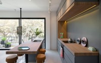
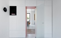
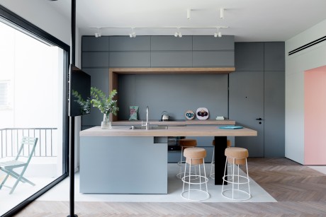
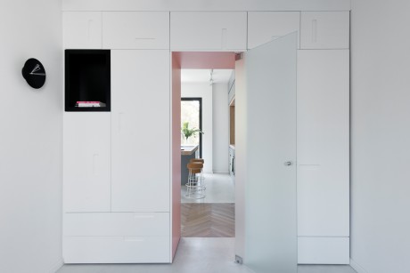
Only 2 minimal walls were build and the rest is custom made carpentry work that segments the space and hides away all electronics and additional devices. Almost every item, down to the living room tables, shelves, bed, drawers were custom designed by us and made and each cm was carefully planned including “secret” storage places.
The building is a “typical” old Tel Aviv building. It is approximately 60 years old (which is pretty old for a country that is 67 years of age:)). It’s in Ein Gedi street (a small and quiet street with a view not typical of the city in its greenery) situated right by Bazel Square which is one of the most central and prestige locations of the city. The apartment needed a complete and total renovation. The layout was one typical of old Israeli apartments meaning that everything was closed up- small and closed kitchen, a closed up balcony and such. In addition, all infrastructure was old.
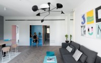
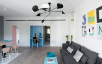
We used cupboards instead of actual walls for two main reasons. The first of which was saving space. The apartment is pretty small and every centimeter mattered. We wanted to provide as much storage space as possible and yet save the 10 cm width that a typical built wall would require. Secondly, we aimed for an appearance that was different, more impressive and smooth and we felt that carpentry would provide this.
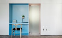
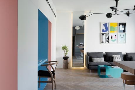
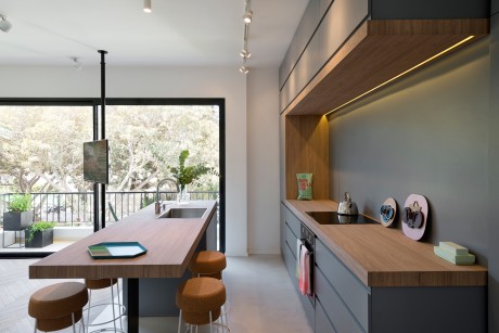
Benefits of this included saving up on significant space, providing a different look and experience (visitors feel the need to touch and feel the walls as they walk through the apartment), creating a wholesome look – the work area located in the middle of the cupboard/wall is custom made in carpentry too. Though it is of a different color, the texture and materials is the same and the connection/flow works appearing as one set unit running through the house instead of “niches” inside a built wall in which another material is plugged in. An additional benefit is the ability of open up storage from the living space. All of the communications/electronics equipment (DVD and so forth) are located in the closet but can be reached through the living-room space (see the photo with the round holes in the cupboard-these are there for heat from the equipment to be released, and this section can be opened). Also, the washing machine and drier are located at the end of the cupboard/wall and though one wouldn’t know it, with a click one can open up this section of the cupboard.
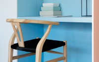
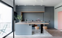
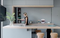
In addition to the storage within the cupboard described above, cement niches and constructional pillars presented the opportunity to create storage spaces that are not visible. Such a niche existed in the kitchen and alongside a pillar hidden within the cupboard by the small office station. Instead of closing these up and “wasting” even half a meter of space, these were turned into shelving units hidden behind smooth carpentry. The kitchen backdrop appears to be smooth but a section of it can be pressed and it opens. Similarly, when one sits in the work space, the side area can be clicked and would reveal the original cement pillar with built in shelves on it).
Some challenges included:
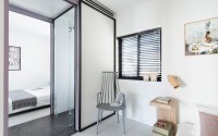
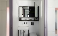
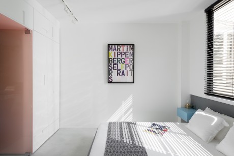
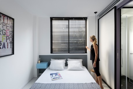
The main challenge was creating the right space segmentation. 2 bedrooms were created and between them the bathroom is located – no space for corridors or built walls here.
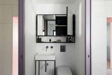
The bathroom was carefully planned and each unit was custom made (such as the sink base and the storage above) so as to carefully utilize all space possible.
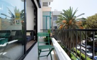
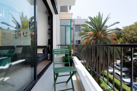
There was a dilemma regarding opening up the balcony or rather leaving the balcony area as part of the living space. Surprisingly we decided to use it as a real, open balcony as the view is just beautiful.
In order to save up on “wall space” a TV pole was used and it can be turned in all directions.
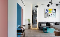
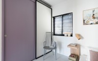
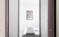
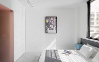
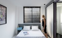
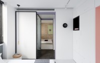
Generally, despite the fact that the space is very small we wanted the apartment to feel large, spacious and airy. The entire balcony window is therefore open and overlooking the greenery, the kitchen and living room are open spaces, and between the bedrooms and bath large sliding doors were used – providing both acoustics, a touch of interesting color and an open and airy feel when open.
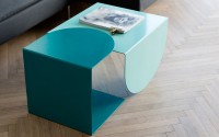
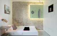
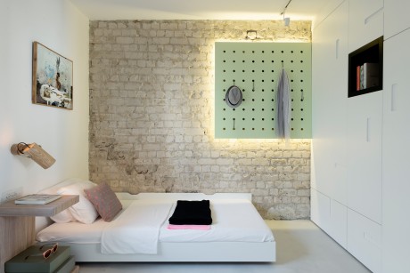
Much of the furniture was designed by us – the master bedroom bed and drawer, the kitchen island, the suspended lit green clothes hanger on the original brick wall background in the second bedroom, the living room tables and black orthogonal folding shelving units. The green chairs in the balcony were actually thrown away by a neighbor – we used them as is, blending old with new. We were aiming for a an interesting contrast of clean yet colorful, modern yet homey, tough yet soft. This can be seen not only in the furniture that is partially wood, partially metal but also in the floors – a blend of warm fishbone parquet with smooth cement floors and lighting fixtures.
As the renovation took place in the summer, 10 minutes away from the beach, the summer color vibes definitely influenced us but are anything but typical.
Photography by Gidon Levin
Visit Maayan Zusman Interior Design
- by Matt Watts