Apartment Filippo by Studio Alexander Fehre
This modern apartment located in London, United Kingdom, was designed in 2015 by Studio Alexander Fehre.

Description by Studio Alexander Fehre
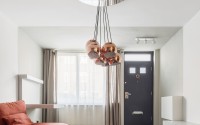
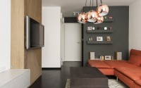
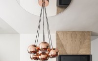
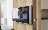
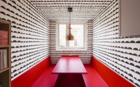
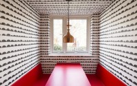
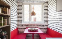
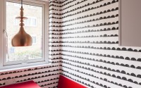
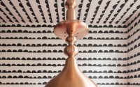
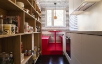
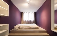
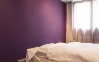
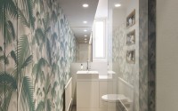
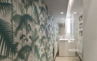
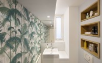
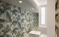
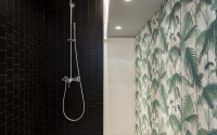
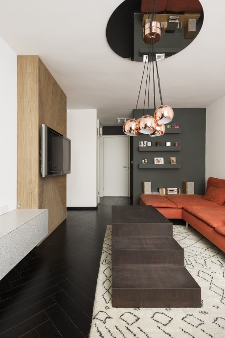
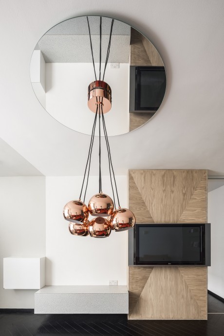
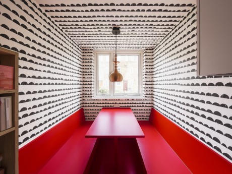
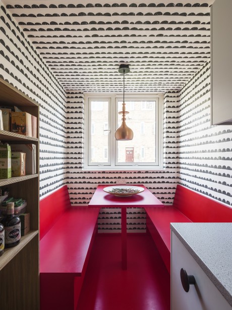
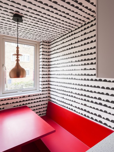
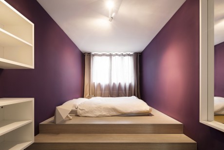
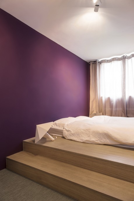
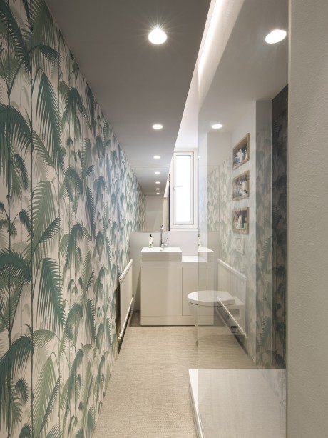
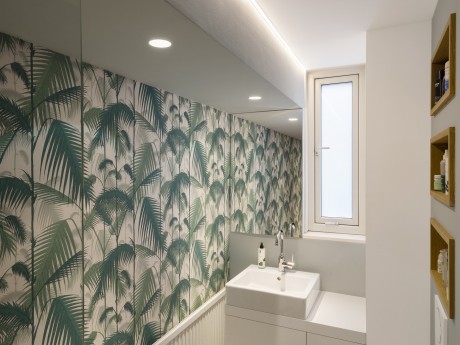
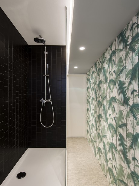
Can you even talk about spaciousness and comfort with such a small floorplan? In London’s over-valued property market you hear a lot about large, exclusive flats that symbolise the constant struggle to find affordable housing close to the city’s centre. Smaller flats however make up the large majority of the city’s housing and can benefit to a much greater degree from considered interior planning. And following the established wisdom for making spaces appear larger than they actually are is not always the right response. With Filippo’s flat, we began by analysing the exact functions and requirements that the space should fulfil with the objective of exploiting every last square centimetre to the full. We determined that redistributing the flat’s layout would make a big difference, merging the living room, kitchen and small hallway to create one space. A black fishbone parquet floor brings a sense of clarity and cohesion to this spatial layout, while the shiny black, varnished finish creates additional depth. The dining area was moved into the kitchen and takes the form of a cosy sitting area painted in Valentino red. The existing kitchen window set high in the wall and the narrow width of the room combine to make the sitting area seem as if it had always been there. The semi-circular, banded wallpaper defines the dining area as a separate small space. Opposite the cleanly designed kitchen stands an open shelving unit made from veneered multiplex, which stretches through into the living room. It serves to connect both areas, while a sliding door can be closed to separate them if desired. As with the dining area, the use of a different wall and ceiling colour in the entrance area gives it a slightly different definition. The desk is optimally positioned at the window and fits in perfectly with the sequence of furniture in the living area. Thanks to a large, L-shaped sofa, stepped table and circular mirror, the living area possesses a very striking lounge-like atmosphere. The bedroom is very narrow, so a platform was constructed that stretches from wall to wall. The bed is positioned on top, thereby structuring the room and making it easier to reach the rear window. The walls are painted a deep purple, contrasting beautifully with the wall-mounted shelving units. In the bathroom a conscious decision was made not to attempt to widen it, instead emphasising the length of this space through a combination of mirror, wallpaper and downlights. Thanks to the generous depth of the shower, it requires no second shower enclosure and the offset ceiling integrates it seamlessly into the overall design. The bathroom floor is covered in a woven vinyl, just like in the bedroom. The bathroom wallpaper accompanies you from the door to the basin and is also the determining element in the shower. Although spaciousness is in the eye of the beholder, Studio Alexander Fehre presents a succinct, contemporary solution to the issue of progressive urbanisation.
- by Matt Watts