Apartment in Tel Aviv by Michal Han Interior Design
This spacious apartment situated in Tel Aviv, Israel, was designed in 2016 by Michal Han Interior Design.

Description by Michal Han Interior Design
A 350m² apartment located within a project facing Tel Aviv’s beautiful seafront. The apartment takes up half of one of the buildings floors and was planned for a couple in their 50’s.
The planning process was both unique and challenging as a result of the apartment’s semi-circular shape. A leading objective in the planning was to create spaces fulfilling the specific needs of the clients. One way in which this was achieved, was by orientating all of the areas in which daily-life takes place – the bedroom, the kitchen, the living room and the dining area – towards the ocean view. This ultimately is how we succeeded to create a rare atmosphere of blue skies, vast oceans and Tel Aviv lifestyle within the interior of the apartment.
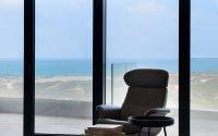
All the daily activities with the apartment – working in the kitchen, sitting in the living room, the site from the master bedroom and bathroom – can all be achieved with a spectacular view over the ocean.
A large focus throughout this project was the division of space through clean straight lines. The planning of the apartment, the division of spaces, the design and the selection of materials were all specifically chosen to suit both the needs and the lifestyle of the clients and to relate to the new surroundings in which they chose to live. A strong relationship can be found between the exterior surroundings of a building and its interior spaces. I strongly believe in the relationship between an interior and an exterior space and constantly allow the exterior of a project to guide and influence the planning and division of the interior space from start to finish. This allows for the creation of a more vibrant design and an overall experience within each aspect of the apartment.
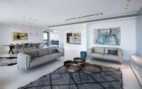
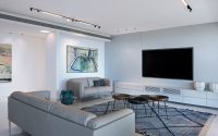
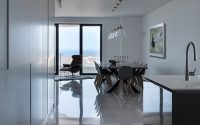
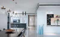
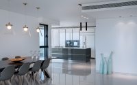
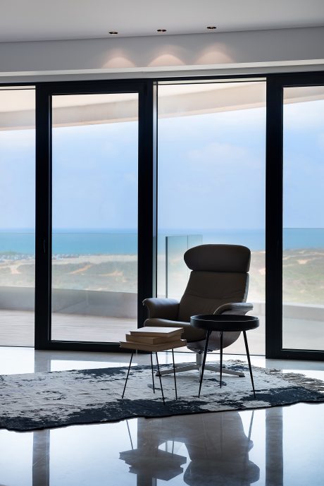
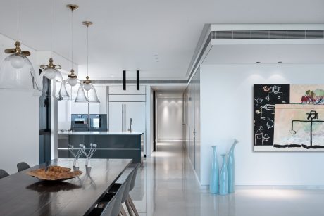
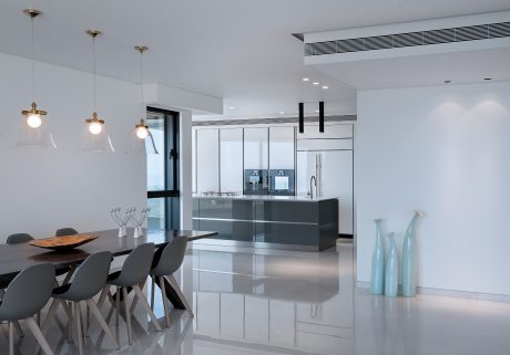
We moved the entrance of the apartment to face South meaning that the first view one receives when entering is one of the ocean and the large open space layout. The entire West section of the expansive living area is engulfed by floor to ceiling windows looking out towards the ocean, and all viewpoints of the public areas are directed towards these windows. In this wide space, you can also find a long dining table seating up to 12 guests.
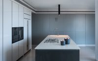
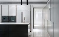
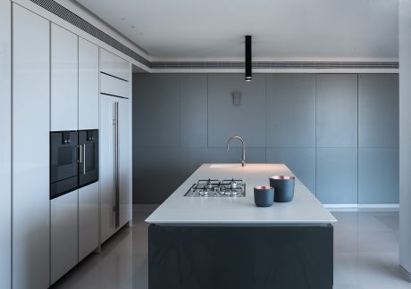
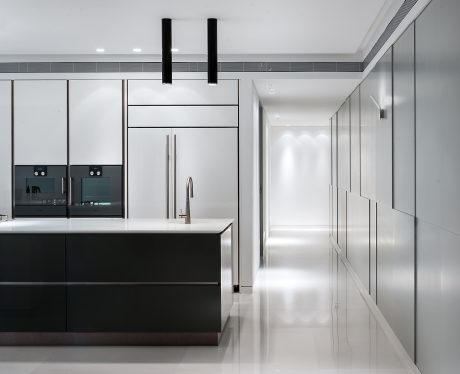
Continuing through the apartment, in the original location of the bedroom, we created the kitchen space equipped with a long island allowing for a working space facing the large windows and ocean view.
The kitchen further includes a round table suited for daily meals which similarly benefits from spectacular views of fields to the north and waves to the west.
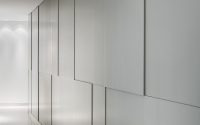
The kitchen space opens towards a hallway which we both widened and designed with a 3D carpentry cladded wall which contains hidden doors introducing disguised utility areas behind. This carpentry cladded wall intentionally creates a three dimensional screen separating between living and utility areas.
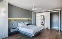
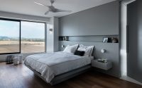
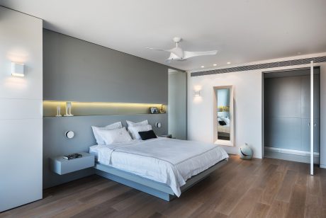
Continuing down the length of the wide hallway, you reach the master bedroom which was designed by combining the three original separate rooms in the original plans into one large light and open master suite. Within the bedroom, the bed is oriented towards the room’s vast windows presenting a further view of the fields to the north and the ocean to the west.
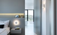
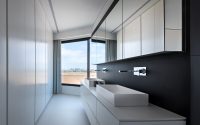
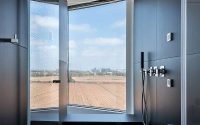
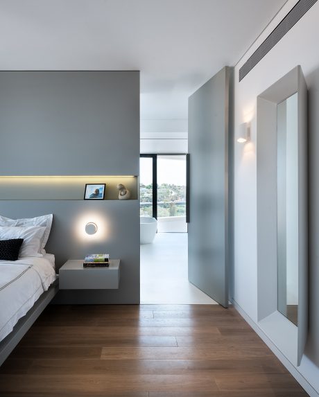
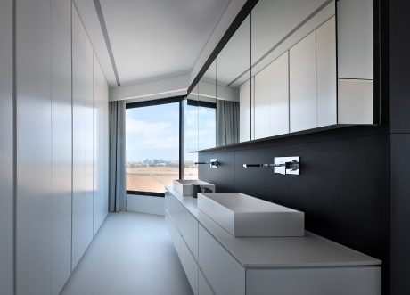
The wall behind the bed is cladded with carpentry which contains a hidden door creating an entrance into the master bathroom. This master bathroom is divided into two main areas, the dressing area and the bathing area. The bathing section of the room contains a large shower including a hanging bench which looks out towards the open view and a free standing bathtub which takes in the lights of the city.
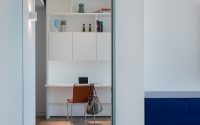
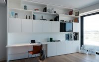
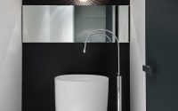
The guest area of the apartment is situated to the east and is separated from the main area with a sliding door. This guest space is separated into three main areas: the library, the living and sleeping area and the bathroom which also included a walk-in closet.
The leading aspiration in this project was to create a sense of respect for the open surrounding landscape, the vast blue sky and the ocean within the confines of the interior apartment space.
The spatial division, the delicate lines and the light materials were intentionally merged to emphasize the apartment’s unique and natural surrounding environment.
For this apartment, the color pallet and selection of materials was highly influenced by our choice of clean and gentle colors and textures. Occasionally, I allowed myself to stray from this scheme by introducing contrasting colors, shades and textures so as to create a sense of excitement and curiosity whilst maintaining a predominantly clean and gentle atmosphere.
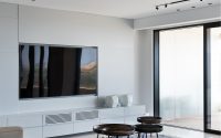
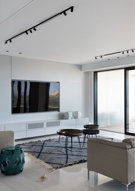
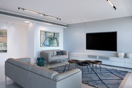
The monochrome light grey shade visible in many aspects of the apartments interior including the carpentry cladded walls, the kitchen and the living room sofas and armchairs effortlessly merges with the dominant blue details of the apartment which in-turn strengthen the interiors relationship with its blue surrounding environment.
The delicate shiny flooring which was chosen, presents an interesting reflection of the apartments view, its architectural features and its furniture creating a further dimension and depth into the design of the space.
The element of lighting played an extensive role in the design of the apartment. In fact, the concept of lighting is one of the strongest tools of an architect by allowing him/her to create a sense of mystery, to emphasize certain areas over others, to add an element of depth, to create drama and to transform a space into an experience when needed.
I chose integrated spot lights within the lowered ceiling of the apartment, and surrounding light strips in order to establish the technical lighting of the space and hanging or wall lighting to create the atmospheric lighting of the space in order to emphasize certain aspects or areas of each room.
The lighting units were chosen and placed in an asymmetric format to emphasize the location of each element or piece of furniture in the apartment and to create certain points of importance.
This lighting scheme allowed for the creation of a comforting lighting experience which establishes a sense of flow through the apartment.
The location of this apartment within a circular building surrounded by the ocean, fields and the city presented an interesting design scheme of creating a relationship between interior and exterior spaces. This was ultimately highlighted and exaggerated through the division of the space, the selection of materials and colors and the aesthetic and functional details of the apartment.
Photography by Amit Gosher
Visit Michal Han Interior Design
- by Matt Watts