Santa Pola Refurbishment by arn Arquitectos
Located in Alicante, Spain, Santa Pola Refurbishment is a historical building completely redesigned by arn Arquitectos.

About Santa Pola Refurbishment
Restoring Historical Architecture
Building often involves removing layers, not just adding them. This principle guided the renovation of the “Posito Pesquero.” For years, the true design of this building remained hidden.
Uncovering Original Elements
Originally, the project aimed to fix humidity issues and leaks. However, it soon became a complete restoration of the historical structure, dating back to 1860. The building’s purpose and structure had changed dramatically over time. These changes made the original design nearly unrecognizable.
Exposing Hidden Structures
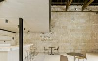
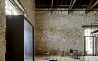
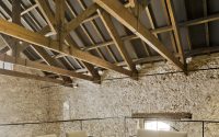
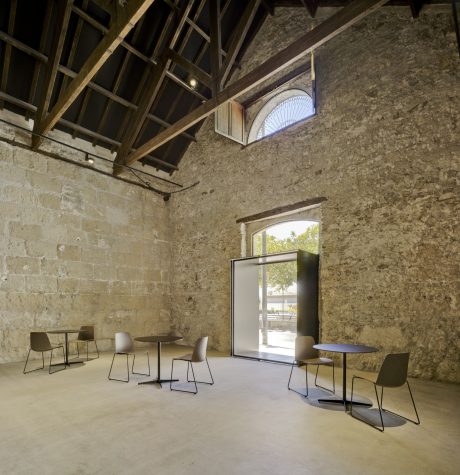
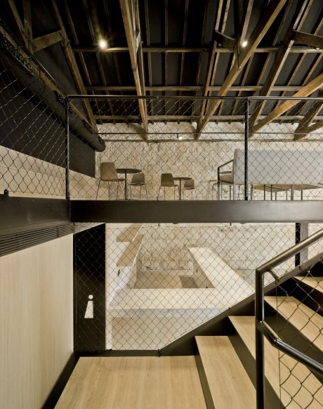
Outside, the walls had layers of paint and mortar. Inside, a tiled brick wall concealed the original stone and masonry. Diverse ceiling heights blocked views of the wooden roof structure.
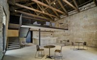
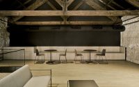
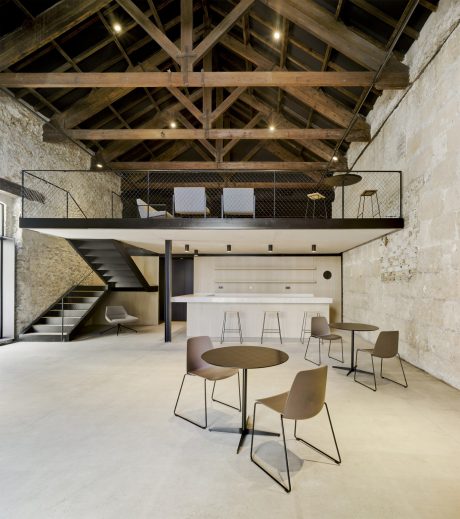
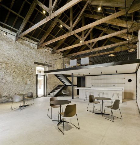
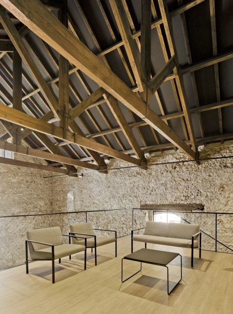
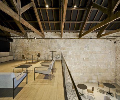
The redesign suggests reconfiguring the interior and slightly expanding the space. This change creates a double-height area, enhancing views from various levels and highlighting unique elements like the wooden roof.
Conservation and Enhancement
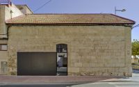
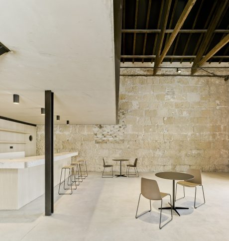
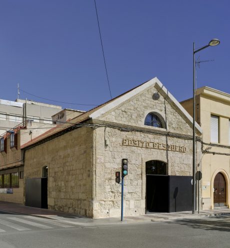
A thorough cleaning and consolidation effort was necessary for maintenance and restoration. Workers removed paint and mortar from the exterior to reveal the underlying masonry with its brick, base (plinth), border, and cornice details.
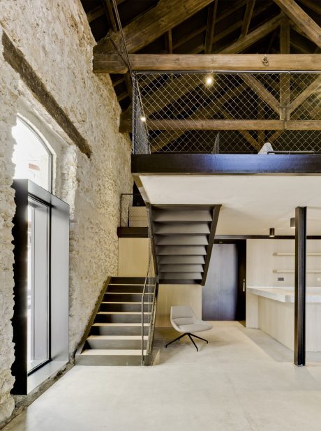
The project restored the facade’s original openings, which had been altered for new uses, prioritizing functionality but ignoring historical accuracy.
Modern Additions and Functional Upgrades
The team polished and updated the original roof tiles, adding insulation and water-resistant treatments. They introduced two large gates that mirror historical warehouse doors, improving access while blending with the facade.
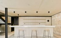
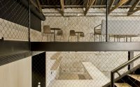
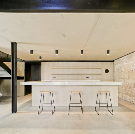
Inside, two black-painted, metallic crates provide separation in the entryway, respecting the original brick outlines. A newly built wall protects the structure from moisture, and a floating concrete deck (pavement) ensures continuity.
Lastly, the new floor structure in the attic respects the original stone and masonry, distinguishing it from the new additions. This approach preserves the integrity of the original building while accommodating modern needs.
Photography by David Frutos
Visit arn Arquitectos
- by Matt Watts