Connect Six by Whiting Architects
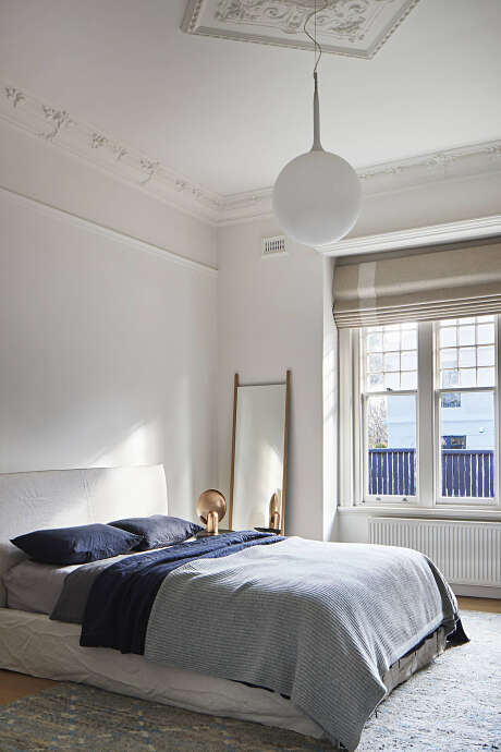
Redesigned in 2018 by Whiting Architects, Connect Six is an inspiring brick house situated in Melbourne, Australia.

About Connect Six
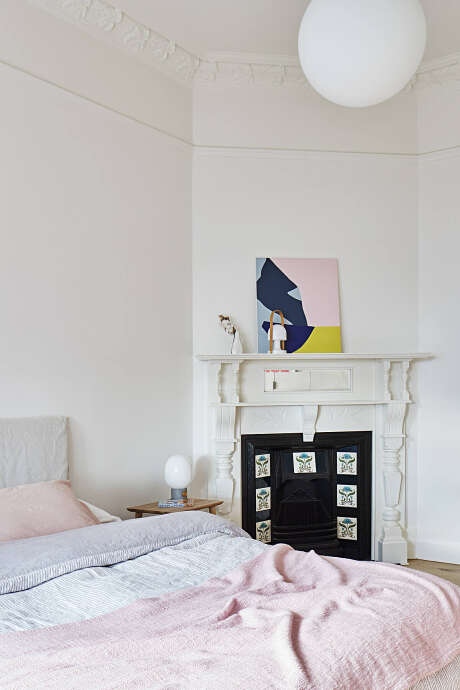
Refined Elegance in Edwardian Revival
Embarking on this journey, we acquired an Edwardian classic, with subdivision in mind. Regrettably, this meant parting with the sprawling garden and pool. Yet, our goal stood firm: to retain the home’s original comforts within the diminished space. Essentials like a pool, storage, parking, and a garden were non-negotiable. The sizable house simply called for modern touches and smarter use. Thus, we seized the challenge to preserve a Brighton home’s grandeur on a modest plot—an exercise in clever conservation and efficiency.
A Harmonious Blend of Time and Style
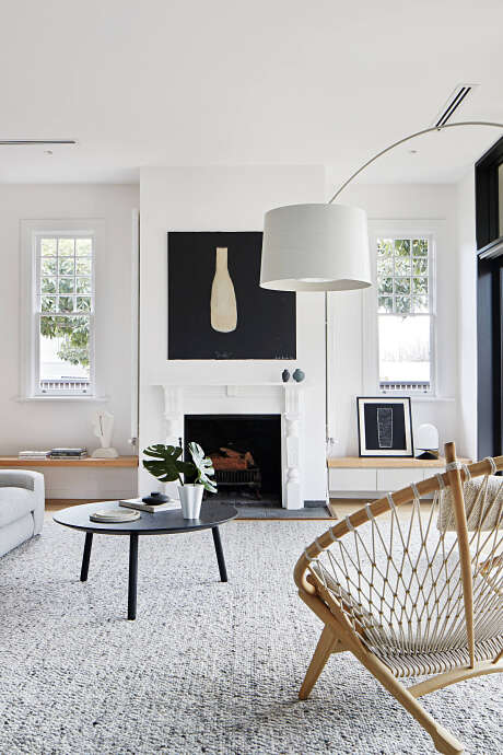
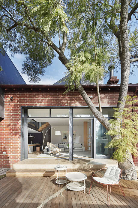
Restraint guided our design, with a reverence for the structure’s past. Situated on a commanding corner, the addition needed to complement—not clash with—the original framework. We aimed for a blend, where old and new converse in a visual symphony, each respecting the other’s presence.
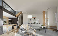
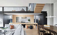
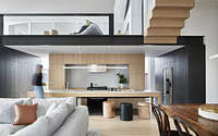
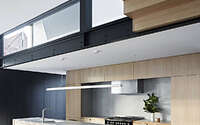
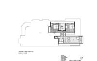
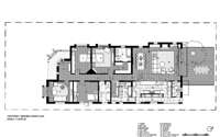
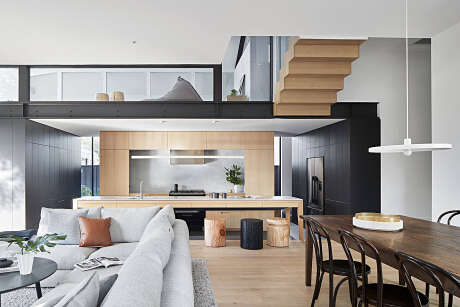
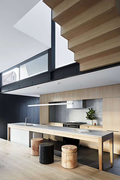
Our strategy revolved around fusing and flowing spaces. We tailored a plan that segmented yet unified various zones. At the heart, the kitchen became a magnetic hub, with lines of sight to key areas. Here, we carefully balanced seclusion with social ambiance. Floor variations and ceiling adjustments demarcated spaces, while blurred thresholds fostered openness and adaptability.
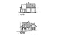
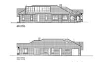
Externally, we expressed humility. New sections, modest in their exterior presentation, played a game of architectural hide and seek with the original structure, reminiscent of the classic ‘sleep-outs.’ This approach minimized the new additions’ impact, ensuring they appeared as gentle extensions rather than bold intrusions.
Crafting Discovery and Drama
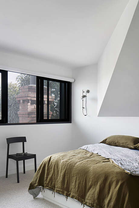
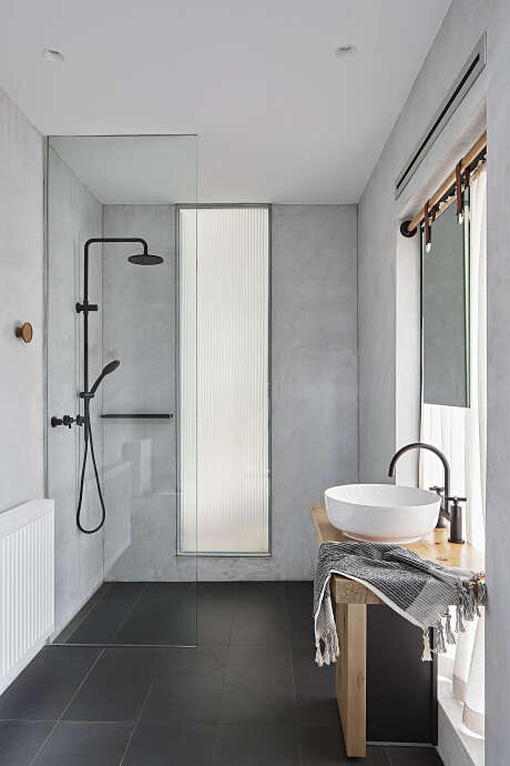
In reimagining the interior, we aimed to mold unique nooks within existing boundaries. Such a strategy allowed for enticing revelations and views that beckoned further investigation. The outcome is a rich mosaic of interlaced spaces that weave a narrative of curiosity and visual delight.
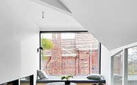
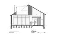
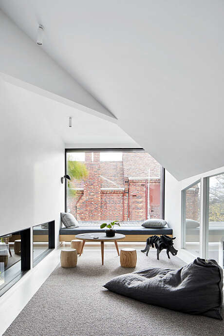
Transitioning from the kitchen’s intimate embrace to the living area’s open expanse presents a dramatic contrast, while the playroom’s angular ceiling adds a dash of architectural drama.
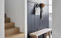
The staircase to the mezzanine, tucked beside the central hallway, offers a discreet ascent. The original home, not designed for a second story, lent no cues for a stairwell. Boldly, we introduced a floating stair that gracefully arches over the hall, a statement of the new embracing the old. This element punctuates our vision: a dance between eras, inviting engagement and fostering a tangible connection with the home’s evolving narrative.
Photography by Shannon McGrath
Visit Whiting Architects
- by Matt Watts