G4 Apartment by Da Bureau
G4 Apartment is a tiny home located in Saint Petersburg, Russia, redesigned in 2020 by Da Bureau.

Description
One of the most important principles that DA bureau embraces when working on projects is to achieve maximum expressiveness with a minimum of means. This was especially important when working on their own project: a small apartment where the founders of the firm, Anya and Borya, live.
They bought a small studio apartment in the historic center of Saint Petersburg, with an area of only 38 m2, which had been empty for many years. Despite plaster falling and broken windows, they decided to turn the apartment into a compact living space, and a place where the doors are always open to friends.
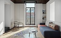
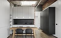
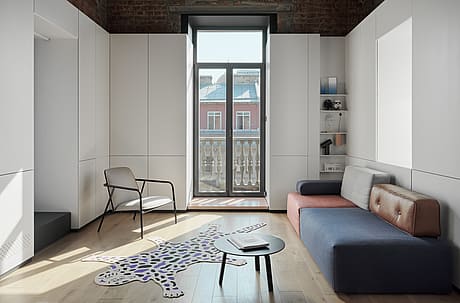
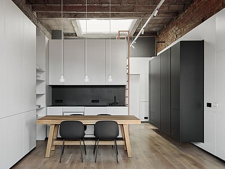
The first thing they did was clear the walls and ceilings of dilapidated plaster, as well as replace all utilities, and reinforce some openings where the construction was flawed. The apartment’s central configuration is unique – windows on three sides and access to a small balcony. But the most unusual remnant is a historic ceiling light lantern, measuring almost 3×3 meters.
Lots of work was invested in restoring the lantern, strengthening the structure, and replacing the sealed double-glazed unit.
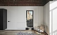
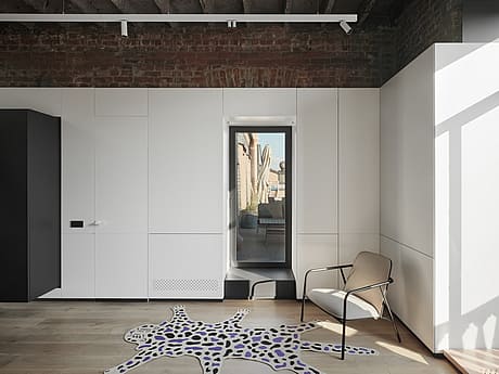
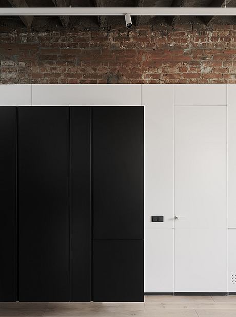
Once the walls and ceilings were cleared, the harsh brick walls and concrete overlap were revealed. The decision was made to leave them open and exactly as they were, with rough seams, construction inscriptions, and metal fragments. That being said, they wanted to make the main space clean, concise, and minimalistic.
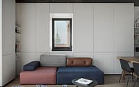
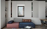
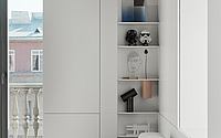
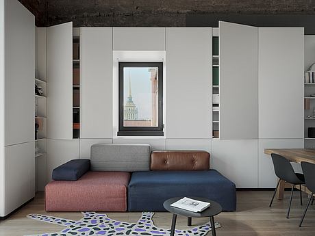
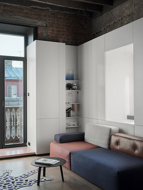
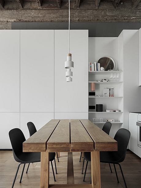
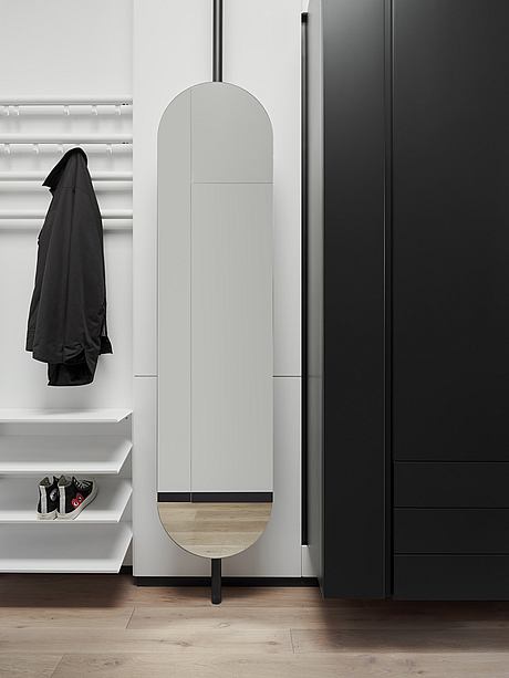
A priority was to ensure that the apartment was highly functional, with open space for hosting parties, comfortable and cozy spaces for leisure time, and abundant closed storage space that would keep the other areas clutter-free. The decision was also made to surround the space around the perimeter with white panels in order to hide all of the functionality concealed behind them, including storage, radiators, and engineering units.
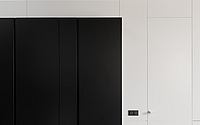
This method allowed the designers to completely abandon any freestanding furniture, except for a table and sofa. The same panels surround the bathroom unit, above which there is a sleeping area. The black volume of the closet, in which the refrigerator is also concealed, is cantilevered as a separate element in contrast to the white environment.
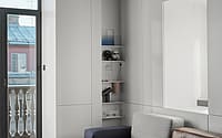
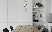
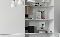
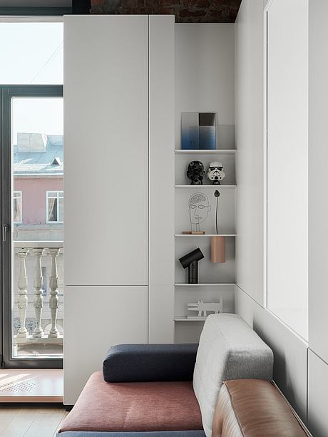
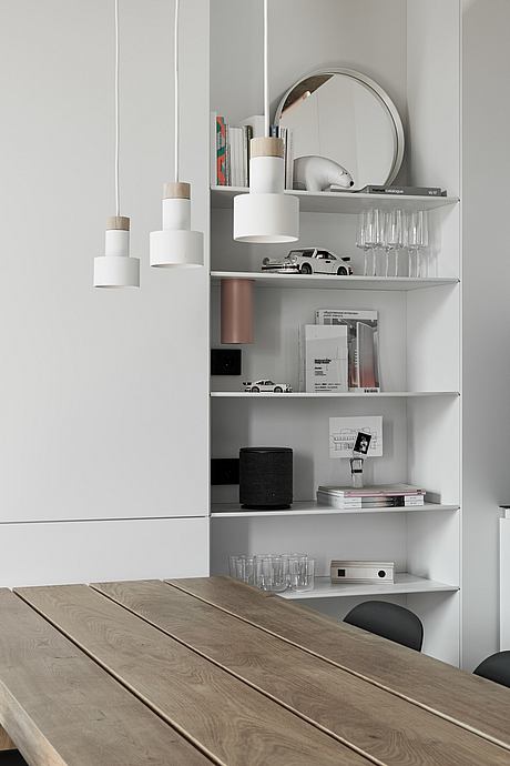
Smooth panels contrast with the open ceiling, converting the space into a blank canvas, which is a visual treat. Only a few shelves with favorite books and art objects remain exposed, and a wooden workbench table became a focal point in the center of the apartment.
All lighting electrics were transplanted to the attic in order to conceal all wires and to leave the ceiling as clean as possible. All furniture, except for Muuto chairs and Fild lamps, were designed by the firm.
Photography by Dmitrii Tsyrenshchikov
Visit Da Bureau
- by Matt Watts