Zigzag by Kevin Veenhuizen Architect
Zigzag is a contemporary extension to a single-family house located in Uithoorn, Netherlands, designed by Kevin Veenhuizen Architect.

Description
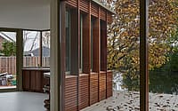
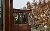
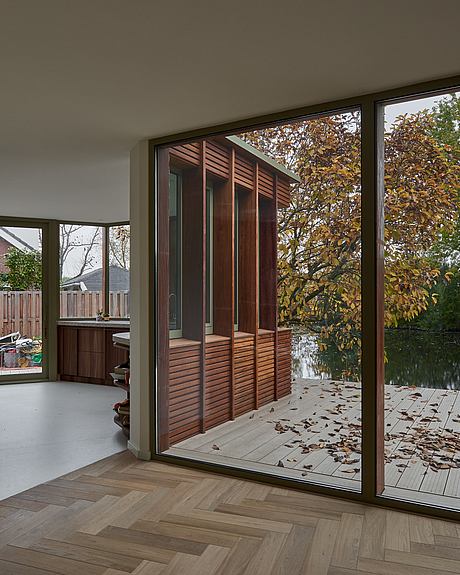
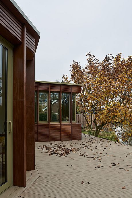
With its robust timber facade, the zigzagging house extension wraps around the outdoor terrace and the beautiful waterfront Magnolia. The new living spaces open outwards and a void has been created in the center of the house for extra daylight from above.
The clients of this project, a middle-aged couple, have recently inherited this house. He grew up in this sixties house and now it has to become a home for both of them. Together we developed a plan in which we looked for a contemporary extension and made the existing house more sustainable.
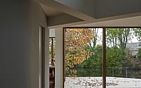
We shortened the garage at the rear by 4 meters to create a better connection between the living areas and the garden on the side. We also wanted to adapt the design to the beautiful Magnolia on the waterfront. The zigzagging shape of the extension derives from the position of the tree and introduces an angle from the living spaces to the garden.
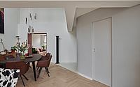
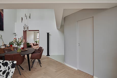
The old and new systems come together around the void. The straight lines that define the structure of the original house can still be clearly seen in the ceiling, while these merge with the angled lines in the floor finish and the new round wall of the utility room.
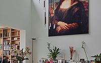
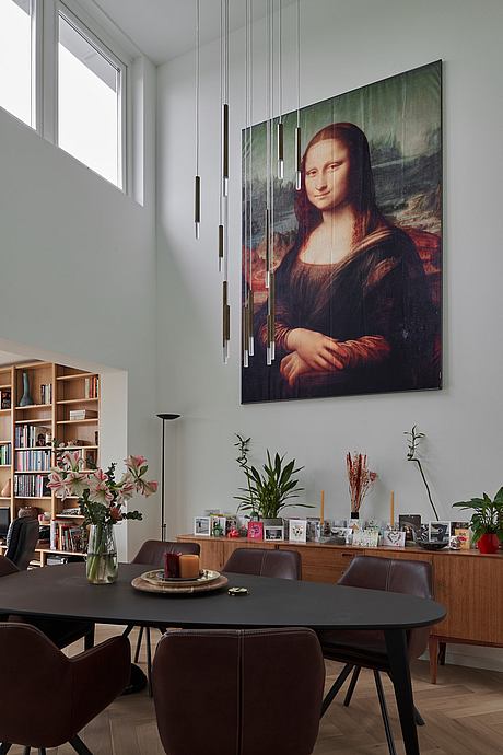
The floor of the former bedroom on the first floor has been removed to create a void. The dining room has been designed in this double-height space, which acts as a link between the other living areas. With the addition of the extension, this space has become centrally located in the house. We, therefore, felt that extra height with daylight and fresh air from above would add quality to this important space.
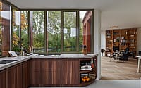
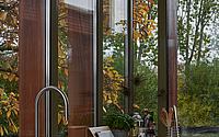
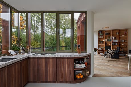
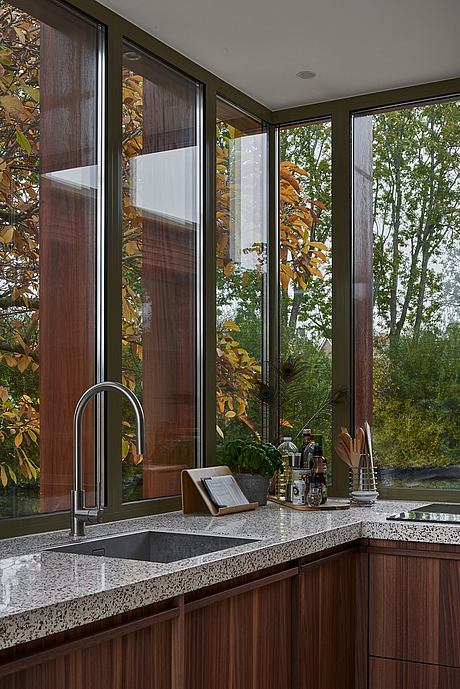
The zigzag facade of the extension is made up of load-bearing Cumaru wooden columns on the outside, with glass behind it. This way, the constructive columns also act as a filter for daylight and create different atmospheres in the interior spaces during the day due to
their depth.
The colors of the rear facade are inspired by the light brown masonry of the existing house and the dark green water. The palette of dark Cumaru wood and yellow-grey aluminum frames continues on the interior. These color tones are reflected in the kitchen, the terrazzo countertops, and the floor.
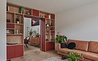
In the front room, mainly lighter oak has been used in combination with a dark red color. This room is mainly used in winter because of the fireplace. When the ensuite doors close, the intimate character in the front room is enhanced.
Since our clients see themselves getting old in this house, we have made the design future-proof. Without modifications, the front room can function as a ground-floor bedroom with access to a bathroom on the ground floor. The ensuite can then be used as a wardrobe.
Furthermore, the house has been made more sustainable with a hybrid heat pump in combination with solar panels, and the insulation envelope has been improved. In addition, the extension is built entirely with wood, a green roof is placed and the terrace is made of 100% recycled plastic.
Photography courtesy of Kevin Veenhuizen Architect
Visit Kevin Veenhuizen Architect
- by Matt Watts