Wonder House by Xigo Studio
Wonder House is a minimalist apartment located in Beijing, China, designed in 2022 by Xigo Studio.

Description
Design Concept
This case is a home designed for children. With an entertaining design full of fantasy, it brings surprises to every corner of the home. Once Picasso said he wanted to “paint like a child”, and the “face figure” has long been used repeatedly as the object of painting by modern masters, and it is also represented in contemporary entertainment by familiar archetypes such as robots, Pac-Man, and Mickey Mouse Clubhouse. The symbolic nature of the face gives people a more childlike, joyful and friendly feeling.
This case embodies the concept of “kitsch” in a jocular way. In other words, while pursuing design logic and rejecting absolute rationality, it incorporates seemingly “vulgar” entertainment symbols into contemporary residential design in a “Collage” and “Dadaistic” creative mode. Through absurdist irony and criticism, it sheds new light on the traditional dwelling house model with “functionalist”, showing the complexity and contradiction of space.
Preliminary Analysis
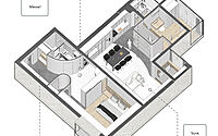
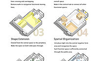
The original house is designed as two bedrooms and a living room, totaling 133 square meters, and it is in the east-west direction. However, the living room is with poor lighting, and such a 44-square-meter large living room space only has a 3-square-meter window on the west, making it very dim. Besides, the kitchen with public properties is squeezed into the corner near the north bedroom, increasing the distance between the dining room and the kitchen, weakening their interrelation, and making the traffic paths between the kitchen and the two bedrooms cross each other. In addition, the bathroom is set at the hallway, but the bedroom is at the innermost place, and it takes two turns from the bedroom to the bathroom, with a longer moving line distance of 7.6m. This original layout also makes the spaces always in a state of confusion regarding the relation between the moving lines.
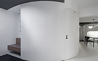
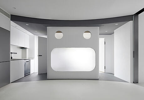
After the renovation, it displaces the living room to the central public space of the whole house and integrates the spatial planning strategy of scattered and isolated functional areas, thereby the whole space will get efficient and rational moving lines and relatively homogeneous natural light. Besides, the spatial organization revolves around the central open public space interconnected with other areas, and the central space is superimposed with diverse functions such as living room, dining room, kitchen, entertainment space, and elderly living room, etc. The abstract “face figure” faces the open public area to form the focal point, with many variable face shapes to adapt to different living scenes. The hallway smoothly transitions through the curved wall to the open western kitchen dining area and continues to the east side to the independently usable Chinese kitchen, integrating the form to give a coherent functional layout.
Flowing Hallway
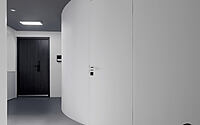
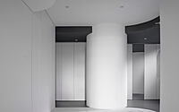
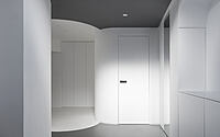
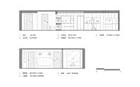
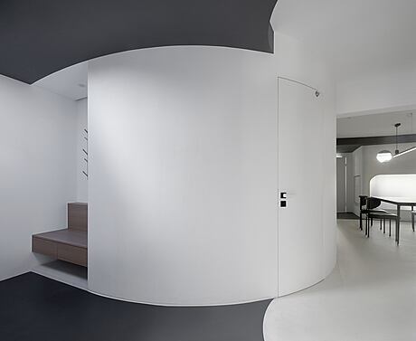
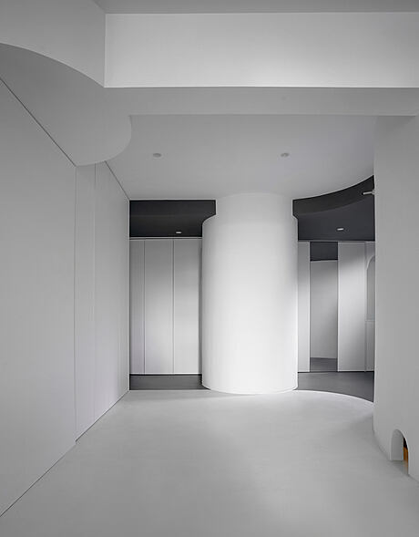
Seen from the first vision of the hallway, three arcs define the boundary between the interior space and the hallway transition area. This takes into account the convenience of luggage storage for the male master who is often on business, while not disturbing other family members’ rest as much as possible. The cloakroom is situated near the hallway, and a separate small storage room is planned to establish a visual partition between the hallway and the master bedroom, providing a guarantee for the private use of the master bedroom. The “Cyan sky light” above the hallway opens a window for the gray ceiling, simulating the optical illusion of sky light to brighten the dark hallway
Integrated Dining & Kitchen
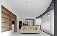
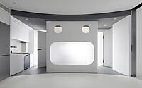
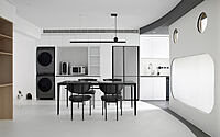
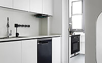
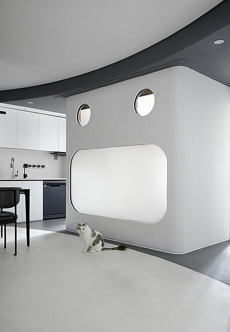
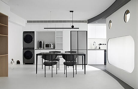
The curved wall creates a dynamic momentum smoothly flowing from the hallway to the central space of the residence, with the oncoming “large scale abstract face”, the central visual symbol of the space, forming the focal point of life and vision. The vertical interface generates morphological tension with the curved gray ceiling and the corresponding floor pavement, and it is more open and brighter by using the east-facing three-sided light to guide in and expand the width of the corridor to both sides of the dining room. By the closed kitchen balcony, it is available to separate the Chinese and Western kitchens. The open western kitchen is interconnected with the dining room, while integrating many household appliances to form an integrated housekeeping area.
Fun Symbols
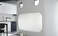
The abstract anthropomorphic “faces” are arranged into the daily life of family members in a story-like way, which embody the concept of “kitsch” in a jocular way. The “face figure” conveys fun and childlike innocence, generating scenes of interaction through the eyelid equipment, adding an interesting focus to the home, and forming a mark symbol with uniqueness.
Multifunctional Living Space
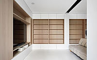
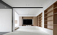
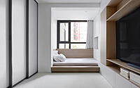
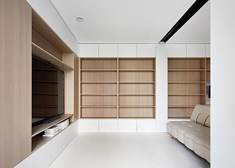
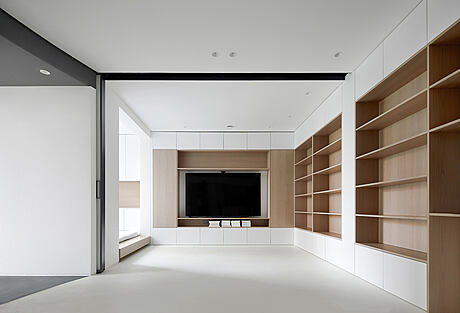
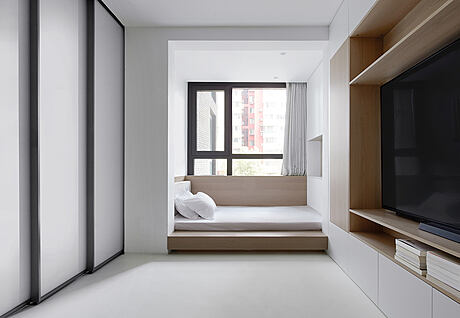
The central space serves as a flexible and open living room, which was added with several daily functions such as dining, meeting, entertainment, office, storage and temporary living. Within the boundaries of the space, the designer does not continue to add restrictions, and it is available to flexibly adjust the placement of the dining table, sofa, coffee table and other functional components within the open space. The sofa faces the children room on the east side, and it will be a free space for entertainment. The window corner in the living room is used as a guest bedroom for temporary stay, and the sliding door hidden in the corridor of the children room can separate the guest bedroom area from the living room.
Eyelid Installation in Children’s Room
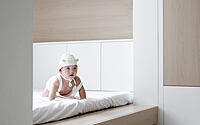
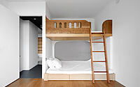
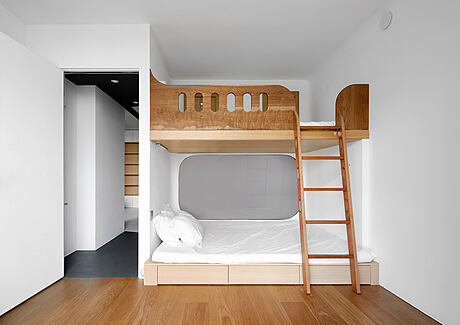
The design of the children’s room takes into account the family structure and future changes. Therefore, the lower bunk is a 1.5m double bed to give space for auntie to stay and accompany the child to sleep and grow. The opening state of the mouth form will bring more lighting to the living room, while the complete privacy is achieved by pulling the curtain closed. The upper bunk is a 1.3m single bed designated to provide more living possibilities for the arrival of the second child in the future. The eyelid equipment corresponds to the position of the upper bunk, and children can open and close the “eyelid” by controlling the operation device, creating an interesting interaction with the outside of the room. In addition to the entertainment of interaction, the eyelid equipment can also suggest dwellers’ state inside. If the eyelids open, suggesting that people are in an active state; if the eyelids closed, suggesting that people are in a resting state.
Master Bedroom
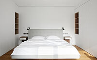
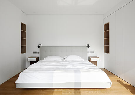
The master bedroom was changed to the west side of the original living room area, with a 3-square-meter bay window whose light is just enough to illuminate the entire bedroom space. The sliding doors in the master bedroom are hidden on both sides of the closet, merging with the closet body. The moving line from the master bedroom to the bathroom is also more direct, with the distance shortened from 7.6m of original house to 3m.
“Cat Toilet” in the Bathroom
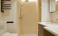
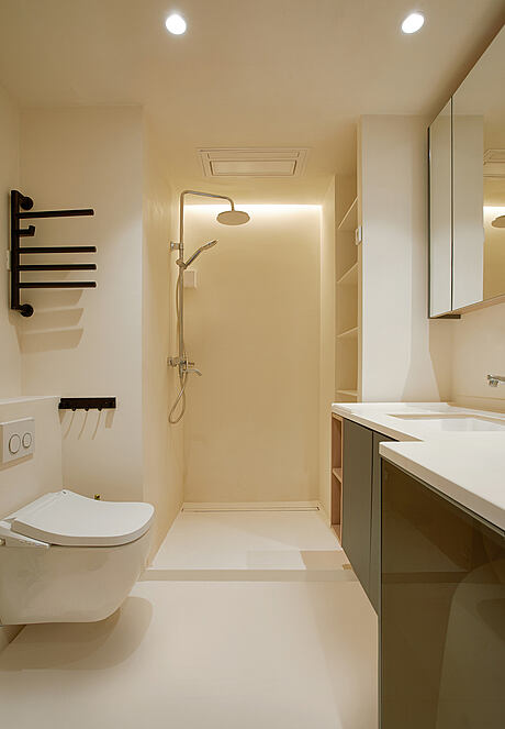
The bathroom was built on the curved wall next to the hallway, and the direction of the door was changed to be more direct to shorten the distance between family members arriving from each space. Cat is one of the family members, certainly, it is unable to ignore the convenience of its hygiene. Considering the convenience of human cleaning and odor isolation, a cat cave was opened in the curved wall to design the independent transportation line for the pet. The cat room is set up in the bathroom cabinet under the bathroom sink, with the function of a cat litter box and food dispenser reserved, and an air exchange system added, making the basic hygiene needs of both people and pets decently addressed.
Photography by Li Ming
Visit Xigo Studio
- by Matt Watts