Grey Green Residence by Lu Yuzhuo
Grey Green Residence is a minimalist apartment located in Shandong, China, designed by Lu Yuzhuo.

Description
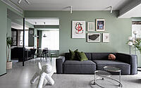
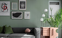
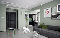
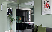
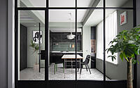
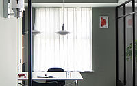
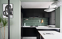
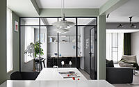
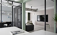
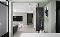
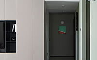
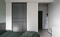
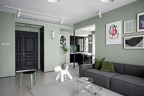
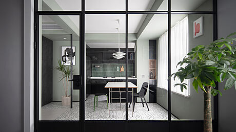
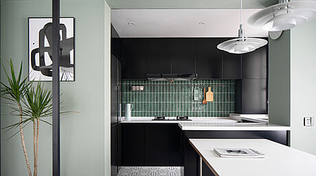
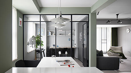
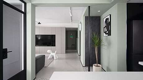
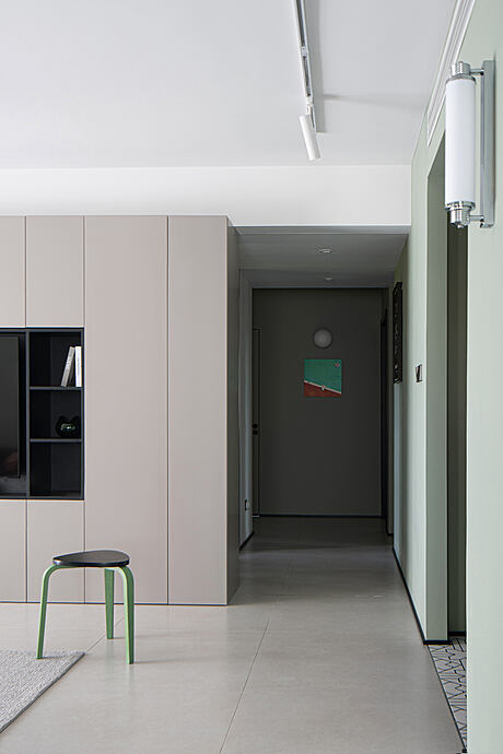
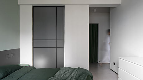
As the era of the pandemic brings new thinking about living, we must consider providing more open areas for activities and a comfortable and relaxing office environment for long hours of staying at home. This case goes beyond the stereotypical image of a traditional residence and creates a calm and livable ambiance for staying at home through materials, structures, and zoning. The original residence layout features a trivial structure in which beams are interspersed with columns. Besides, the beams are of varying heights. The space is overly segmented and underutilized. We broke the partitions in the public space, removed redundant parts, weakened structural defects, and utilized marginal positions for storage purposes.We set up the entrance area to strengthen the feeling of the area through the distinction of structures, colors, and floor materials. We removed the wall of the original balcony and incorporated the balcony into the living room space. Large areas of greenery and potted plants inject vitality of life into the residence.The stainless-steel coffee table and floor lamp add a sense of exquisiteness to the space. Velvet pillows and casual blankets soften the hardness of the minimalist space and enhance the quality of the space.The line-of-sight travels through the living room, end views, and kitchen. It looks like the diagonal articulation of a traditional Chinese garden in the southern area of the lower reaches of the Yangtze River. It gives rise to a passage that meanders like a corridor, giving a hint of a winding path that leads to deep and quiet seclusion. The top surface of the vestibule is flush with the dining room beam. The columns separate the two areas. The uniform height of the top surfaces and the uniform ground materials enhance the feeling of the region. The top, ground, walls, and columns separate to create a courtyard lit by natural light. They look like corridors and pavilions in traditional Chinese gardens.A look from the study area to the dining room and kitchen creates a mutually gazing relationship between the inside and the outside. The beams of varying heights were uniformly leveled during the carpentry period to present a regular structural form. After the kitchen is gotten through to the dining room, it forms an open dining and kitchen space, which increases the interaction among family members.The partition wall between the study and the dining room is broken to create a connection among spaces. To the eyes, all public spaces become an open whole. The study’s paint color, which is different from that of the dining room, is more suitable for engaging in office work. The wall near the living room is painted with a chalkboard finish.Looking from the kitchen to the living room, one feels as if being in a pavilion surrounded by porches, while the whole living room is like a courtyard. The living room features a full side of customized storage cabinets for daily storage. The TV’s location meets the need to watch TV in different locations such as the living room, dining room, and kitchen. The leftmost area of the cabinet hides the entrance to the storage room. The setting of the invisible door makes the whole living room more integral.At the end of the passageway is a customized invisible door with uniform color painting. This way, a closed door blends in with the wall. Mirrors are added in the middle part of the passageway to extend the space.The wall between the bedroom and the bathroom is replaced with a glass partition to bring in light to the master bathroom.Lighting display.
Photography by Lu Yuzhuo
- by Matt Watts