Combined Two-unit Apartment in an Old Neighborhood by Parallect Design
Combined Two-unit Apartment in an Old Neighborhood is an industrial loft located in Kunming, China, designed in 2017 by Parallect Design.

Description
The apartment is in a 90s-residential district in Kunming, Yunnan Province. Many years ago, the developer opened 2 standard unit layer to create a loft apartment, although the indoor area is very large, but the layout of the house is extremely unreasonable, many building and construction problems have been left behind. Designers aim to create a modern indoor space for a family of three generations to enjoy a comfortable life.
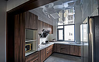
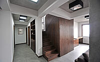
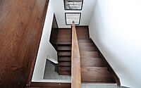
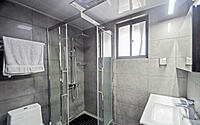
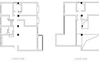
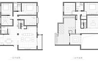
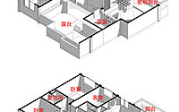
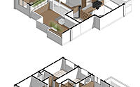
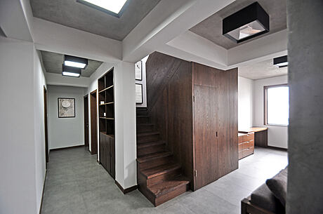
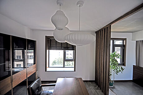
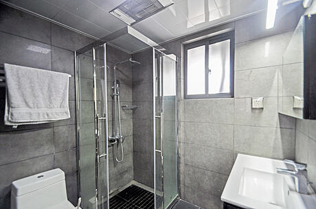
The kitchen and the dining room in 1F are very small for the house. There are many rooms but very cramped.The terrace in 2F is large but there is too much gray space between indoor space and the terrace. So, renovation focused on these aspects, opening the wall between the kitchen and the dining room to enlarge the kitchen, removing part of the toilet to expand the dining room. The bedrooms are connected into one room, and a storage room is created by the staircase. Finally, creating the teahouse by the terrace and build the study at the staircase side.
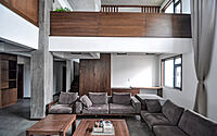
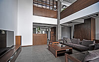
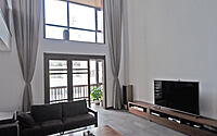
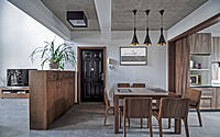
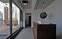
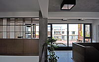
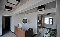
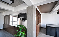
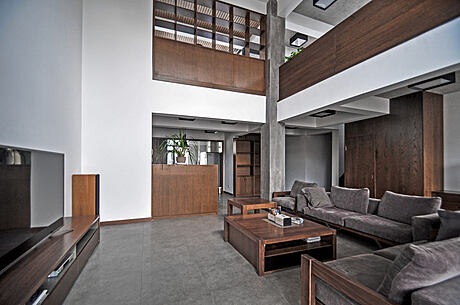
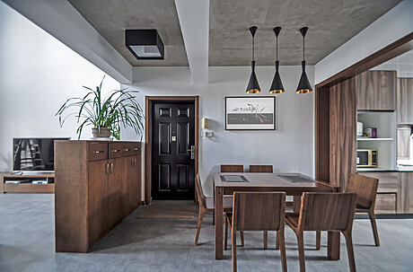
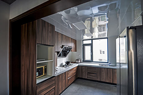
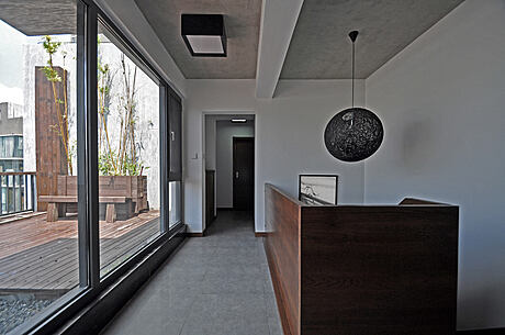
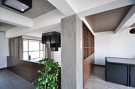
The restaurant and kitchen are connected to make the whole space looks more open, and it also improved the indoor daylight. The table is a flexible furniture, with a normal width of 1.5m to meet five people in a family’s needs to use, and could also be expand to 1.8m wide for party. Through careful analysis of customer’s needs and lifestyles, the kitchen has been reserved lots of room for home cooking, and space for old home appliances and kitchen ware. Because the old aluminum alloy windows have cracked, heat and sound insulation is very poor, so the external windows of the entire house are replaced with a new double glazing windows. While maintaining the openness of the living space, the living room brings together all the functional requirements in a small, concentrated space, creating a powerful result–high space, attractive terraces and large windows, and outdoor landscapes. The house only use ceiling for the kitchen and the toilet, and the rest of the house retain the beam and column and painted them white and used gray finishes for the roof to strengthen frame structure of the old house. Transparent corridor space connects both inside and outside, large open windows bring the outdoor environment into the interior form the terrace, and the green planting embellishment creates a feeling of internal and external intermediation.
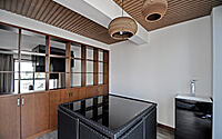
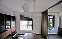
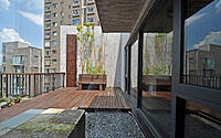
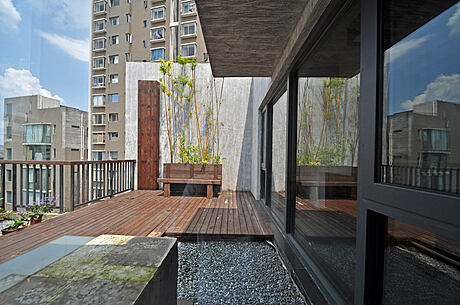
The study was raised one step higher and was separated by the showcase and the living room, using a half-open state to show a sense of a half public space. The teahouse has an outdoor tea table which is convenient to move to the terrace at any time. The study was reopened by grille and new partitions. The terrace uses antiseptic wood flooring and reserves space for water pipes on the roof, and two old concrete pumps are fitted with a new half transparent block, with spotlights for lighting at night. The exterior wall of the terrace is painted with a simple grey waterproof coating, which is matched with an antiseptic wood and interacts with the indoor space.
Photography courtesy of Parallect Design
Visit Parallect Design
- by Matt Watts