SGAD Office by Soong Lab+
SGAD Office is a practical office space located in Beijing, China, designed in 2020 by Soong Lab+.


Description
Creative individuals, are dependent on work to shine in cement. They have the same way of doing things like cement, using clumsy methods to do solid. Through the complex environment of the times, they have a transparent force like light, changing new methods irregularly. SGAD is a new brand of full-case service established jointly by Shanghai Shengjia Advertising Company and senior creative people in the industry. Wang Songtao and his Soong Lab+ was invited to design the office space.
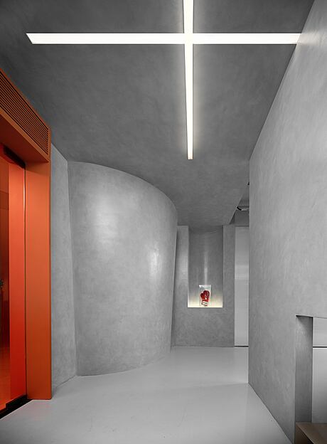
The project is located in a 5A-class office building in the core of CBD in Chaoyang District, Beijing. The surrounding environment is full of vitality, change, a sense of the times, and a strong urban commercial atmosphere. As a creative advertising firm, the daily work is relatively free. When building the internal space of the site, based on satisfying the functional area, we emphasize more on the experience of people and the fun of walking. The city is like a noisy valley without an echo. The courtyard in the valley, which is not visible outside but brilliant inside, is a secret place to the heart. It is full of countless unknowns and surprises… It separates us from the city for a while.
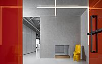
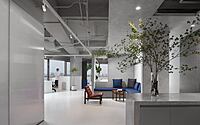
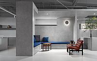
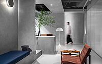
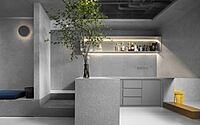
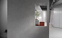
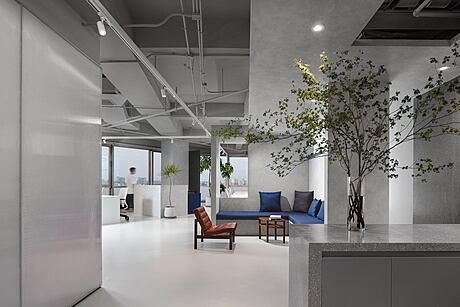
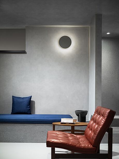
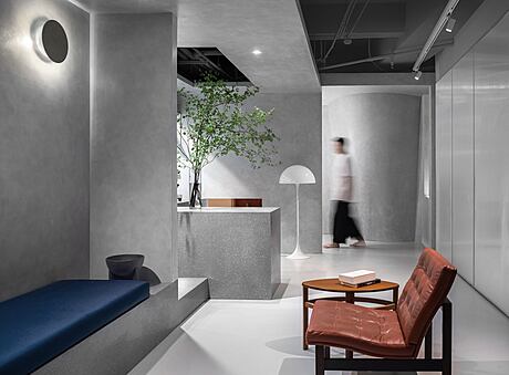
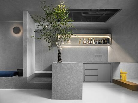
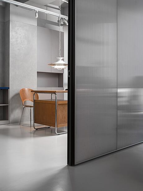
This courtyard made of cement is a natural open space with a rich sensory experience, which contains the light of inspiration. Adjacent to the lounges of the ‘inner courtyard’, we learn from the architecture of ‘XUAN轩’ of the Chinese traditional gardens. ‘A straw shed as a shadow as cover, a ridge of hills, a few old trees’; Such painting makes other functional offices, meeting rooms, desks and chairs, plants, cabinets, and shelves as if there has the breath of pavilions, stages, trees, stones. Several windows strengthen the interaction of the space, where you can rest, meditate, view, and meet friends, full of quiet and comfortable.
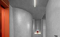
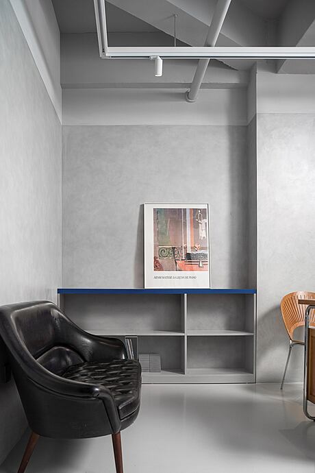
There is a secret path behind the lounges, which enhances the accessibility and functionality of the space. Without artificial lighting, a tall window above the path catches light of the lounges, creating a sense of serenity. After it was put into use, they used this path as a tiny art gallery, regularly displaying daily paintings. Some designers even used this path as their “meditation space and the birthplace of inspiration”, which is a pleasant surprise to us.
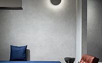
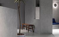
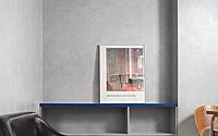
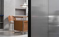
Similar hues of micro cement, terrazzo, self-leveling, polycarbonate, and other materials form a simple uniform gray tone, which is in sharp contrast to the external urban landscape. The furniture, paintings, plants, and other selected products have different cultural characteristics, shape structure, and color texture, reflecting the differences between each other but not contradictory, natural and balanced integration with the overall space, enhancing the intuitive temperament of the place. Among them, vintage furniture from the 1920s to 1970s in Northern Europe coexists with practical design, and still maintains wonderful popularity and exuberant vitality.
In this “courtyard” that contains the elements of the times, AtelierTing provides furniture and products that reflect the key point of our design. They have a humanistic atmosphere, and the traces of use on the surface reflect the interest generated by the flow of time, but also a symbol of the continuation of life.
Photography courtesy of Soong Lab+
- by Matt Watts