Florentyna’s Apartament by Ende Marcin Lewandowicz
Florentyna’s Apartament is a minimalist home located in Poznań, Poland, designed in 2020 by Ende Marcin Lewandowicz.

Description
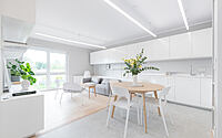
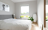
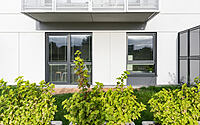
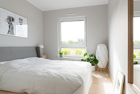
The design of the apartment in Poznań is minimalist. The façade architecture of the multi-family multi-family building in which the apartment is located on the ground floor is just as ascetic. The project assumed the use of as few textures, colors and equipment as possible. Paradoxically, the interior required abundant furniture. From the beginning, the purpose of the interior was not specified. The interior was to fulfill residential or office functions. Until the very end of the project, we were not sure how this space would eventually be utilized. The apartment was almost fully furnished and equipped, and only then it turned out that it would be a living space. You had to buy a few decorative details, a bed, a sofa, two armchairs and make the room more cozy and comfortable for the resident. Still, by replacing the sofa and bed with furniture with desk tops, this interior can be adapted to office work in one day. It is so universal in design that architects, accountants, lawyers can work here comfortably, and at the same time a person looking for peace, tranquility and not looking for an excess of visual stimuli will also feel comfortable here.
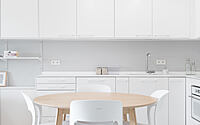
The apartment has three rooms: a bedroom / office, a bathroom and an open space living room / open space with a kitchenette.
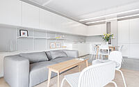
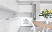
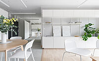
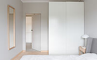
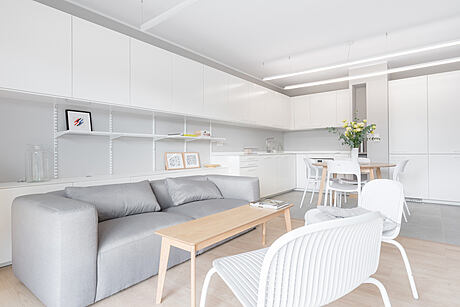
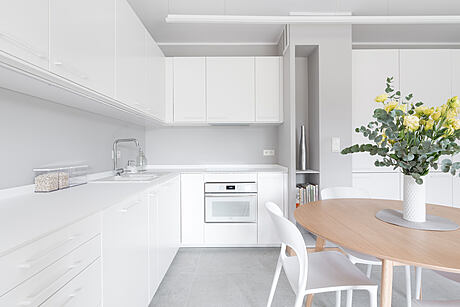
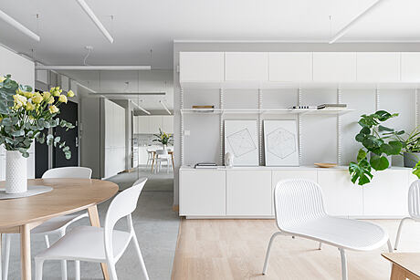
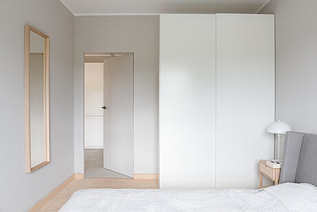
The design is inspired by the aesthetics of Scandinavian interiors, although interior enthusiasts of minimallisimo.com websites should also feel good here. The sterile white of the cabinets gives the interior a laboratory character. A variety of colors against the background of gray-white walls and furniture are juicy monstera leaves and delicate beige of natural ash wood. A small hall has been optically enlarged with a wall of mirrors with hidden bathroom doors. The currently popular doors with a hidden door frame are covered with a mirror pane. After making this element, it turned out that opening the sash wider causes the risk of chipping the mirror edge. It was necessary to install a door closer with the function of limiting the opening of the sash. A solution unusual for apartments, but ultimately quite practical.
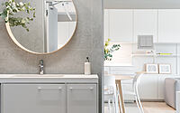
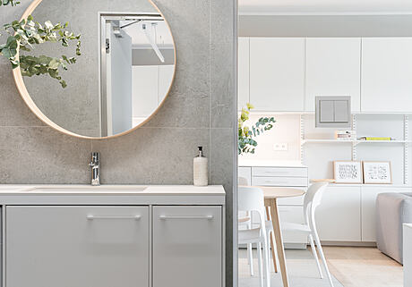
The bathroom has a comfortable, open shower cubicle, cabinets with an under-counter washbasin and a hanging toilet bowl. There is a place for a washing machine or additional storage space under the countertop. A characteristic element of the decor is a round mirror in an ash frame. In the living room, technical cantilever shelves made of metal grids are worth paying attention to. They give the possibility to freely shape the open storage space between the hanging cabinets and add an industrial character. The shelves can be freely moved and supplemented with other system accessories.
Design armchairs straight from Italy were selected in a garden furniture store. The apartment has access to a small garden. The apartment is so small that it would be a problem to store garden furniture, hence the idea to choose comfortable, light armchairs for the living room, which can be put outside on sunny days.
The lighting was designed with the use of aluminum system profiles with warm LED strips covered with a matte masking. The use of this type of solution allows for any adjustment of the length of the luminaires, but is associated with greater assembly requirements. It is the basic utility interior lighting. The cosiness is supported by standing lamps in the form resembling Japanese lanterns.
Photography courtesy of Ende Marcin Lewandowicz
- by Matt Watts