Pastoral Garden Duplex by Tzvia Kazayoff
Pastoral Garden Duplex is a contemporary residence located in Tel Aviv, Israel, designed by Tzvia Kazayoff.


Description
Welcome to an elegant and dramatic apartment that offers all the treats for young and old. The apartment, which belongs to a couple in their 30s with small children, is located in a new residential project and was purchased by them in advanced stages of construction, so that the far-reaching changes that were made inside it only after: “We started the planning near the end of construction and as soon as the occupancy permit was received, we demolished the existing And we created an almost completely different layout,” according to interior designer Tzvia Kazayoff, who is responsible for the impressive planning and design.
“The guest toilets planned by the contractor were located right next to the front door and we changed their location. The 7-year-old twins asked to live in a common room, so we combined two rooms into one large room for them and by changing the location of the bathroom we created a room for the baby and enlarged the master bedroom for the parents. Since the family members spend a considerable part of their free time in the outdoor environment, and at the same time they often entertain and cook, we changed the locations of the functions in the public space and significantly enlarged the kitchen at the expense of the living room, which has become much more intimate in the new design. The family gatherings are usually in the kitchen space where they enjoy six seats, or in the yard. And if they want to enjoy quality time together in front of the TV, a spacious and pampering family room awaits them on the lower level with a home theater system and game console.”
This is a good example of how a house, or an apartment, should be faithful to the lifestyles of those who live in it, even if the planning different from what is customary.
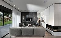
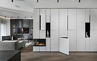
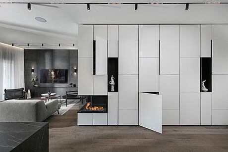
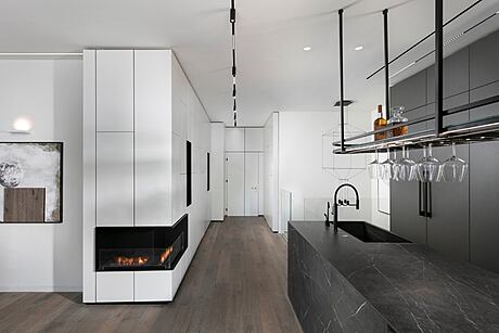
The elegant and impressive look of the new apartment is revealed once you enter it. The multi-layer parquet floor, which was imported from Belgium, is made of old-fashioned oak, and to the right of the entrance door an impressive 5-meter-long power wall is revealed, which accompanies the entrance and wraps around the corridor connecting the public space with the private wing: “Since this is an active family with 3 small children, Storage became extremely important. We designed a particularly aesthetic whole hinge for them with touch-opened doors in an asymmetrical composition, with plenty of storage space. This wall cabinet, made by a craftsman carpenter, does not reveal even the slightest bit what is going on inside. The doors were painted in an oven and look Like tiles of varying sizes, the opaque mass is broken by two black iron niches in which we integrated beautiful utensils. In the connection between the two fronts we integrated a fireplace that adds a warm and homely dimension. The cabinet also contains the electrical cabinet and the communication cabinet, so the space remains clean and devoid of visible systems”.
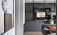
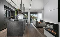
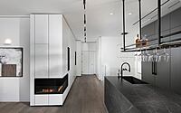
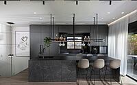
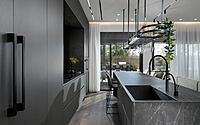
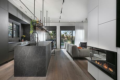
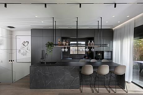
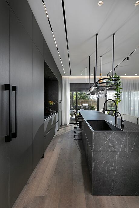
The kitchen is undoubtedly the star of the impressive ground floor: “The kitchen was designed as a parallel kitchen for several reasons: it gives the public space an airy and spacious look and allows effortless access to every area. All the corners are well used, and the ergonomics are optimal. In the middle of the celling-height cabinets that embraces the window overlooking the garden, an integral refrigerator was placed beside the stove and the wine refrigerator. The facades have been painted in graphite gray shade -, which gives them a polished and luxurious appearance. The kitchen island, which is about 6 meters long, is covered with a cladding imported from Italy with a special texture, which exactly matches the pattern of the porcelain granite from which it is made the upper surface – these are two completely different materials, and it took a lot of thought to create one homogeneous surface from both.”
Above the kitchen island, Kazayoff planned an element made of black iron that serves as a storage addition and as an aesthetic motif that emphasizes the height of the space: “By CNC cutting the bottom of the device, wine glasses can be hung upside down and even when a few glasses are hanging from it, when you look at it from the bottom up, the bar remains elegant and impressive.”
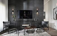
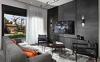
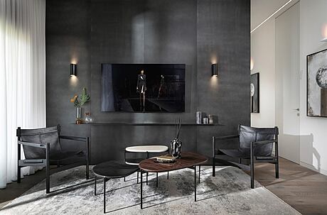
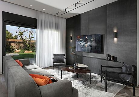
From the kitchen to the living room: the designer created the power wall in the center using wooden panels painted in a metallic black shade: “The apartment is relatively high (3.4 m) and if I had chosen iron panels, we would have had to use several separate panels and make connections between them. To maintain the continuous clean look, I chose to use wooden slats that allowed me to rise from the floor to the height of the ceiling. Underneath the TV screen is a shelf made of thin metal and on both sides of it lights that flood the wall with dramatic lighting. In general, in the public space I chose to work with quite a few items that emphasize the good proportions of the space, so for example, the linear lighting strips that are embedded in the ceiling and emphasize the longitudinal lines of the apartment”.
Kazayoff is known by her attention to small detail, and so she harnessed the entrance door to the apartment as part of the design monument: “Since this building has a fifth facade, which means that it is forbidden to replace the original contractor’s door, I was looking for another creative idea that would link the entrance door to the design of the space. As a result, we covered it with the identical cabinet carpentry, since It was important to keep the original door and with the help of the cladding, we were able to obscure the rough and raw look of the standard steel door.”
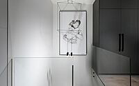
The experiential atmosphere continues all the way to the private wing – in the corridor, a false sense of interest was created by using 3D art and LED lighting recessed in the ceiling, which is then embedded in the carpentry. The new guest toilets are almost invisible thanks to a pocket door in the color of the wall: “A pocket door integrated into the wall allows us to create a spacious and practical design even in small spaces, such as guest toilets. I covered the walls of the toilets with black tiles, the toilet is also black, and the Free-standing sink has a faucet from the ceiling that enhances the experiential dimension. The sink niche is covered with a special stone in shades of gold and brown that goes great with the items made of brass.”
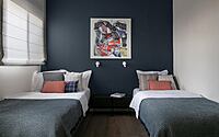
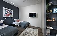
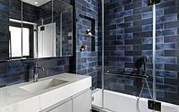
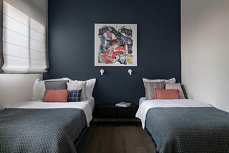
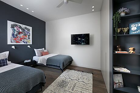
Like many of twin pairs, the couple’s 7-year-old sons also chose to join forces and asked for a shared room. “Their bedroom is not a classic children’s room and is mainly used for sleeping. They have a dedicated play area in the yard and a well-equipped family corner on the lower level. In the family room, I planned a designated area for them for a large desk, for them to study in. That way we have enough room for two large beds and an extra-large wall closet. For the wall I chose a blue color that is suitable for a wide range of ages, thinking that it will remain relevant for years to come. I covered the walls of the adjoining bathroom with tiles in three shades of blue that create a dynamic and youthful look.”
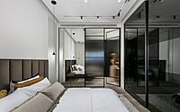
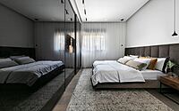
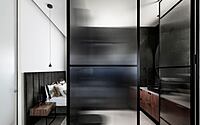
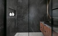
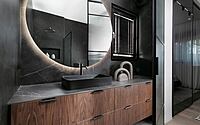
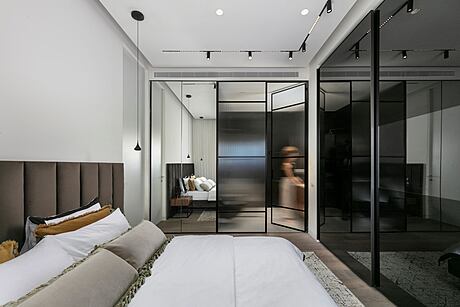
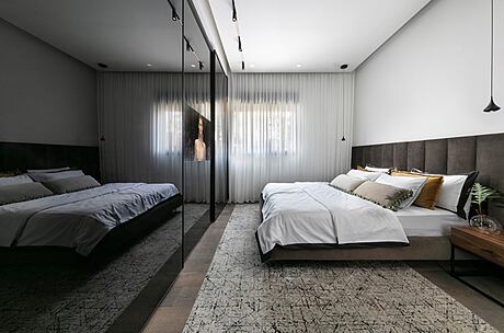
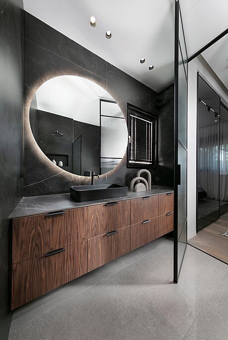
The parents’ master bedroom is also particularly pampering. Kazayoff designed for the couple a wall-to-wall closet with plenty of storage space, with black glass fronts with a built-in TV integrated into the plane of the closet door. The front that separates the bedroom from the bathroom holds a surprise: “This is actually the wall that separates the guest toilet from the master bedroom, so I used this part for a 30 cm deep shoe cabinet that is covered with a body mirror and looks like an integral part of the front of the bathroom. Instead of creating a built wall that would differentiate between the functions, I chose to work with a Belgian profile in which I inserted Master-Line glass that obscures the figure and allows intimacy. In the bathroom, the couple enjoys an extra-large bath cabinet, covered with oak veneer, and surrounded by LED lighting and an extra-large shower with a built-in niche for shampoo and soaps. I covered the walls with black porcelain granite tiles from floor to ceiling, with a pattern of fine gray veins.”
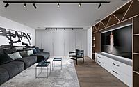
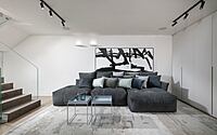
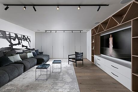
The lower level, which is used as a family corner and has an area of about 50 square meters, has an English courtyard and as such is naturally lighted and ventilated: “I created a huge wall cabinet for storage in the color of the walls, and a library that was partly oven-dyed and partly made of oak veneer. It is used to store games, books, and video games. The members of the family enjoy a high-quality home theater system, powerful speakers and large, deep sofas with only luxurious upholstery that allow them to stretch out comfortably.”
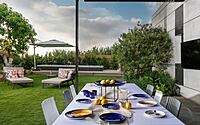
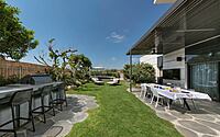
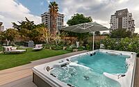
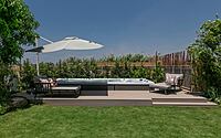
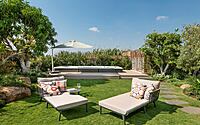
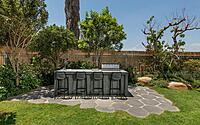
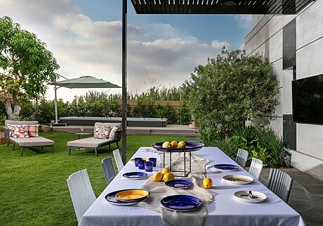
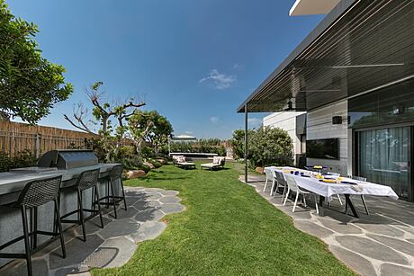
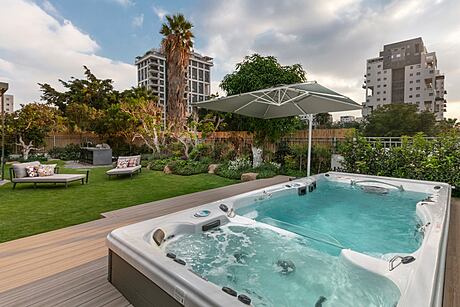
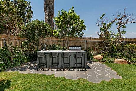
The outdoor environment does not fall away from the apartment itself and as mentioned the family members spend a large part of their time there: “For the children we planned a dedicated play area equipped with a climbing wall, a trampoline and garden toys. We integrated a jacuzzi with currents and a shower next to it, where you can wash off just before entering the water. The family and their guests have a great time Also from a large dining table, a TV screen and a well-equipped and luxurious outdoor kitchen that includes, among other things, an island and a grill, a refrigerator, an ice machine and more.
Photography courtesy of Elad Gonen
Visit Tzvia Kazayoff
- by Matt Watts