The Way It Works by Halel Arch
Located in the vibrant city of Tel Aviv, Israel, The Way It Works office space was designed by Halel Architecture and Interior Design in 2022 with an industrial-but-warm design style.
This unique workspace offers versatility, creativity and a different atmosphere to its employees who are constantly growing and expanding. Special features such as the phone booth for confessing into a camera help create a memorable experience for all who enter.
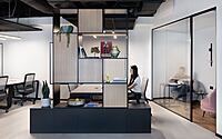
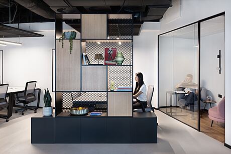
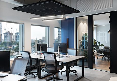
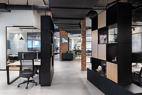
The fusion design combines aluminum systems with warm motifs like bricks, vegetation and soft lighting fixtures to add character throughout the space. Acoustic sponges provide privacy while allowing natural light from large windows to fill the open area where individual workstations are separated by library compartments made from split oak wood panels painted in black shades along with expanded nets.
With its dynamic look, this office is sure to make any employee feel right at home!

About The Way It Works
Designing a Unique and Versatile Work Environment
Halel Architecture and Interior Design created a unique and versatile work environment, including ample space in the house, for a local start-up company that is constantly growing. “Within a year, the number of employees in the company quadrupled, so as part of the planning process, I made sure to create a versatile space that will provide a comfortable, effective, and inviting work environment for a growing capacity of employees,” explains Adi Shani, the project manager on behalf of the firm.
Designing the “The Way It Works” Office
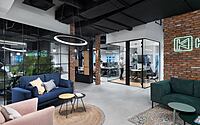
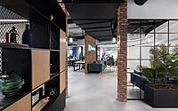
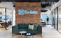
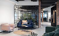
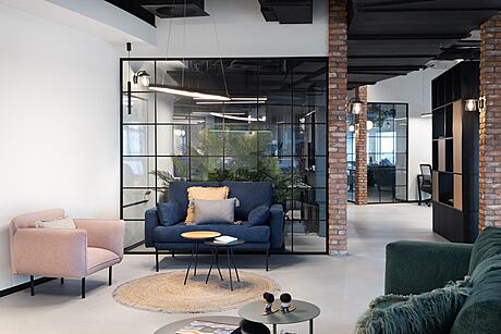
The design of the office was done in parallel with the design of the CEO’s house. The CEO wanted a completely different atmosphere in the office from the one in his private home. “It was important to him to add an experiential dimension to the offices, and so it was,” says Shani. The fusion design combines an industrial underground atmosphere with warm and lively motifs, such as bricks and vegetation in front of the dark aluminum systems and the gray microtopping floor.
Special features, like a phone booth that serves as a “confession booth” where employees can speak to a camera, have been integrated throughout the space to fit the creative, high-tech company. At the end of each year, the best segments are edited into a music video as a fun souvenir of the past year.
Challenges and Solutions
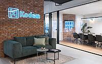
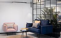
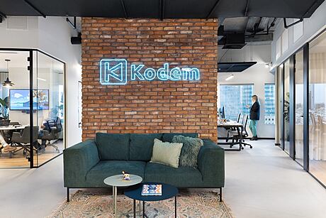
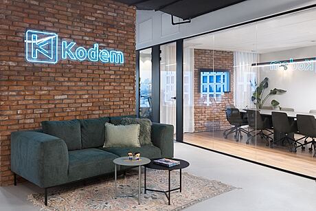
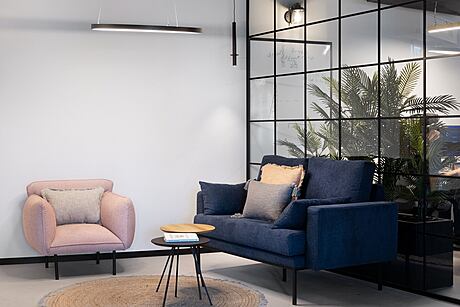
The road to the final result was full of challenges. “We were given a completely dismantled space, without partitions and low ceilings, and we actually started from scratch,” says Shani. One of the challenges was the existing building infrastructure that couldn’t be changed or moved, so the design had to work around it. It was important to create a series of interconnected spaces that wouldn’t reveal themselves all at once but in stages. For example, the entrance area is defined by a brick wall with the company logo, which creates intimacy and serves as a warm, inviting waiting area for guests. The seating area bordering the glass partition of one of the work spaces creates an open and airy feeling while still maintaining privacy for employees through the use of vegetation.
Creating a Dynamic and Natural Environment
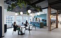
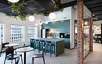
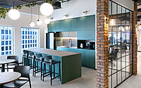
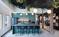
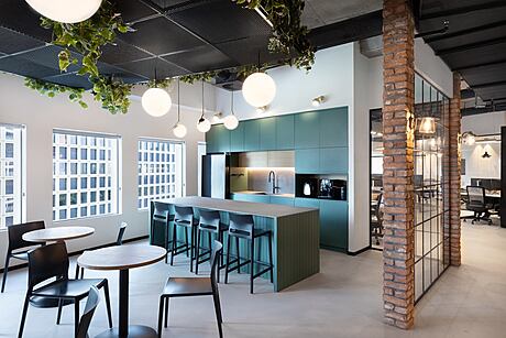
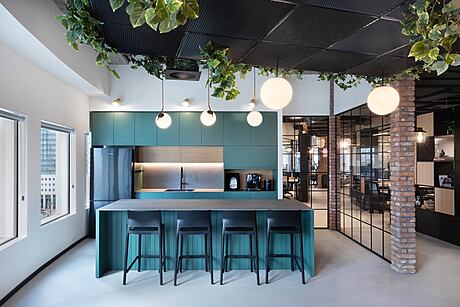
Throughout the office, the vegetation motif is used to create a dynamic and natural environment. In the workrooms and the kitchen, a ceiling-lowering net with added vegetation gives the area a lively look. “We wanted to create a living and natural environment in the heart of the urban space, in an implicit way and in the right doses,” says the designer. In addition to plants, the designer used other motifs such as the color of the walls, which were given a green pigment, and the kitchen, which was also designed in shades of green. The kitchen furniture serves as a buffer between the dining area and the open space, preventing odors from entering the work spaces. A large island with a grooved back and a porcelain granite surface was added for extra functionality and storage.
Maximizing Natural Light
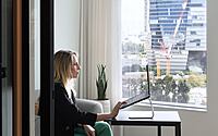
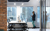
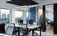
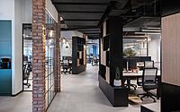
Most of the rooms were designed around the building’s casing and large windows to make the most of natural light. The central meeting room, which borders a smaller office, was designed to allow natural light to enter the larger space through a partition. The open space in the center of the office serves as a pleasant work area that is divided into positions for pairs and groups of four. To create peace and privacy, a library was created for each area that combines sealed storage compartments with open parts to break up the mass and provide privacy and acoustic benefits. The objects in the space, including the furniture and textiles, were chosen to create perfect acoustics in the open spaces.
Defining Functions with Lighting
Lighting is used as a tool to define functions and create the desired atmosphere. A boulevard with coal bulbs installed on top of brick pillars creates the feeling of street lighting. Stripes on the ceiling provide functional lighting, while designed lighting fixtures highlight various areas and provide a soft and pleasant lighting. The lighting fixtures are combined with floating rods and hanging fixtures to further define the various functions in the workspace and tell the story of the place through the lighting.
Photography by Adi Eckstein
Visit Halel Arch
- by Matt Watts