Apartment for 2+1: A Modern Redesign of a 1940s Belgrade Gem
Dive into the world of Apartment for 2+1, a stunningly redesigned living space located in the heart of Belgrade, Serbia. Crafted by talented designers Stefan Đorđević and Dalia Dukanac from Taktika, this apartment caters to couples or families with a baby, boasting a flexible, open-plan design. Combining modern aesthetics with the charm of 1940s architecture, this unique apartment offers a harmonious blend of style and functionality.
Get ready to explore this versatile home with its carefully curated materials and light-filled spaces.

About Apartment for 2+1
A Versatile Apartment Design in Belgrade
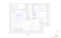
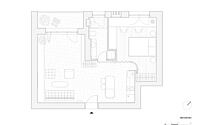
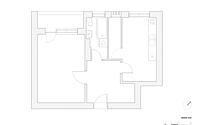
“Apartment for 2+1” is situated in a peaceful neighborhood within central Belgrade, Serbia. Belgrade-based architects Stefan Đorđević and Dalia Dukanac (taktika.rs) designed this space with dual functionality in mind: for a couple, and for a couple with a baby. The project involved reconstructing and reimagining a residential unit from the 1940s. Originally, the one-side-oriented apartment had a highly compartmentalized layout, featuring an unlit anteroom, a multifunctional room, a kitchen and dining room with a pantry, and a bathroom. Although the redesigned floor plan is dramatically different in function, the architects skillfully reinterpreted the engineering and aesthetic principles of the inherited architecture.
Open Spatial Plan with Flexible Partitioning
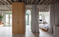
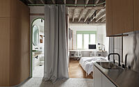
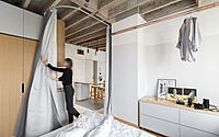
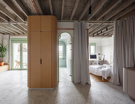
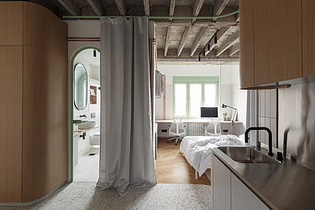
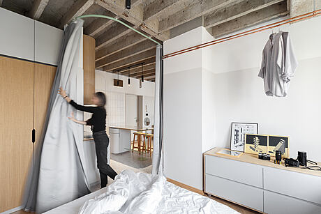
The new apartment design centers around an open spatial plan, seamlessly connecting different functions while allowing for potential separation through curtain partitions. This approach caters to the current and future needs of the tenants, enabling planned spatial and functional alterations as the household grows.
Maximizing Space and Daylight
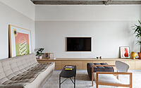
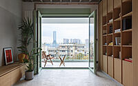
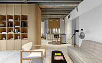
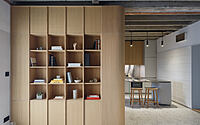
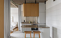
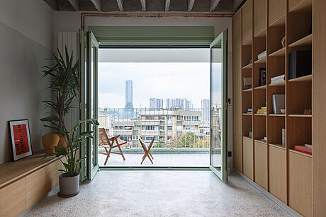
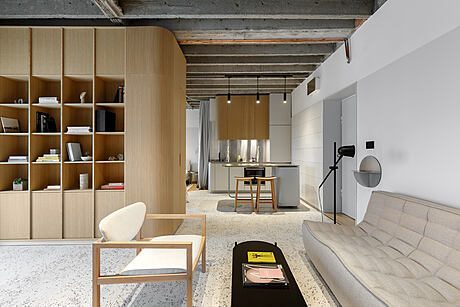
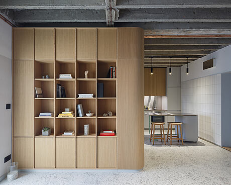
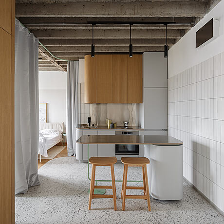
By removing the ceiling to reveal the “Herbst” ribbed slab and eliminating partition walls and parapets facing the terrace, the architects increased both the volume and daylight illumination of the interior space. Custom-built furniture maximizes the use value of the space, providing flexibility for the apartment’s future use. Curved surfaces and lines of the furniture soften the periodic grid of the ribbed ceiling, visually enhancing the family home concept.
Thoughtful Material Selection
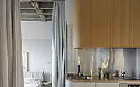
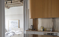
The choice of materials responds to the original architectural elements. The rough concrete of the ribbed ceiling contrasts with the smooth white cement-based terrazzo floor, while the cold stainless steel of the kitchen complements the warm shades of oak. Light green details weave throughout the entire interior, providing a visual accent to the neutral, original materials and colors.
Photography courtesy of Taktika
Visit Taktika
- by Matt Watts