Apartment with Blue Accents: A Retro Revival in Moscow
In the heart of Moscow, renowned for its rich history and iconic architecture, the Apartment with Blue Accents stands as a tribute to the retro era. Designed by Anastasia Kholoptseva in 2023, this apartment melds 60s-70s vibes with modern functionality.
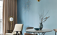
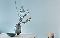
Dominated by shades of blue, it boasts unique design choices like the ombre effect, transitioning from intense to lighter hues, and clever space optimization that merges comfort with aesthetics.


About Apartment with Blue Accents
Retro Vibes in Modern Living
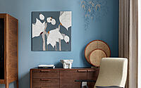
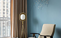
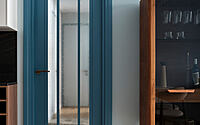
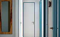
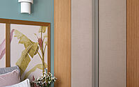
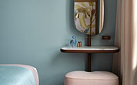
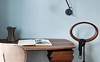
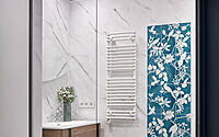
A middle-aged couple, bursting with energy, desired a touch of the 60s and 70s in their apartment’s decor. Right from the start, our chemistry clicked, leading to swift decision-making. Given the apartment’s limited size, we opted for a single chromatic hue and its variants. Initially, we flirted with the idea of blue doors. Consequently, this hue adorned other areas and items as well.
Fusing Spaces with the Ombre Effect
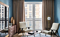
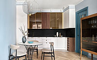
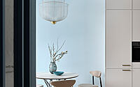
To seamlessly merge the retro living room and kitchen, we employed the ombre/degrade technique. Here, a deep blue gracefully transitions into a soft light-blue.
Strategic Choices for a Spacious Feel
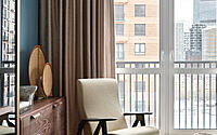
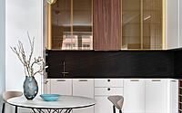
Our ace move? Selecting two armchairs over a sofa for the relaxation area. This switch instantly expanded the living room’s feel. A compact dining table, boasting a transparent base, paired with a grand yet airy overhead fixture, sat perfectly at the intersection of the living and kitchen areas. The kitchen itself emerged as a marvel, both in functionality and design. A black countertop and Sahara Noir Italian ceramic panels mirror the black marble of the coffee table, infusing sophistication into the setting.
Prioritizing Restful Sleep
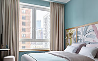
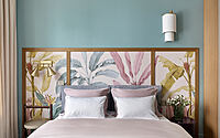
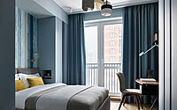
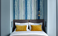
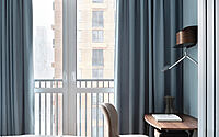
We devoted ample time to the bedrooms, ensuring every detail stood out. The mattress choices and bed designs spurred lengthy discussions. Ultimately, the husband’s bedroom showcased a transformer mattress (ergomotion). This versatile piece can effortlessly morph into a lounge chair or even an armchair.
Photography courtesy of Anastasia Kholoptseva
Visit Anastasia Kholoptseva
- by Matt Watts