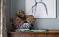
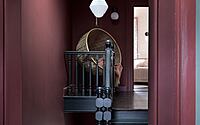
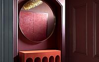
The Schoolhouse: Where Georgian Legacy Meets Contemporary Design
Unveiling The Schoolhouse in Galway City, Ireland: a fusion of Georgian elegance with contemporary panache. Kingston Lafferty Design brings to life a home that echoes the vibrant heartbeat of a bustling family of seven.
Through a harmonious blend of old-world charm and modern innovation, this house celebrates both its historical architecture and the warmth of family moments, from tranquil coffee nooks overlooking courtyards to spirited Irish dancing sessions in the evening.

About The Schoolhouse
Galway’s Family Home
Located right in the middle of Galway, Ireland, this home is full of life from a husband, wife, and their five kids. It’s where they have breakfast, do after-school stuff, and enjoy lively evening dances and lots of laughter. It’s more than a house; it’s full of happy memories.
A Look Back in Time
Built in the 1960s, this house shows off Galway City’s old building style. Every part of this house has a story from the past.
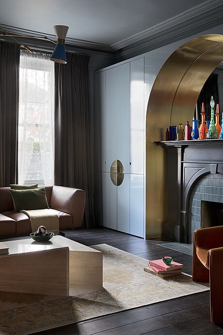
When you walk in, the hallway welcomes you. From there, you see a big staircase. On the left, the living room leads to a reading room. And further on, there’s the kitchen. There’s also a small space between the kitchen and reading room. This was once outside, but now it’s a nice place to have tea. It also makes walking between rooms more fun.
New Changes
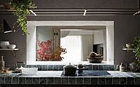
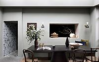
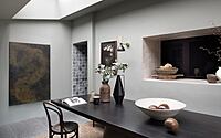
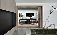
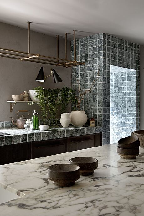
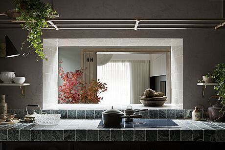
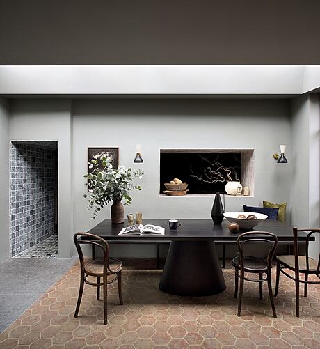
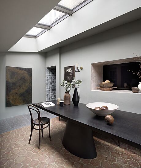
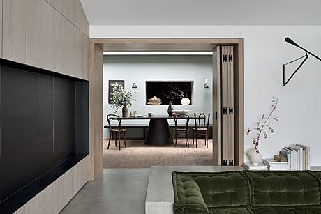
In the kitchen, they took down a big wall, which now lets you see the dining area and the green backyard. Before, this wall kept the two areas apart. Now, they feel like one big space. There’s also a bright outside area with glass doors and a roof to let in lots of light. They added foldable wooden doors to separate the dining and sitting areas, so the family can choose how they want to use the space. On one side, there’s a hallway with places to store things, leading to the laundry area and a small restroom.
Building Thoughtfully
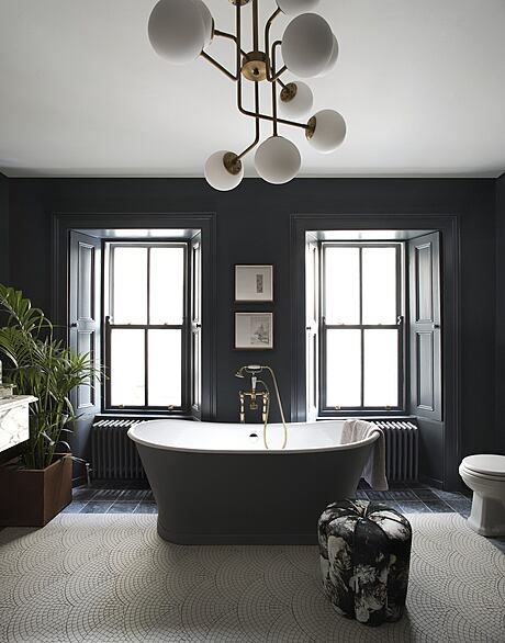
We started working together in December 2018, and with the help of the architects, it took almost five years. Because this house is old and special, there were rules about what we could change. We wanted to make the inside look new and also make it work for the family. One big goal was to let in more light, which was hard because of the thick walls. So, we made bigger windows, added glass sections to the roof, and placed windows in the ceiling.
Design with Heart
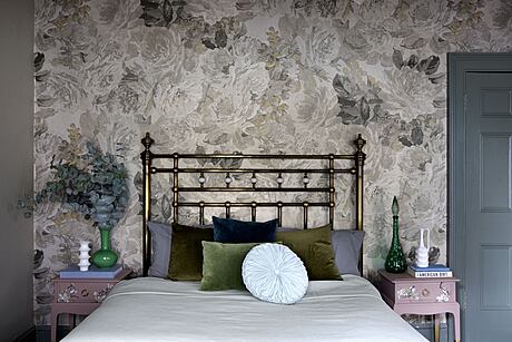
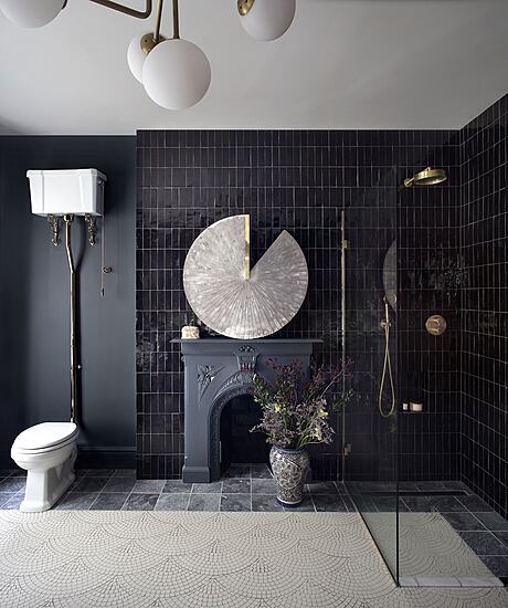
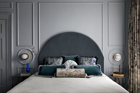
We wanted our design to feel timeless and match the house’s old charm. A TV show, “Handmaid’s Tale”, gave us some ideas. Even though it’s a serious show, the sets had the warm and old-timey feel we wanted.
Above all, we wanted the house to show both its history and the family’s lively spirit. It was tough to work around the rules, but in the end, we found creative ways to make it all come together.
Mixing Old and New
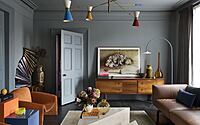
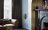
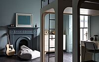
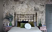
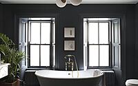
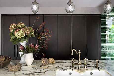
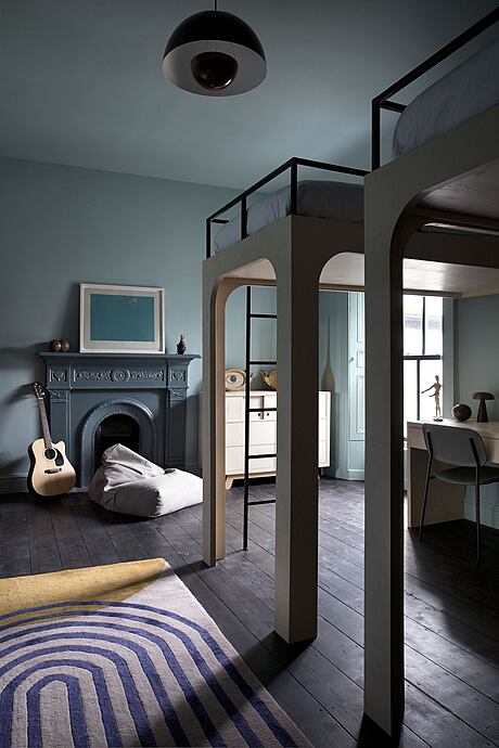
We aimed to mix the old look of the house with new designs, using colors and patterns from the past. We kept some old things like cabinets and lights but added new ones to make it look fresh.
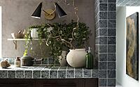
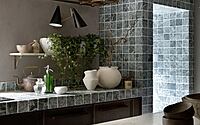
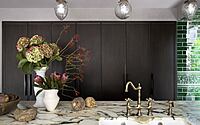
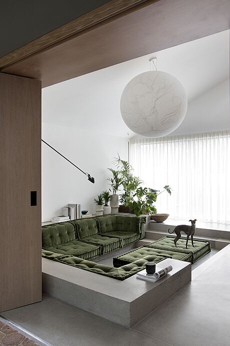
In the kitchen, we added touches that remind us of our first meeting with the family. At the back of the house, there’s a modern area that’s a bit lower than the rest, which makes the garden look even prettier. The dining area mixes new designs with old touches, leading to the open outdoor space.
Photography courtesy of Barbara Corsico
Visit Kingston Lafferty Design
- by Matt Watts