Casa Kaleido Balances Soft Daylight with Saturated Interior Color
Casa Kaleido is an apartment in Naples, Italy, designed by Area Dieci as a sequence of rooms shaped by color, glass, and built-in elements. Across the living area, kitchen, bedroom, and baths, deep blue portals, green tile, pink-tinted partitions, and pale oak floors give the home a clear visual rhythm. The result feels graphic yet livable, with daylight softening every saturated surface.


About Casa Kaleido
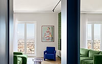
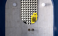
A deep blue opening cuts into a white room, turning the first view into a framed passage rather than a broad reveal. Daylight stays soft. Pale oak flooring runs underfoot, and the light catches a green sofa, a wall of books, and the edge of a glass dining table.
In Naples, Italy, Area Dieci shapes this apartment as a sequence of distinct yet connected rooms, each marked by color, material, and a controlled shift in enclosure. The plan reads clearly. Instead of relying on many finishes, the interior builds its character through a few repeated moves: blue thresholds, tiled surfaces, black linear lighting, and translucent partitions that tint the view without closing it down.
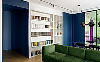
Frame The Living Room
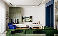
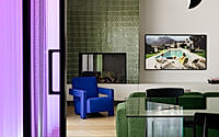
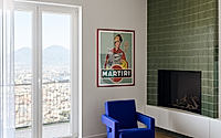
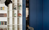
The main living area is arranged with unusual clarity. A full-height bookcase fills one wall, a long low cabinet holds the television, and a tiled fireplace volume anchors the corner in muted green. Against that steady backdrop, furniture introduces sharper notes: a saturated blue armchair, a deep green sectional, dark dining chairs, and a smoked acrylic table that keeps the center of the room visually light.
The room stays open. Yet the blue wall openings make each connection feel deliberate, almost like moving through a set of edited views rather than one continuous field. Track lights trace the ceiling perimeter, reinforcing that sense of outline and keeping attention on edges, corners, and the route from living area to dining zone.
Tint The Threshold
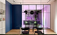
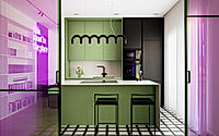
The kitchen sits behind a black-framed glass partition washed in pink and violet tones. Color shifts everything. From the dining table, cabinetry, shelving, and even the floor beyond appear filtered, so the act of crossing into the kitchen becomes part of the apartment’s visual rhythm.
Inside, the palette tightens. Pale green cabinets meet a white counter and black fixtures, while a gridded black-and-white floor sets up a sharper geometry under the island and stools. A scalloped black pendant draws a low line over the work surface, giving the compact room a clear center without weighing it down.
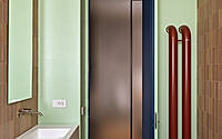
Carry Blue Inward
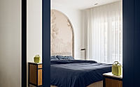
Blue returns in the more private rooms, but it shifts from accent to surround. The transition is direct. Door frames, wall planes, and even a ceiling surface pull the color inward, so the passage to the bedroom feels compressed and immersive before the room opens again to white walls and sheer curtains.
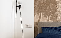
That release matters. The bedroom uses fewer elements than the living area: a blue bedspread, wood nightstands, a pale mural-like headboard backdrop, and broad daylight from a tall opening. The herringbone floor continues through the room, keeping the apartment legible as one home even as each threshold changes the mood.
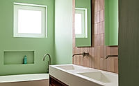
Set Pattern Against Color
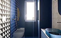
The bathrooms push the sequence further through pattern and saturation. One reads as dark and graphic. Blue walls and ceiling, a blue basin, and a black-framed shower sit against bold black-and-white geometric tile, turning a narrow footprint into a compact room with real presence.
The other bath is lighter and calmer, though no less precise. Mint walls, blush-toned tile, a long white double sink, and fluted wood cabinetry work with a boxy tub and small window to create a measured composition. Even here, the apartment avoids excess; the effect comes from proportion, contrast, and where each color is allowed to stop.
What holds the interior together is not a single dominant room but the sequence between rooms. That is the point. Glass, tile, paint, and built-in storage turn circulation into the apartment’s strongest tool, so daily movement becomes the way the project is fully read.
Photography by Carlo Oriente
Visit Area Dieci