Costa Esmeralda by BAK Arquitectos
Awesome two-storey single family concrete property designed by BAK Arquitectos located in Pinimar, Argentina.


Description by BAK Arquitectos
The place
This was our first project in Costa Esmeralda, a real estate development neighbor to Pinamar started in 2004. As a recent batching, at the moment there are very few constructions and the place is known for having different types of landscapes, with vegetation varying from pine forests, with similar characteristics to the forest of Mar Azul, to areas where that vegetation is scarce.
In turn, topography also has a variety of situations, and there are flat areas, depressed, or elevations with steep slopes, as this lot division was made over an area of coastal dunes.
The place
The lot has, as most relevant data, a slight depression towards the center and a row of acacia trees of about 3 meters in height parallel to the front line. These two features are very interesting, since both depression and acacias give privacy within the field which is a privilege, given the low density of the neighborhood that leaves it very exposed to the few existing buildings.
The climate
The weather was a determinant factor at the time of the project generation, given the conditions of this area of the sea coast and this particular batch. It is a harsh climate, temperatures are high during the summer as the solar radiation impacts directly by the lack of vegetation, and winters are cold, wet and windy.
The commission
The client requested the project of a summer house with aesthetics and benefits, in terms of maintenance, built of concrete houses in Mar Azul.
The house should have two rooms and a third of sporadic use: to be visited by an older child or eventual guests.
The heating and cooling system should be resolved through the use of split equipment, since the client is the manufacturer of these equipments.
The proposal
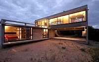
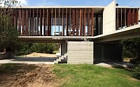
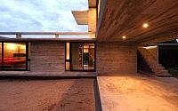
The projectual answer seeks to capitalize on the difference in level between the street and within the lot. For this reason, we decided to solve the house in two volumes perpendicularly intersecting in “L” at different levels, opting to provide more privacy to the volume that contains the private uses of the house by resting over the level of the lot and placing it perpendicular to the front. The higher volume, of public use, is resolved alongside the front line taking advantage of the acacia trees that provide privacy and allow the enjoyment of the far views into the wilderness environment, in turn its elevated position sought to provide the house some presence from the street leaning out slightly above the level of the acacias. This volume was generated as an elongated prism, supported at one end over the volume of the bedrooms. At the opposite end rests on a blind lateral wall on which, in the lower level, the grill was located taking advantage of the partially covered generated as flexible use space serving both for storing of two cars as for preparation and enjoyment of the classic roast. This space is protected from external visuals in part by the difference of level and in part by the abundance of acacias on the front of the lot, so that there can easily develop all kinds of activities.
The access
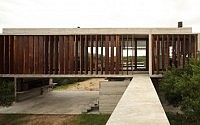
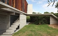
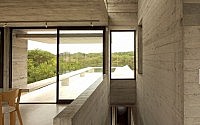
Access to the house has been solved on the high level of the main floor, so it should save the half-height difference between the street level and the access level. This difference is saved in the first instance, by a stairway near the street that continues on a bridge that crosses the acacias, allowing the enjoyment of walking between them and the arrival at the gateway to the higher floor. It was also projected a second staircase that links the partially covered area with access to the main floor.
The bedrooms
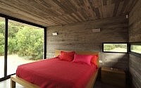
Two bedrooms en suite are nucleated in a prismatic volume at ground level. This volume opens towards the interior of lot with floor to ceiling woodwork to enjoy the views of the surrounding nature; however the openings become smaller on the partition wall of the SW, where is located the circulation that connects to a stairway leading to the main floor of the house.
In the commission was also required a third bedroom of sporadic use to receive the eldest son or eventual guests. We decided it should be part of the main living space with the possibility of integration to gain use of that space, incorporating it to the rest of the plan during the time it remains free.
The principal volume
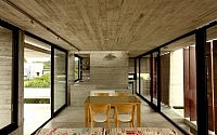
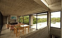
The main volume was conceived almost like a partially covered space since, for his two long sides, -the front and back- sliding openings were incorporated which can be opened when the weather permits in a proportion of two thirds.
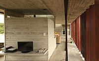
To the front of the volume of guidance Northwest is developed a system of double skin: in front, a row of vertical sunshades of quebracho boards, and behind a line of carpentry from floor to ceiling. This was required to prevent direct sun radiation and, at the same time, to provide a privacy bellow that protects from the view from the street to the interior.
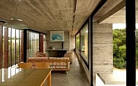
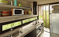
This volume brings together the functions of living and dining room, integrated bedroom for occasional use (or a room with more intimacy), a small toilet (which separates the dining room from the integrated bedroom) and the kitchen, located on the west end of the volume, separated from living-room by the stairwell that links this level with the volume of the bedrooms.
Structural resolution
The volume of ground floor, which is blinder than the elevated volume, is easily resolved by bearing walls and a slab with ring beams.
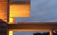
Moreover, the upper volume is resolved as a bridge supported at one end on the volume of the bedroom and, at the opposite end, on a closing wall which extends to lean on the ground. This slab is supported by two beams that run through to the volume in its longest direction. Towards the front, a 40 cm high beam, and facing the back, an inverted beam works as back parapet for fenestration.
The top slab or roof is supported by two inverted beams hiding the subfloor and the thermal insulation.
Construction
The work was done in exposed concrete, a material that unifies in a single element structure and finishing. H21 concrete was used with the addition of a fluidifiant so that this mixture, with little amount of water to harden, results very compact and doesn’t require sealing. Furthermore, the expressive quality of concrete and its resistance and impermeability, made superfluous any type of surface finish. It achieves a low cost of execution at finishing and needless future maintenance.
To adapt the building system used in the forest to this new environment of more extreme conditions was necessary to improve the thermal insulation.
To solve the thermal insulation of the elevated volume cover was made a low density underlayment which is hidden behind two inverted beams.
Furthermore, to improve the insulation of the exterior walls a second concrete wall was constructed on the inside, leaving between the two partitions a space where the insulating material was placed.
Cross ventilation was designed both in the bedrooms and on the main floor to allow air circulation and thus to ensure that the house will be refresh in summer with the sea breeze.
In the main façade was also implemented a parasols row of red quebracho to avoid the direct incidence of sunlight over the glazed enclosure. Quebracho wood was chosen considering a minimum maintenance.
The heating system of this house is given by the use of hot and cold air conditioners. Was also included a home-salamander to complement the heating system.
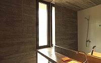
The few interior partition walls are of brick, plastered and painted with white latex. Bathrooms feature white enameled ceramic coating on the walls that are not of concrete. The floor cloths are also from concrete screed divided with aluminum plates. The meeting between walls and the floor was resolved with a recessed aluminum profile, as a base.
Light and visual treatment
As detailed above, the book is basically in two volumes in ¨ L intersecting at different levels. The lower volume constitutes the most private part of the house while the higher volume contains the more public area.
The treatment of light and visuals is closely linked to these concepts.
The lower volume is closed towards the western dividing wall to provide privacy to the bedrooms sector (thinking on the future occupations of neighboring lots) and it opens towards the interior of the lot to enjoy the natural environment visuals (outside visual surroundings protected by the abundance of acacia). So we can say that this volume has controlled lighting and is more tightly closed.
In contrast, the higher volume is designed as a completely open and permeable volume, as a semi-covered that rises to enjoy more distant views and greater natural lighting. The implementation of the parasols cushions the impact of sunlight and sifted the entry of sunlight casting long shadows and creating a very special atmosphere, serving also as separation bellows between inside and the private outside, allowing you to see outward but avoiding views inward.
Another resource utilized regarding the natural light is the aperture of two skylights in the roof of the main volume, one on the stairway and the other on the area destined to the fireplace – salamander. The skylight placed on the stairway generates an entry of light which gives hierarchy to the union space of the two volumes vertically. The skylight above the fireplace – salamander area generates a center of attention and hierarchy in the sector of the plan destined to family reunion, while that allows also the illumination of the toilette with natural light.
- by Matt Watts