YSM House by Parallel Lines
YSM House is a luxury penthouse located in Tel Aviv, Israel, designed in 2021 by Parallel Lines.




Description
This Central Israel-located prestigious penthouse designed by Moran Gozali covers 220 sq.m. It was bought by a young family who dreamt of an apartment that would be a kind of a “resort” for them. This refers to a sense of freedom, elegance, warmth, and intimacy imbued with a warm modern style so well-identified with the interior architect.
Moran Gozali, carefully selected to design this project, says: “in our studio we believe in total design in which the home functions as a single harmonious and synchronized unit. This starts at the program planning stage, while considering the space and its environmental context. Then the various systems are added, bringing all of these considerations together to create a tight design and planning, precisely tailored to the available proportions and the family lifestyle”.
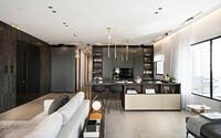
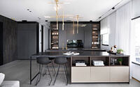
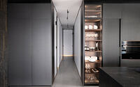
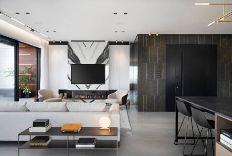
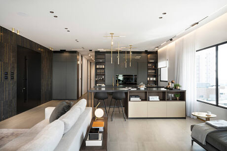
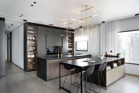
The apartment’s interior was totally demolished in order to be replaced with a new design based on the intended plan. The parallel lines created as part of the initial planning were leading lines for a design language that was reiterated throughout the various elements making up that space. These lines appear in various versions, both horizontally and vertically, in the spatial enclosures, kitchen design and other tailor-made elements. The open space was planned with an Italian kitchen at its center, certainly not a standard design element.
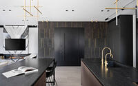
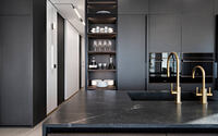
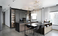
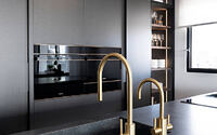
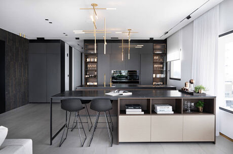
It is made of tall kitchen units and two parallel islands, each having a different function. The first island is for cooking and food preparation, located near the tall cupboards where the integral ovens and fridges found their place. The second island is meant as a sitting area for the family, who can also view the nearby TV together from there. “The idea behind the two islands in the open space also raised the question of how to separate them both functionally and design-wise. The first island is more massive and looks like an enclosed mass with its wooden doors and granite cladding around it. For the other island I decided to subtract from the material, have it look as if it was flying over with a minimalist aluminum support, open wooden bays and bright golden doors to provide an elegant, lightweight and ethereal look. The mixing of the various materials creates a unique and authentic feel to that space.
The lighting elements above the kitchen islands were designed taking the kitchen and home proportions in mind, and they combine vertical and horizontal brass poles which create a songbook of rhythms. From the kitchen front one can be impressed with their identically looking “book match” design. Yet from each direction they present a totally different new dimension.
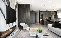
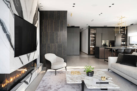
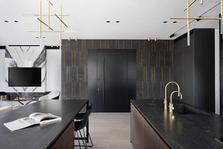
At the entry to the apartment there’s an impressive wall covering made of stone with different brass strips of differing rhythms. “Planning the stone wall was quite challenging, as I had to carefully plan the way each stone and strip meet each other so that they perfectly match, also the apartment’s entry door and the electrical sockets”.
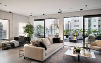
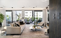
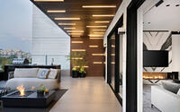
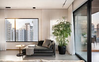
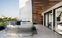
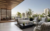
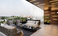
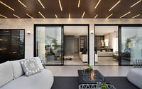
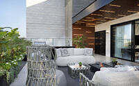
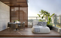
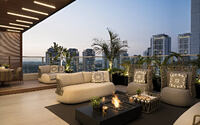
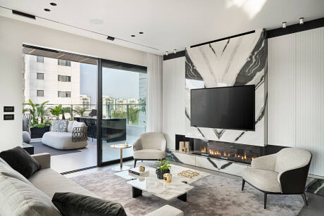
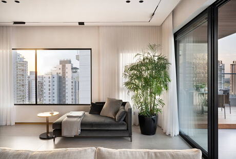
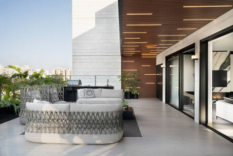
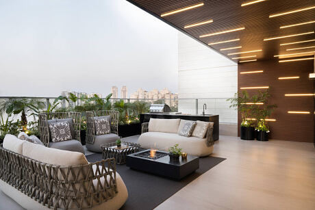
The first view upon entering the apartment is a well-lit open space with large show windows linking the inside and outside, giving a feel of a sky-floating villa. The wide balcony covers about 80 sqm. and is surrounded by tropical plants. In order to emphasize the resort and holiday feel, “we chose identical flooring inside and out, stressing the continuity and space. Each tile is 1 by 3 m in size, and this creates a smooth feel, obscuring any divisions that existed within that space”, explains Gozali. One of the most salient elements in the balcony is a 12 m-long wooden pergola designed with horizontal lighting strips of various sizes and rhythms, which create a boundary around the sides and top part of the balcony. The balcony also has other functions, such as an external kitchen, a hidden aluminum-covered storage area and an intimate area surrounded by “Ipe deck” planks, in which the dining space is located together with a comfy couch.
This apartment is unique in that all its materials are carefully linked to each other to create a precise harmonical look. There is no wall or corner here that were not well-planned in advance: “Each wall and element in this apartment were carefully planned and manufactured down to the small details and stitched together like a perfectly matching evening dress. My imagination and vision tend to stretch the abilities of experienced craftsmen, hence only the best ones had been chosen to make my vision a reality, translating that vision into a physical space with top notch finishing. This is the spirit of our studio”, explains Gozali.
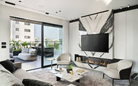
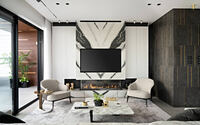
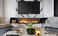
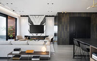
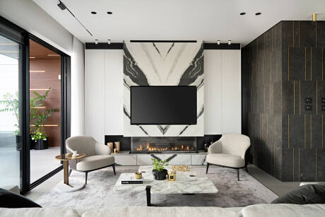
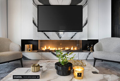
The TV wall is a real design monument, a joinery wall combined with “Panda” stone cladding in the “book match” method. The challenge was to stitch together all materials, while hiding some technical systems – fireplace flute, vertical air-conditioning, audio systems and storage units – while maintaining a well-designed aesthetics. The apartment’s design is very precise, based on Moran Gozali’s vision, making these technical systems an integral, yet well-hidden part of the design, that sits well with it in a system-wide harmony. The air-conditioning units were embedded within the joinery by tailor-made grills and vents.
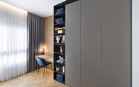
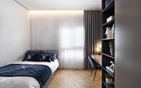
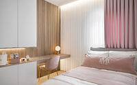
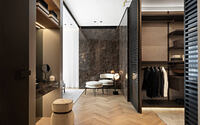
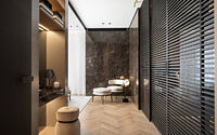
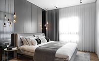
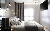
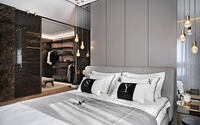
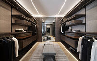
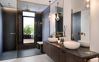
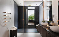
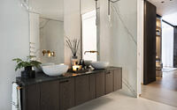
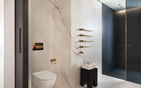
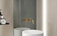
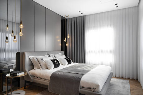
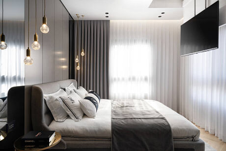
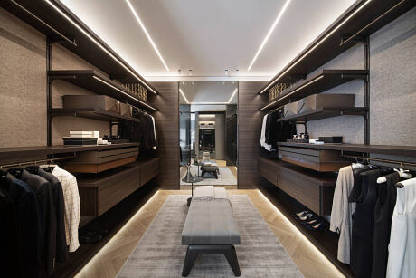
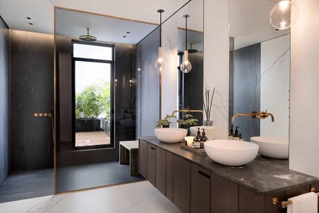
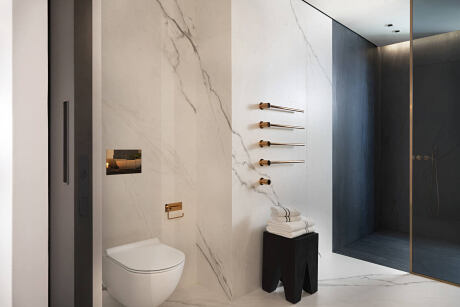
In the personal part of the apartment reside the master bedroom, children’s rooms and bathroom. The master bedroom has a cupboards room ordered in two parallel lines separated from the sleeping quarters by glass and aluminum screens in order to camouflage them. Facing the cupboard room, an R-shaped joinery wall was designed to function as a storage area, air-conditioning units’ hiding place, makeup vanity and bed headboard covering. The wall is painted in light grey shades, contrasting with the warm, dominant “Emperador” stone wall, to create a designed dissonance between the various materials. The bathroom was designed with a long narrow window overlooking the deck balcony with tropical plants creating a sense of being on holiday in a luxurious Thai resort.
Gozali’s design concept is based on combining natural materials with trendy industrialized materials. The metals used in the apartment were combined with different versions of wood and natural stone surfaces. Natural cloths and leather too show up in the furniture as part of the different coverings. It is an infinite struggle in Gozali’s studio to find the right formula for matching together the various materials and details that together create the ultimate and exciting meeting point that is well above time.
“My challenge has always been to create a design experience whose details all create a wholesome, uniform and harmonic space. This struggle is paved with technical and functional difficulties, making the interior architect a kind of conductor of all those systems, aiming to create a single, well-functioning synchronized concert”, says Moran Gozali.
Photography by Moran Gozali
Visit Parallel Lines
- by Matt Watts