Modern Nordic Cube by U+A Architecture & Interior Design
Modern Nordic Cube is a modern single-family house located in Herzliya, Israel, designed in 2020 by U+A Architecture & Interior Design.

Description
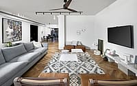
The tenants sought a modern-style home that would suit their needs and which would serve them as a family. It was important to them that the public space be large and suitable for raising 3 small children.
The tenants, a couple of parents in their late 30s, are modest people who really cared about the house radiating simplicity on the one hand, but also very much wanted a pampering and innovative home on the other.
Hence the style of the house was born: a Nordic cube with functional features that puts comfort and family in the first place, but with a modern mindset that is designed to the last detail, innovative, invested, and with the use of high technology.
The designer and planner Ayelet Levi Adani admits that once she solved the stair problem, the entire planning process flowed and managed to reconcile with the story of the house.
The stairs, located in the center of the house, were trapped inside walls that hid the continuation to the second floor and gave the impression that the house is smaller than it is.
Together with the square shape of the house, the designer decided that the concept that fits and characterizes the project will be a cube that represents straight, modern lines and is a balanced division of space.
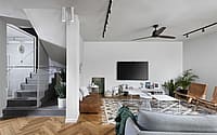
The stairwell forms the center of the cube and each wig leads to a different space. Therefore, the center of the cube (stairs) has great weight in the interior design of the house.
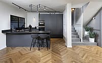
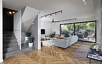
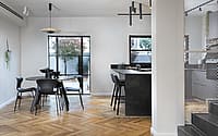
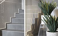
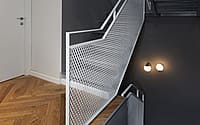
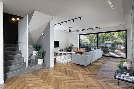
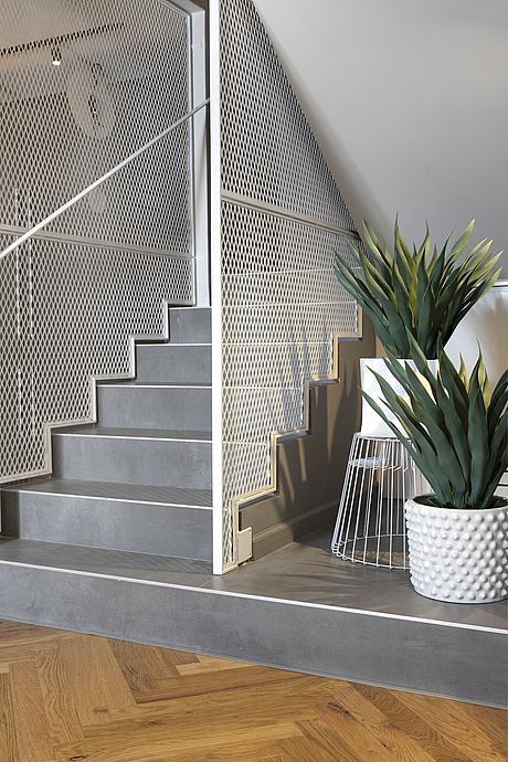
The walls that ‘closed’ on the stairs were partially removed and exposed the staircase and the passing space. In order to emphasize the importance of the stairs, the first step was extended to a kind of stage.
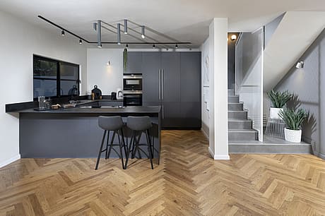
The entire space of the stairs, sidewalks, and lighting was painted gray, and a white iron mesh was chosen for the railings which envelop the entire space and connect it to its additional sides.
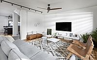
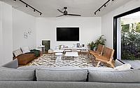
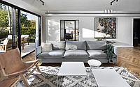
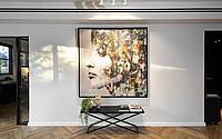
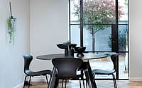
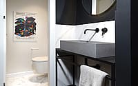
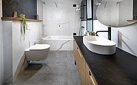
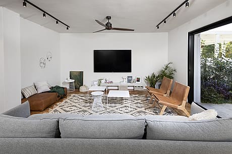
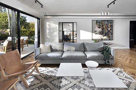
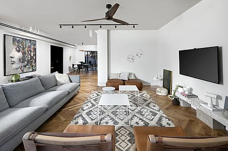
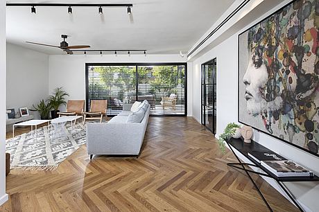
At home, a monochromatic color palette was chosen due to the dominance of the parquet flooring. Black, white, gray, and camel brown blended perfectly into the space and gave an inviting and minimal feel.
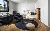
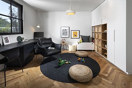
In practical terms, the designer, Ayelet Levi Adani decided that the guest room that was on the ground floor would be converted into a playroom combined with a parents’ office which is located in front of the living room and provides eye contact for parents with their toddler children.
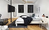
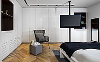
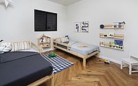
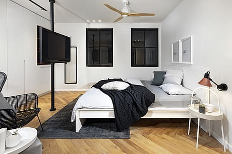
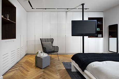
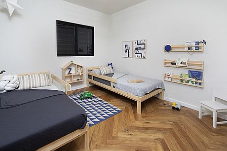
On the second floor are the children’s rooms + the luxurious parents’ suite which includes a spacious closet with a coffee machine and a stand for making baby food bottles in the small hours of the night …
The house has been extensively renovated both outside and inside. Beyond the design of the large openings and access to the garden from all parts of the house, all the exterior cladding was replaced and vegetation was added that brought nature into the modern house.
Photography by Eran Turgeman
Visit U+A Architecture & Interior Design
- by Matt Watts