Joliver by Studio Bonba

Description
The apartment is located in a residential neighborhood on the outskirts of Barcelona, inside a four-story building.
The goal of the project was to give the flat a new look, and since all the rooms have outdoor facing windows, to let the light enter the common areas as much as possible while creating more open spaces.
The property which was originally built in the 90s was characterized by dark floors and several doors and walls which separated every room, as well as a service area and a large kitchen with a suboptimal arrangement. All of this made it difficult to appreciate the charm and potential of the apartment.
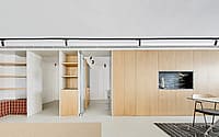
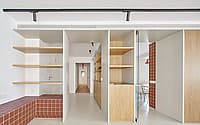
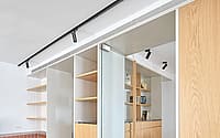
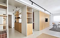
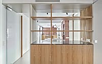
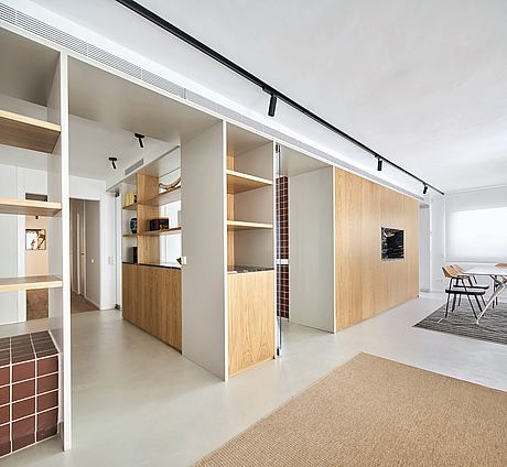
The first step we took was to eliminate all those dividers that did not allow the light from the outside to come through and to re-organize the space by designing a series of volumes made of wood that act both as pieces of furniture and space distributors, creating overall a lighter and more fluid space.
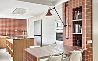
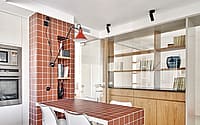
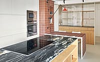
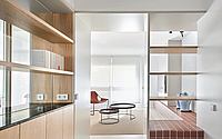
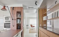
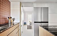
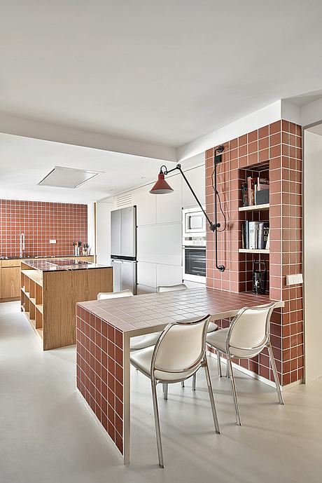
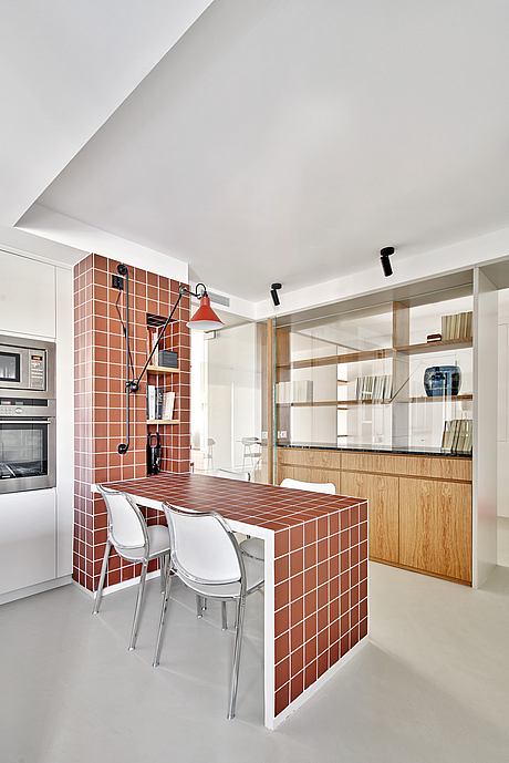
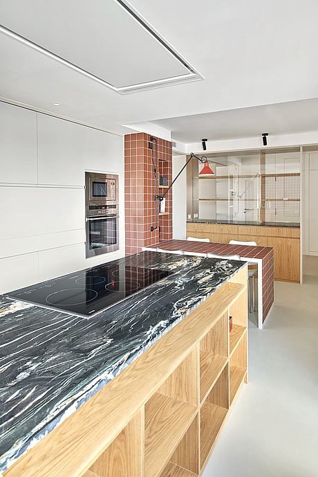
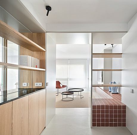
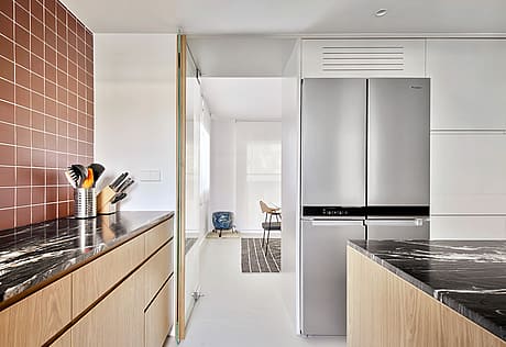
Following our refurbishment, when one enters the house is welcomed in the hall by a structure made of natural wood, combined with lacquered wood and granite. Through glass doors, to which we added wooden handles to give them a floating effect, one enters the kitchen where the terracotta tones of the ceramic tiles of 10x10cm, dictate the colors of the room, finished with a touch of black matt granite.
We created an island in the middle of the kitchen with the cooker hood attached to the ceiling to let as much light as possible come through. A table has also been added made from the same terracotta tiles, to create a more intimate area, as the client likes having breakfast in the kitchen, taking advantage again of all the light that now comes through.
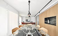
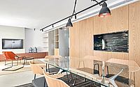
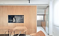
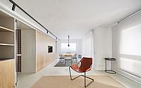
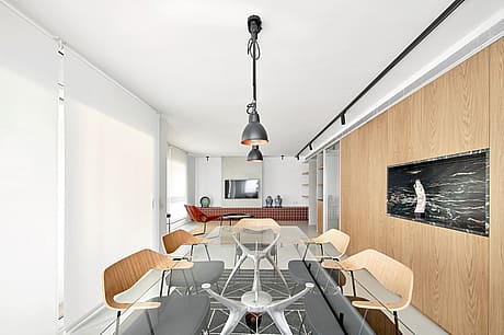
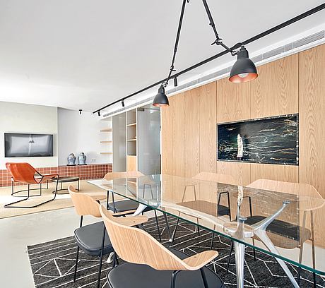
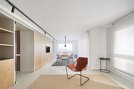
Entering the living/dining room area through one of the corridors, the new wooden volumes distribute the space. In the dining room, paneled cupboards and a black granite vaulted niche which serves as a support for the dining table are the protagonists. In the living area, a bench was built from side to side of the room with the same terracotta tiles, creating an altar-style area for the TV, following our client’s requirements.
To give continuity to the whole space, we chose light grey microcement as the paving.
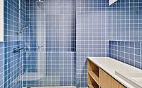
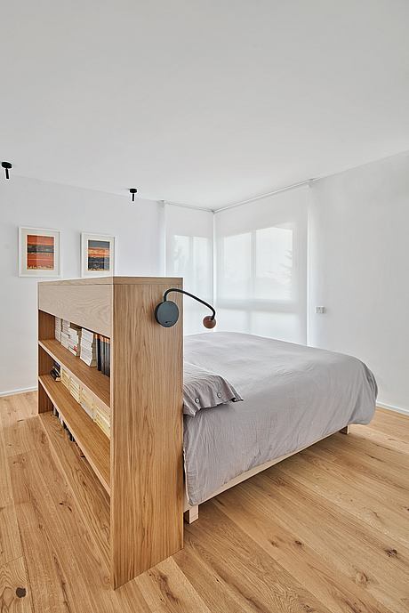
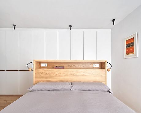
A white lacquered sliding door, which was created following the redistribution of the space, gives access to the bedrooms, where the flooring changes to natural oak. In the bedrooms we changed the floors, the lighting, and the wardrobe, bringing them up to date and keeping them in harmony with the rest of the flat. In the bathroom, the key elements used were blue ceramic tiles, oak veneer wood for the furniture, and white silestone.
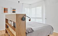
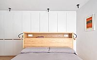
In the main room at the back of the house, the client wanted to create an ample space that could accommodate any accessibility requirements that might be required in the future. We created a 5m long wardrobe that separates the bathroom from the sleeping area and added the same detail as in the other doors of a solid oak handle. The bed is placed in the middle of the wardrobe wall facing the windows, as the client wanted to be able to wake up looking at the mountains.
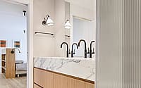
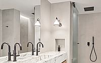
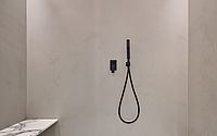
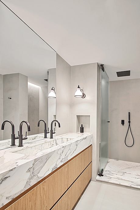
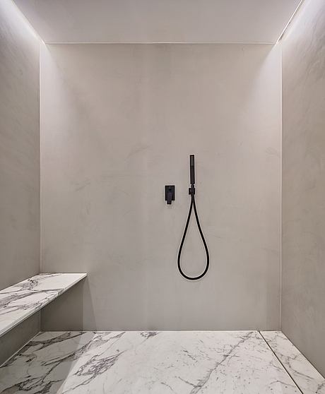
The main bathroom, created as a mini spa, features microcement in the floor and walls, and warmth is given to the space by using arabescato marble – with brown shades – and solid oak furniture.
Photography by José Hevia
Visit Studio Bonba
- by Matt Watts