A Villa on Cloud Nine by Nitzan Horowitz
A Villa on Cloud Nine is a luxury penthouse apartment located in Israel, designed for a family of 6 by Nitzan Horowitz.

Description
This penthouse apartment, located on the 21st floor of an apartment block in central Israel was bought by a family of six. The owners wanted a “Villa in the clouds”, in the sense that the property, spreading across 220 sqm of living space, and a 170 sqm balcony, would incorporate all the functionalities that standard private homes have, such as a family room, a wide corridor and a stunning outdoor space. Designer Nitzan Horowitz, who was hired to manage the renovation, designed the apartment in a way that would accommodate the family’s needs. The project started on the day the first set of keys was received and lasted seven months.
The designer has known the owners for almost 30 years, and as a result, he was given complete design freedom. The owners were happy to “go with the flow” and as Horowitz says, “This is what made the project extremely fascinating. When there is a budget and complete design freedom, you can go totally wild. I created an apartment that is very casual, cozy and warm on the one hand, and luxurious on the other”.
The best materials and suppliers were chosen from an Italian designed kitchen through furniture that was ordered from France six months in advance, including the bedroom furniture. The attention to detail and materials was meticulous, and a variety of elements were incorporated to make the apartment unique.
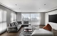
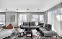
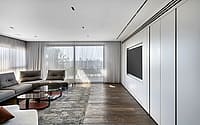
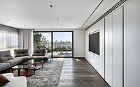
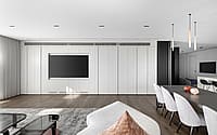
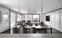
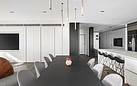
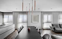
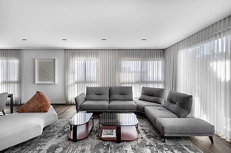
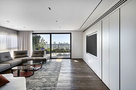
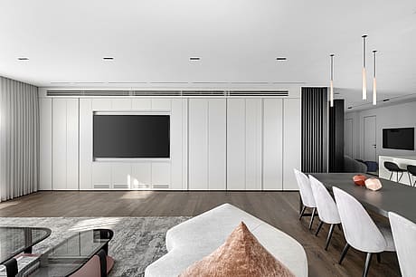
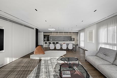
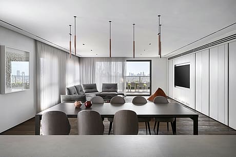
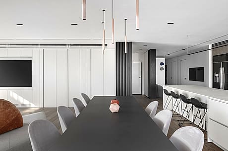
A light yet dominant wall was created in the main living space, and fitted with an audio system, a/c, a wine bar and additional storage. Each unit was tailor-made to meet its specific functionality as well as serve the various forms of entertainment carried out in the living space. The entrance hall shares a wall with the family corner and structural pillars were used to continue the separation with an airier feel.
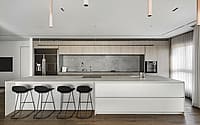
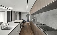
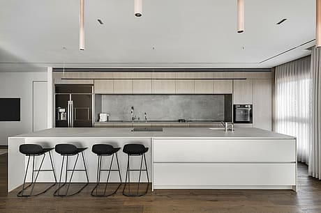
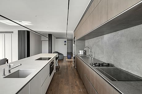
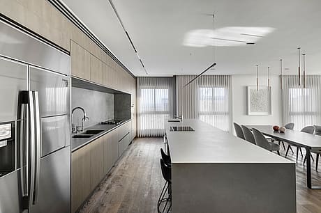
The Italian kitchen is made of Mil-Tec (Industrial material) in two shades, one that resembles steel, and the other corresponds with the color of the living space carpentry.
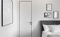
A lively color palette was used throughout the apartment. Shades of black, for example, appear in glass, wood, a variety of light fixtures, profile installations for suspended ceilings and for Frameless doors. The color scheme reappears in touches throughout the property and in different contexts that create continuity and fluidity, leaving a vivid memory that is carried on from room to room.
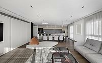
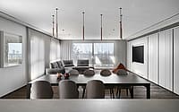
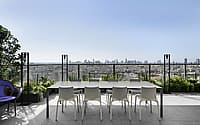
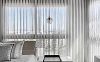
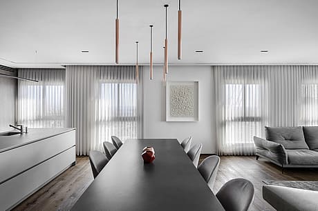
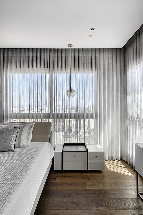
A focal point of the property is its panoramic view. From the 21st floor, the view along with the positioning of the free-standing furniture throughout the apartment, create a light and breezy open space.
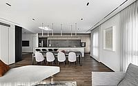
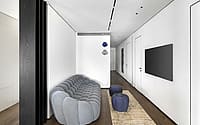
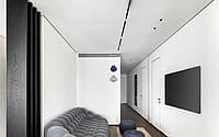
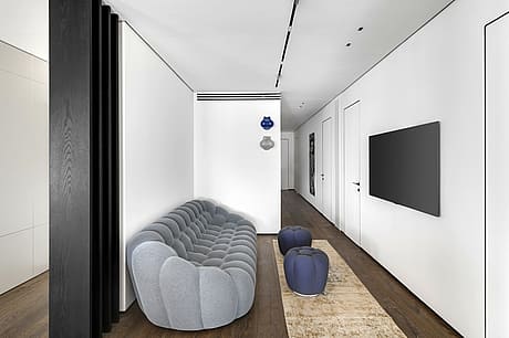
A variety of styles were combined when choosing materials. The concrete table in the lounge and the blue couch, dominant in shade, shape, and texture – create a very current urban feel, alongside more classic elements such as a classic kitchen island and the parquet, which runs throughout the apartment.
This is also evident in the artistic and decorative pieces that were chosen in collaboration with an Israeli art gallery. Colorful, joyful, and humorous art such as graphic or rhinoceros prints were chosen for the family corner and the children’s rooms, whereas more elegant pieces were chosen for the rest of the property such as the piece chosen for the dining area that was created by a local artist out of 1,500 paper cuttings.
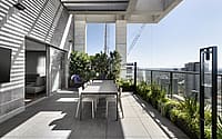
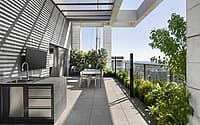
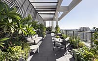
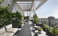
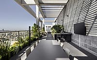
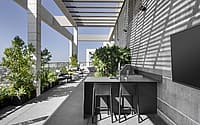
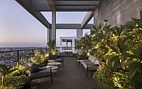
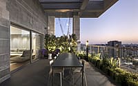
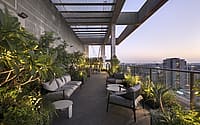
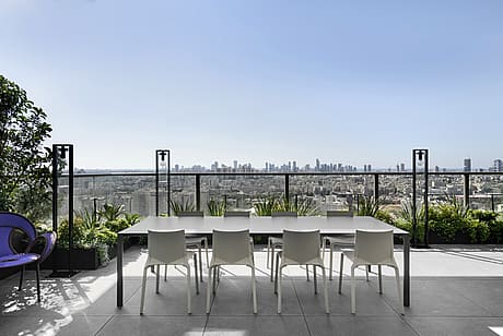
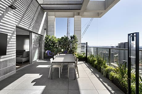
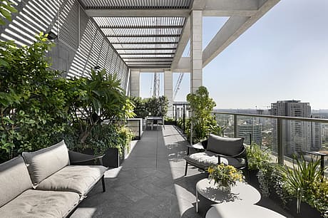
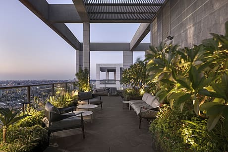
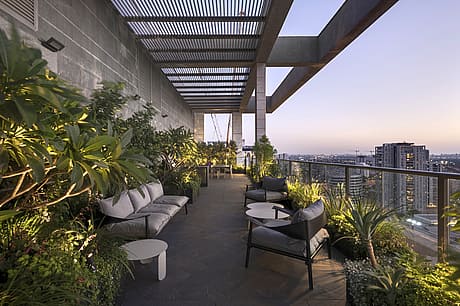
In the large 170 sqm balcony, the designer wanted to create a “garden” that would make any private property owner proud, by giving it a real jungle vibe. The balcony planning was carried out similarly to the interior in terms of its functionality, and as such was fitted with a guest seating area and outdoor cooking area, all overlooking the stunning view. The property’s color scheme runs across the balcony too with the most dominant color, green, bursting from the vegetation.
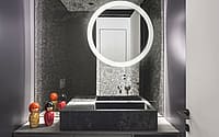
The family corner is an open space that is a central point through which all areas of the property cross and as such also serves as a passage. It is bolder in color and has a young pop-art feel to it. This vibe continues in the guest toilets that were fitted with a special mirror and a purple wall.
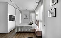
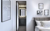
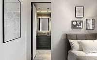
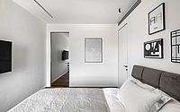
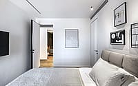
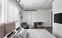
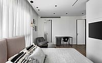
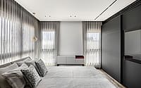
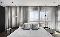
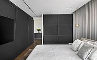
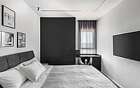
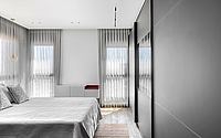
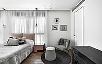
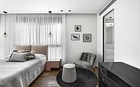
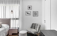
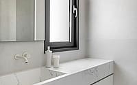
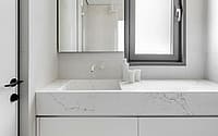
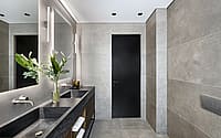
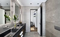
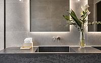
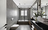
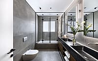
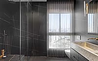
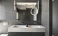
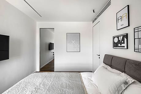
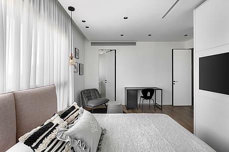
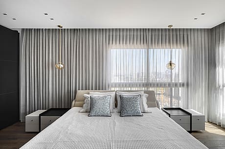
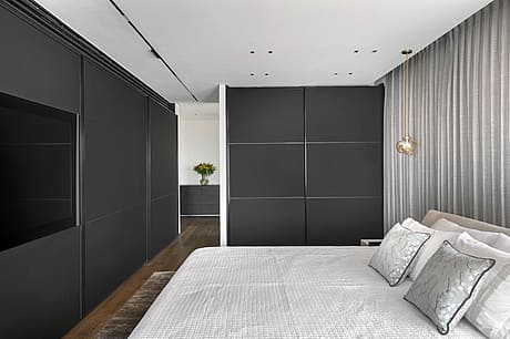
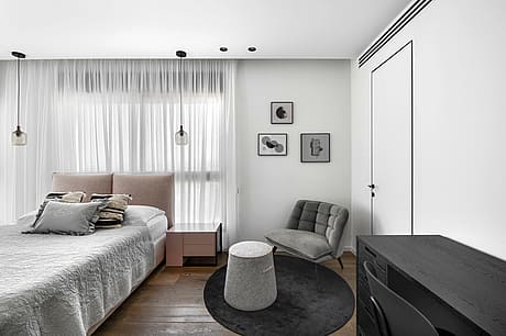
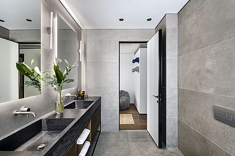
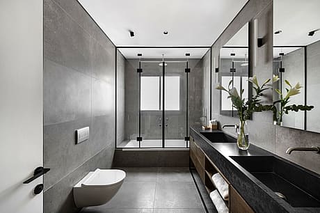
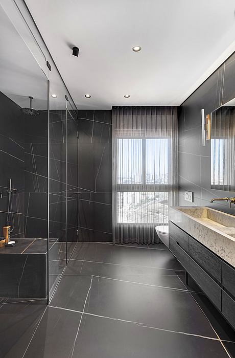
The children each have their own bedroom. The teenagers have their own en-suites, and the older children share a bathroom. The bathrooms were designed to complement the design of each of the bedrooms. The daughter’s bathroom, for example, continues the white shades used in her room. A long black wardrobe with rose gold lighting was fitted in the master bedroom and the colors continue in the en-suite with black carpentry and touches of rose gold in the lighting and sanitaryware.
These elements are dotted across the various spaces creating “pockets” of design stories whilst at the same time coming together as part of a greater design concept.
Photography courtesy of Nitzan Horowitz
Visit Nitzan Horowitz
- by Matt Watts