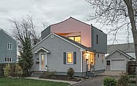
House on House by Architensions
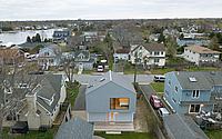
House on House is a unique contemporary single-family suburban home located in Babylon, Long Island, designed in 2022 by Architensions.


Description
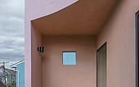
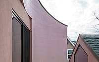
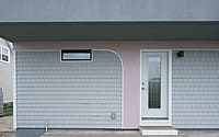
New York-based studio Architensions has designed House on House, the transformation of a compact suburban home in Babylon, Long Island, that includes the addition of a second-floor volume that looks as if another house has been placed on top of the house. A juxtaposition of past and present, visually and programmatically, characterizes the design: the original light gray vinyl siding was retained on the exterior of the first story, but the second floor addition is clad in a thick stucco to enhance the volume’s solid, heavy, massing; and, in select areas, a skin of smooth, light pink rectangular ceramic tile. In several places, the tile descends onto exterior walls of the original home in inverted arcs, arches and swoops, as if the new is slowly overtaking the old. The stark aesthetics of this transformation accompany a layout, geometry, and overall approach that challenges the cookie-cutter single-family suburban typology that is typical of the surrounding area, and more broadly representative of mid-century middle-class white flight.
The project began in 2018, when Architensions co-founders Alessandro Orsini and Nick Roseboro responded to the homeowner’s request for a project that reflected his adventurous design ambitions and desire to expand. Rather uniquely, the client was not interested in approaching the project from the perspective of resale value. “The idea of the commodification of architecture as a real estate asset did not emerge throughout the development of the design. The process was collaborative, with a focus on a highly iterative design process.” The homeowner was interested in updating the original layout from an introverted enclosure, to a space in which functions were open and traditional notions of privacy or propriety challenged. He wanted to link the existing ground floor to the addition above, and to make the entire home more open to the neighborhood and porous to the backyard.
This prompt set the stage for a design process rooted in extensive research into the cultural history and architectural taxonomy of the surrounding suburban neighborhoods. In particular, co-principals Orsini and Roseboro were interested in the home’s proximity to Levittown, NY, a suburban development archetypal of the relationship between race, inequality, and housing in America, in which segregation was embedded in its formation through exclusionary contracts and redlining. In Levittown, African Americans and indigenous communities could not access sales contracts by specific prescription of the Levitt & Sons Company; this was true of similar developments across suburban America and their surrounding neighborhoods. Further inherent in the typology were architectural features and layouts that fostered the isolation and introversion of the nuclear family, rather than community.
“In order to subvert the typology, we needed to become intimately familiar with it—then remix and subvert it,” says Roseboro. “Research is crucial to our practice,” says Orsini. “For House on House on one side, we investigated the governmental regulations and data of the town of Babylon. On the other, we explored design solutions that addressed the existing home’s relationship with the history, context, and vernacular. We wanted to discover a new spatial paradigm that would link the architecture of the house to its social narrative.
The design process began with the analysis of the existing house, acknowledging its form—a ranch house similar to those offered by Sears House Catalogues between 1908 and 1942 —as spillage from one of the standardized homes made popular by Levittown. These homes were made without the help of an architect or design idea, and were based on the vernacular tectonics of the balloon frame, with an added element of standardization. The wooden profiles were made with industrial techniques and dimensions that do not afford design flexibility, and variation existed only in the decorative style of the facades, which were made most often with neo-classical or Victorian references. Orsini and Roseboro then surveyed and produced a taxonomy of architectural elements (windows, porches, roofs, additions) typical of these suburban houses, which they would then “hack” and remix on the home’s new volume—simultaneously referencing the neighborhood’s architectural history and turning it on its head.
“We wanted to “hack” the typology of the American suburban single-family home, which is so influenced by the Cult of Domesticity” says Orsini. “Early American suburban home design values a patriarchal structure in which women are granted status only through domestic labor and child-rearing, and prefers these activities to occur in the privacy of the home, rather than amongst the community. In fact, the family is treated as a religious entity where the benefits of communal life are replaced by a higher idea of privacy, protection, and purity. Therefore, the spatial organization and ordering of these homes are based on separating the life of the family from the community, and furthermore, concealing and compartmentalizing certain private acts, like sex, from the communal life of the family, such that they are presumed not to exist.”
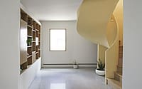
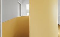
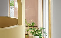
The new, second-floor volume is defined by a large massing sitting on top of the existing house. The stair connecting the first floor and the new addition needed to be compacted to save on space, but it also needed to be part of the layout as an element of separation, without being a wall. Architensions chose to use a discrete cylinder, which helped to develop the design from inside out. On the exterior, the striking geometry of the cylinder appears subtracted from the square volume to create a street-facing, semi-circular outdoor patio, which extends from the second-floor bedroom and offers a unique connection to activity on the street. This acts as a subversion of the surrounding suburban typology, in which decks and patios are introverted towards the backyard, rather than extroverted towards the front, and the traditional front porch was either erased or reduced in size to only offer rain shelter or ornamental decoration above the front entry.
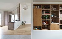
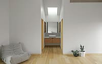
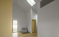
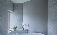
Programmatically, Architensions reconfigured the ground floor, generously opening the kitchen and living room and adding a study area and a guest room, complementing the reorganization of the service core including closet, laundry room and bathroom. On the new second floor, a large open space is used as a primary bedroom, with the volumetric cylinder creating an interior partition between the sleeping area and the front patio. The primary bathroom, including the window bench, is clad in gray and white speckled terrazzo and features a communal sink located in between the bathroom enclosure and the walk-in closet, rejecting the traditional
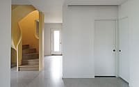
single-family separation of bed and bath, and questioning traditional concepts of modesty and privacy. Large windows open the views to the front and the back. At the ground level, the cylinder meets the closet in the corridor, another defining element of the geometry.
Says Orsini: “There is a very close relationship between the interior and exterior in the project. On the first floor, we configured openings and relationships without altering the geometry of the existing enclosure, but by repositioning windows and doors. This new configuration of openings then influenced the material placement on the facade. Once a window changed in size and position, we were found in need of replacing the original cladding in the old window position.Therefore, we introduced the ceramic tiles to establish the duality between new versus existing. The ceramic tile defines the resulting cylinder of the second floor patio and demarcates the old and new of the first floor exterior cladding.”
The interior was originally painted white, which conveyed a numbness, or fear of color. They used yellow throughout the project to highlight transitions, bring light inside, and define spaces. Says Roseboro: “The colors are also related to openings. The new horizontal opening of the stair manifests with a yellow cylinder, which informs the use of the yellow as the accent interior color. The window openings are in relationship, instead, with the newly introduced materiality of the ceramic. In this way, both interior colors and exterior materials began a dialogue between each other.”
Photography by Michael Vahrenwald
Visit Architensions
- by Matt Watts