The Kew House 3 by Vibe Design Group
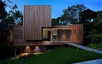
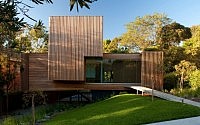
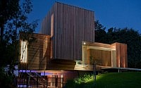
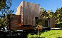
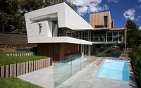
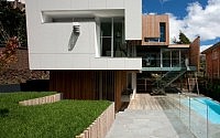
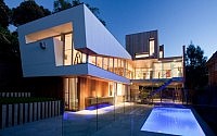
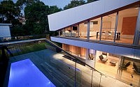
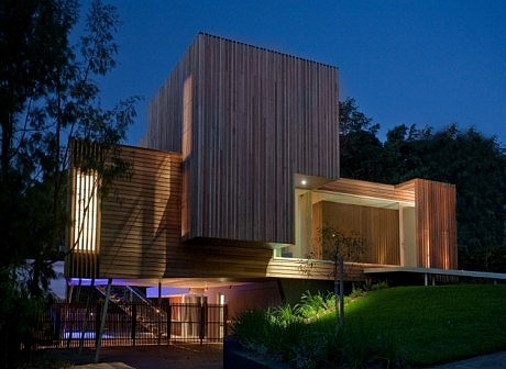
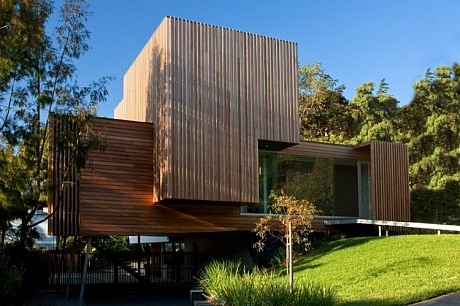
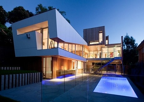
Kew House 3 is a modern single family residence designed by Australian architectural firm Vibe Design Group. The home comprises multiple rectangular sections which extend upward and out of the central living spaces within.



Description by Vibe Design Group
The clients came to our office with the intention of moving into property development. Common ground was that they were focused on presenting projects with high design content supporting a different visual approach.
In the early design phase we were looking to create an open, more interactive street presence which led to a very different design response.
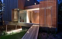
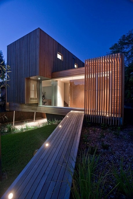
The actual front façade was inspired by the study of 60s and early 70s stereo cabinets with the slatted timber reflecting the slotted speaker elements, in this case they accommodate the covered entry and private en suite window. The house sits lightly balanced on angled steel posts again reminiscent of the stereo cabinet legs, which affords the house the appearance of floating out across the land.
The project sits well in its treed environs, Silvertop Ash was chosen as the cladding because its eventual grey colour will blend completely and afford a sense of belonging in the treed backdrop.
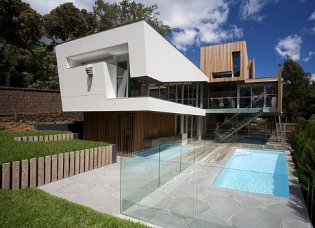
Silvertop Ash timber has a unique ability to assimilate into the surrounds, offering a very different visual affect. To the North the timber is still evident but only on the third storey – as from this vantage point we wanted the upper level to appear as a tree house. ExoTec Façade Panel System was the other main material used because it offers a refreshing contrast to the timber.
The cut out element of the living area window directs the line of sight down to the pool, BBQ area and backyard space – protecting privacy.
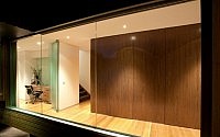
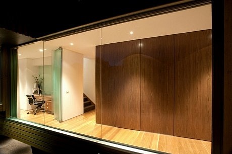
The interior begins with a flat veneer wall on approach. It’s intention is to create the feeling of being at the base of a huge tree.
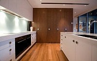
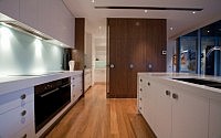
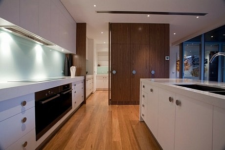
Practically, it houses the cloak, powder room, cellar and on into the integrated kitchen. It’s all achieved with hidden doors that, when opened, offer an unexpected surprise. This house is open yet private and the timber feature wall of the interior invites a journey of discovery. The cantilevered box on the street facade internally houses the day bed and library which interacts with the study space. The study has a glass splash back wall chosen for it’s ability to reflect the outer landscape.
A dumbwaiter is included which travels up from the garage into the scullery that resides behind one of the four integrated doors in the kitchen area. The classic Calcutta Marble has been used in the bathrooms, while the kitchen has Caesar stone bench tops and a preparation cube at the end of the main island bench.
- by Matt Watts