Citylife Apartment Interior by Alessia Garibaldi

Alessia Garibaldi updated Citylife Apartment, located in Milan, Italy, in 2024. Known for offering her services for exclusive projects in the city, Garibaldi designed a quiet and sustainable green oasis with both private and professional spaces. Rigid and minimal interiors in beige, forest green, ivory, and burnt earth tones feature hidden cabinets and artistic decor.

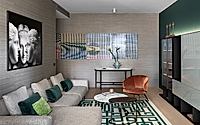
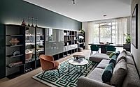
Cozy modern living room with sleek built-in shelving, plush sofa, and geometric rug.

Minimalist Interiors with Timeless Atmosphere

Located at the prestigious Libeskind complex in Milan, Citylife Apartment became a part of the Italian oasis with both private and professional spaces. According to Garibaldi, “a timeless atmosphere was created throughout the apartment” through the Italian creativity and contemporary design.

The studio used a dedicated colour palette in tones of taupe, forest green, dove gray and burnt earth. This way, the interiors, inspired by Japanese houses, feature warm and enveloping tones without compromising neutral colours.

With accents of cool tones or ivory, large flush-door cabinets contribute to the concentration and visual ease across the interiors. Also characterising the surfaces, natural materials like oak veneered wood were chosen by the architects.
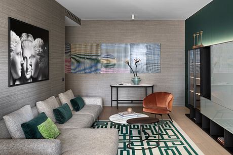
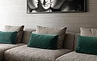
Contemporary living room with textured walls, geometric rug, and mix of modern furniture.

Natural Materials and Textures Characterise the Surfaces

Instead of using paint, internal walls were mainly upholstered with patterned wallpaper in warm and neutral shades.

Wooden furniture with dark tones was favourited by the architects. Wenge boiserie and furniture pieces, according to the statement, express a sincere “minimalism with clean lines.”

In the communal area, “the long equipped wall of the living room, which becomes the absolute protagonist of the living area, comes out of the green wall of tribute at Caccia Dominioni”. In this sense, green is used as an accent colour in the interiors, subjected to tribute to the Italian architect.
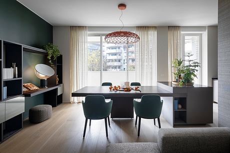
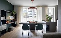
Sleek, modern dining area with large windows, pendant lighting, and minimalist furnishings.

There is a strong relationship between the designed spaces and art. The area aims to be a room dedicated to feel and display contemporary Italian artists like Erik Saglia, Achille Castiglioni, and Piero Gemelli.

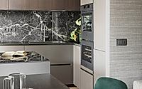
Garibaldi selected a dark-tone oval kitchen island that separates the dining area and the actual kitchen. By choosing a homogenous colour palette, including the base cabinets and countertops, the kitchen was meant to be “a very modern solution to make it an important and scenic element” too.
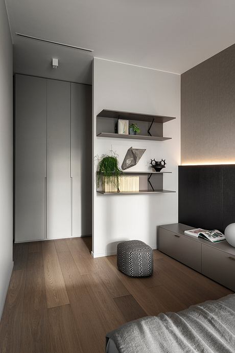
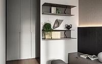
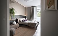
Minimalist bedroom with built-in storage, floating shelves, and textured accents.

An Asian Mood Infused the Private Spaces

In the apartment, the rooms for daily activities such as gatherings and for private spaces are differentiated. To create more intimate atmospheres instead of simply arranging closed boxes, architects used neutral-toned textures with natural tones.

Garibaldi narrated that “the master bedroom is a very clean room, softened by the curtains and cushions in an Asian mood” with less number of furnishings. With a soft brown bed topped with comfy mattresses, the wardrobe, integrated into the wall, is barely apparent.
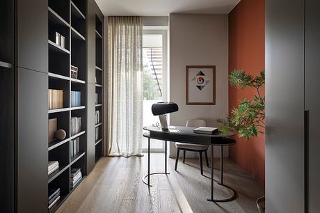
Modern home office with bold, geometric bookcase and minimalist desk setup.
For the guest room, in addition to the wenge elements used for the headboard and boiserie, “small bedside tables and an integrated light that illuminate the light coloured wallpaper” complete the bed. The bedroom is designed as “an element that creates the perfect atmosphere for the night.”

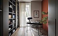
Located in the back of the guest room, the study room features a curved desk “that softens the room and a terracotta-coloured wall that warms the atmosphere, making it cozy.” The functionality of the room is provided by a large bookshelf made of wood with wenge veneer.
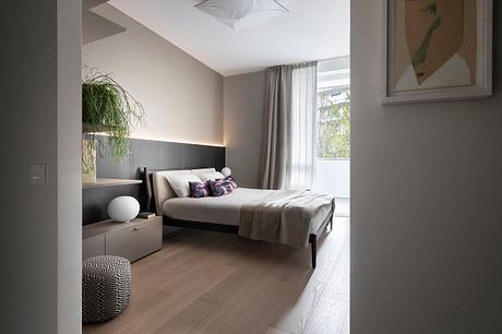
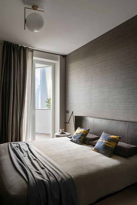
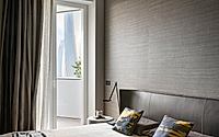
Minimalist bedroom with gray accent wall, floor-to-ceiling curtains, and modern lighting fixture.

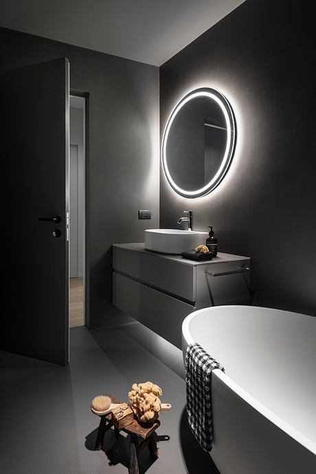
In another room, on the other hand, even the bathroom prioritizes minimalism. Featuring soft grayish tones as well as other spotted surfaces, “even the guest bathrooms were designed according to the same minimalist principle.”
Cozy bedroom with textured gray walls, plush bedding, and modern lighting fixture.
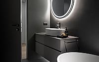
Garibaldi used clean materials and forms. Freestanding bathtub and satin finished glass furniture carefully placed in front of the several eye-catching elements. Resins and clean material without joints became a backdrop “to enhance other elements.”
Sleek, modern bathroom with backlit oval mirror, minimalist sink vanity, and patterned towel.

Photography by Piero Gemelli
Visit Alessia Garibaldi
- by Matt Watts

Tags

Gallery

Get the latest updates from HomeAdore

Click on Allow to get notifications