MoMA Design Store Soho Reframes Artful Retail in Historic SoHo
MoMA Design Store Soho reopens in New York, United States with a refreshed identity by Peterson Rich Office that leans into the building’s rich 19th-century bones. The reimagined store restores the 1884 cast iron architecture while weaving in contemporary display systems, art, and signage that speak directly to design-savvy visitors. Past and present sit in close conversation here, and the result feels both grounded and distinctly urban.
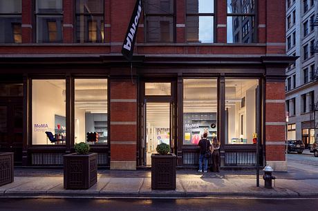
Light falls across cast iron columns and deep window bays, catching on blackened trim and bright product displays. From the sidewalk, the view pulls visitors straight toward color and craft.
Inside, original 19th-century details meet contemporary insertions that speak to a global audience of design enthusiasts. The store at 81 Spring Street is both shop and gallery, a place where historic structure frames everyday objects. Peterson Rich Office steers the renovation toward material clarity and visual rhythm, using architecture and art to guide how people move, look, and linger.
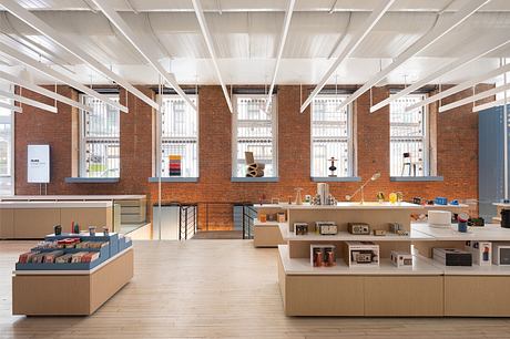
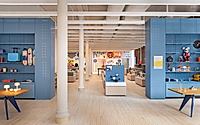
MoMA’s Soho outpost occupies a quintessential cast iron and masonry building from 1884, now restored to its sharper early presence. The historic facade shifts from muddy brown to assertive black, with Landmarks Commission approval supporting the return to an 1880s footprint. That adjustment restores the depth of the storefront and sharpens circulation, while opened windows pull the energy of Spring Street deep into the interior. Within this frame, new display systems, mural art, and layered signage focus on how products live in the eye and in the hand.
Restoring The Historic Shell
From the street, the renewed facade reads crisp and legible against Soho’s cast iron row. Black paint clarifies moldings and cornices, turning shadow into a design element. Returning the storefront to its original 1880s location rebuilds the building’s full footprint and gives the interior a cleaner, more generous threshold. Reopened windows increase transparency between store and city, so passersby catch a layered view of architecture, artwork, and merchandise in a single glance.
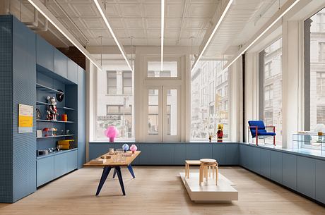
Reframing Circulation And Display
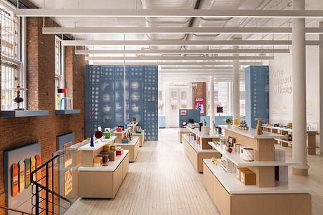
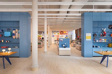
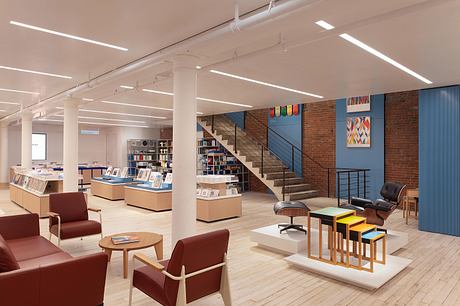
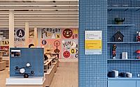
Across 6,600 square feet, the layout shifts from static aisles to fluid pathways that encourage wandering. Perforated steel display walls slice the long floor plate into smaller episodes, creating surfaces for shelving and hooks while letting light and sightlines pass through. Vitrine cases protect more delicate or collectible objects, turning everyday products into small exhibitions. Island displays draw visitors into the center of the room, loosening the edge-bound pattern of traditional retail and encouraging cross-movement from one collection to another.
Materials For A Contemporary Store
Perforated steel, glass vitrines, and clean-lined fixtures sit against masonry and cast iron, a deliberate contrast in age and texture. Cool metal surfaces carry a quiet sheen under store lighting, while the historic shell absorbs and softens that light. New systems for product presentation remain legible as objects in their own right, giving the interior a clear hierarchy between structure, display, and merchandise. Throughout the room, these elements work less as decoration than as tools that shape how visitors read each product family.
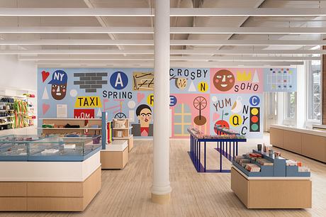
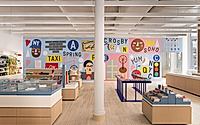
Mural As Urban Dialogue
A new commission from New York–based artist Nina Chanel Abney stretches across the store, turning one wall into a vivid graphic field. Using her paper cut-out technique, she builds a dense composition of cobblestones, street names, and subway lines that root the work in the Soho streetscape. Interlaced with these city references are nods to MoMA’s collection, from a melting clock and an Andy Warhol–inspired soup can to Marcel Duchamp’s bicycle wheel. Visitors read these images while shopping, so the mural folds art history, neighborhood context, and retail experience into one continuous surface.
Signage And Storytelling
New signage does more than label shelves. Short texts share the inspiration and creative process behind individual products, giving visitors an informal primer in contemporary design thinking. This approach extends the museum’s curatorial voice into the store, inviting people to connect objects on display with broader cultural narratives. As shoppers move through the room, they gather fragments of story that deepen engagement and slow the pace of browsing.
In the end, the Soho store reads as a dialogue between past structure and present systems. Cast iron columns, masonry, and restored windows fix the project firmly in its 19th-century context. Against that durable shell, steel walls, vitrines, artwork, and text knit together a current view of how design lives in daily life.
Photography by Eric Petschek
Visit Peterson Rich Office


