Three Shades of Home: Color-Rich Prague Apartment for a Young Family
Three Shades of Home sits in a renovated 1950s panel apartment in Prague, Czech Rep., reshaped by B² Architecture for a young family’s daily rhythms. The project turns a once cramped layout into a light-filled sequence of rooms, with a colorful central core that quietly organizes movement and privacy. Color, concrete, and oak work together to give the home a steady, contemporary character without losing the building’s honest structure.


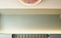
Morning light grazes the exposed beams, picking up soft shadows along the cement-finished ceiling. Oak flooring runs toward the windows facing the square, drawing the eye to the city beyond in a single, clear gesture that frames both outlook and movement through the apartment.
Three Shades of Home occupies a generous apartment in a 1950s panel building in Prague’s Holešovice district, reworked by B² Architecture for a young family. The renovation turns a previously cramped layout into an open, legible interior centered on a green core that holds the most private functions. Color becomes a primary tool here, not decoration: three tones guide circulation, define rooms, and bring a measured freshness to everyday life.
Green Core Guides Daily Life
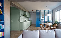
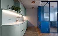
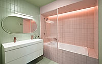
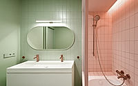
At the heart of the apartment, a solid green volume houses the walk-in closet and bathroom, giving the family a compact service hub that stays close at hand. This core acts as a pivot, with movement spiraling around it toward living, working, and sleeping rooms so that routines like dressing, bathing, and storing belongings remain centered yet discreet.
Its color is not an accent applied at the end but a clear marker for the most intimate zone, anchoring circulation visually and functionally. As people move from entry to living area or from bedroom to study, the green enclosure stays in peripheral view, a constant reference point that steadies orientation.
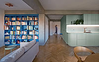
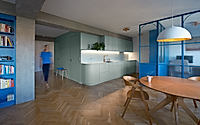
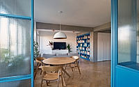
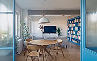
Living Rooms Around The Square
Around this core unfolds the main living area, oriented toward the square with city views that stretch past the windows. The open volume combines daily activities in one continuous field, yet color and built-in elements gently distinguish places for sitting, dining, and working without erecting new solid walls.
Transparent partitions draw a clear line for a workspace while keeping sightlines long and daylight generous. Blue built-ins along the study and library reinforce that threshold, so the working zone reads as distinct but still connected to family life and the changing light from the square.
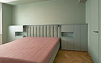
Quiet Rooms To The Courtyard
Toward the quieter courtyard, the bedroom and children’s room shift away from the more animated face of the city. Here the color story softens, and the strong green and blue moments give way to calmer tones that let rest take priority.
White built-in cabinets line the walls, taking on storage duties while concealing an additional closet so loose furniture can stay minimal. This built-in layer keeps surfaces clear, allowing the three primary tones—green, blue, and pink—to read with clarity rather than compete with visual clutter.
Material Palette In Balance
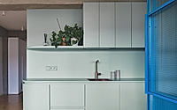
The material palette reflects the building’s robust structure: concrete pairs with cement finishes, oak flooring, and bold color surfaces that echo the panel era without nostalgia. Exposed structural columns and beams are kept present in the interior, their load-bearing role legible even as they participate in the composition of rooms and thresholds.
Original concrete beams that once conflicted with the clients’ vision are unified with a cement screed, making them visually lighter and helping to lift the relatively low ceilings. Copper details in fittings, door handles, and bespoke lighting cut through the neutral base, adding small points of warmth where hand and eye meet every day.
Three Tones, One Home
Across the apartment, the color scheme rests on three tones—green, blue, and pink—combined in calm, deliberate ways rather than scattered as decorative accents. Each tone carries a role: green for the internal core, blue for study and library built-ins, and pink as a gentle counterpoint that enriches the overall atmosphere.
These colors sit against concrete, cement, and oak, so their presence feels grounded rather than fleeting. As day turns to evening, changing light slides over these surfaces, bringing subtle shifts to their depth and reinforcing the apartment’s new identity as an open, airy home shaped by structure, color, and the routines of a growing family.
Photography by Alexander Dobrovodský
Visit B² Architecture