K House by AworkDesign.studio
Designed in 2015 by AworkDesign.studio, this contemporary residence is situated in Taipei City, Taiwan.

Description by AworkDesign.studio
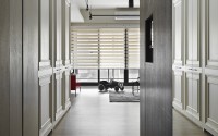
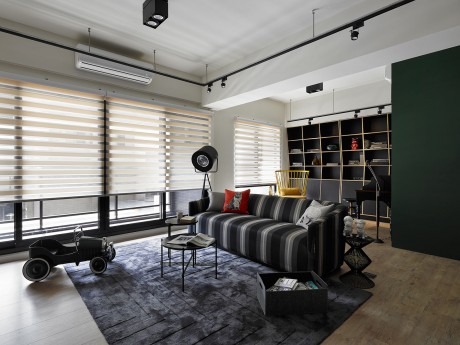
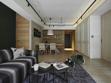
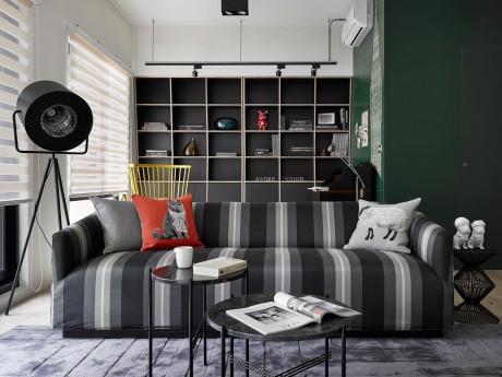
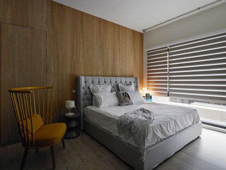
The base tones of brown, grey and white consolidate the spaces into a streamlined and balanced contemporary loft style. The moment you walk into the entrance, you will be embraced by the welcoming panels built from wood wool cement boards. They make a strong statement without overwhelming intimidation. The elongated corridor leads to a source of soft natural light, unfolding an exploration of the intricate interactivity between human and space.
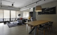
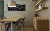
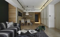
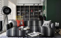
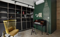
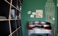
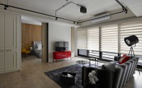
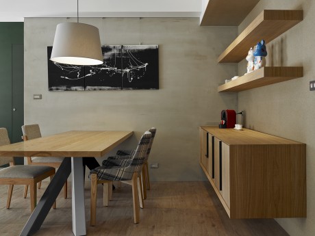
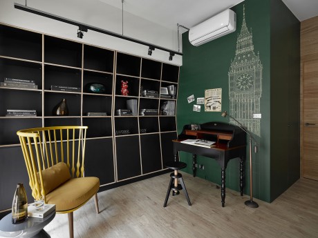
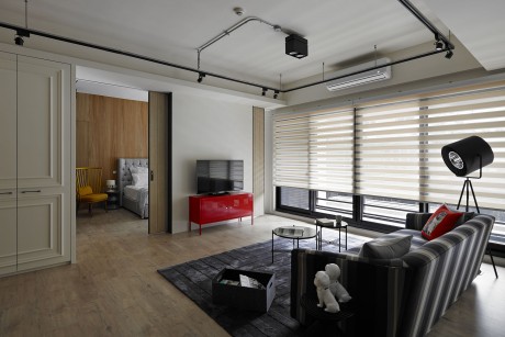
Moving forward, warm well-lit dining room is hosted by a solid rectangular oak dining table set against a canvass of cement wall sedated by solid brown and streamline grey. The living room is set next to the dining room. The newly-wed couple wishes to have more flexibility with the spaces. Therefore, the wall between the living room and study is removed. Tracks for lighting extend from the living room to the dining room to create a unified warm feeling in the spaces of domestic activities. The boundaries are blurred, but the functions are clearly defined.
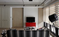
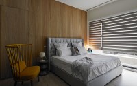
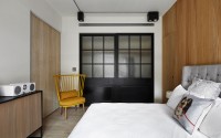
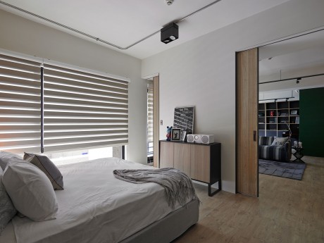
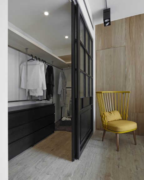
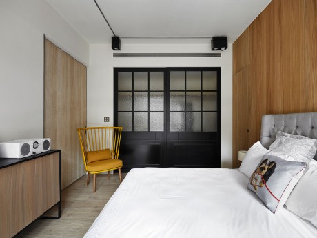
Privacy is essential in between the master bedroom and living room, but open space provides integrated visual layout. Therefore, a semi-opened TV wall is designed as a partition in between the two spaces. The fixed wall at the center pronounces the inviolable boundary and the retractable doors by the two sides extend the space of the living room into the bedroom and invite the eyesight to travel through an integrated depth. This variability creates an intriguing spatial relationship of high versatility. The dressing room, kitchen storages and dining room cupboards are built back-to-back in the same section to achieve high-efficiency storage.
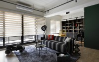
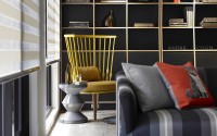
Three luxurious French windows bring flooding natural sunlight into the living spaces for optimum illumination. Imagine an afternoon with a cup of coffee and a magazine in hand. This is a perfect nestling spot for a moment of relaxation.
Photography by MW Photo Inc
- by Matt Watts